You are using an out of date browser. It may not display this or other websites correctly.
You should upgrade or use an alternative browser.
You should upgrade or use an alternative browser.
dr.blix
Senior member
- Messages
- 2,279
- Likes
- 33
(I see your RSI - which you highlight as a divergence - has come away from overbought levels, so it may have had its breather.
i don't use momentum indicators in an oversold/overbought way, i look at the indices trading range to try to get a handle on that aspect.
i just use RSI just for potential divergence signals to try and gauge if a move is becoming tapped out.
interesting place we're at now!
Attachments
Thanks Tomorton
I'am beginning to think the same although I will endeavour to continue, I do think there are certain times of the day combined with a reliable system where you could potentially do very well from day trading using SB but I will let you know if I do start to make any money.
Do you have any ideas on what kind of trading is suitable for day trading, i,e futures etc. The only thing is that they seem more expensive and you could end up losing more if the market moves against you but would be interested in any opinons.
I have been backtesting a system where I use 20MA on 4 different time charts and wait for crossover on all four charts before going long/short. It seems to wok very well but commissions on SB can take away a lot of profits, i was wondering if anyone has any idea on what the costs would be trade a ftse future contract and what 1 contract is typically worth.
Cheers
Don't know pard. It seems to me daytrading by scalping is a model with micro-overheads that became popular with US electronic access in the late 90's. SBing can be used to mimic direct market access but the SB overheads seem just too high for multiple positions per session and so it would be hard to make it work. I have not looked at other mechanisms like DMA, CFDs etc. I might occasionally take an intra-day position, but at one per day, I don;t think many people would count that as daytrading.
timsk
Legendary member
- Messages
- 8,836
- Likes
- 3,538
MACD Divergence
Hi Everyone,
Just thought I'd stick my head around the door and say hi.
Hi!
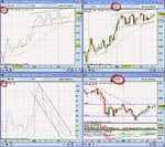
Attached is a mish mash of FTSE charts. The bottom right is a weekly chart and shows that in spite of the rally since early March, the index is still in a trading range. The bulls will take heart from what appears to be a well developed ascending triangle pattern and be readying themselves for a breakout above the 4,600 area. I suspect that price will get there and may even poke its head above the line briefly - as it did at the start of the year and in November prior to that. Then I fear it will retreat hastily, the bulls will get stopped out and the shorts will step in. Why? Well, the funnymentals aren't good for starters. Oil is moving back up which will mean higher fuel prices and petrol especially. The unstable political situation doesn't help with Gordo desperately clinging on to power and, historically, June isn't a great month for the index anyway. Then there's the daily chart. Top left is a simple good ol' fashioned line chart and beneath it is MACD. Anyone who's a fan of divergence patterns will, I imagine, have their fingers poised on the sell button as I type. All in all, the sentiment is pretty bearish in my view.
Tim.
Attachments
dr.blix
Senior member
- Messages
- 2,279
- Likes
- 33
really interesting timsk 🙂
i'm in the bear camp...i've been posting recently, wondering about the possibility of a rise to 4673 followed by a drop to 4150.
i found this article really interesting:
The shipping index shows most stocks are heading down - MoneyWeek
i'm in the bear camp...i've been posting recently, wondering about the possibility of a rise to 4673 followed by a drop to 4150.
i found this article really interesting:
The shipping index shows most stocks are heading down - MoneyWeek
Hi Tim - Yes, looks short-term bullish, medium-term bearish. Big problem with these widely recognised lazy patterns like triangles, H&S etc. is that the participants are easily traded against and the patterns traded out. Yes, I do think we''ll break out of the triangle, but agree with you, not for long. Failure of a bullish break-out at these low levels could be a nasty shock for the market and very bearish.
Deeply negative day shattered the ascending triangle and March uptrend, but price remains within 5-week rectangle/range. In fact, low today was very close to head of old gap 4294-4317, dating from 05/05. This gap has been tested several times but not closed. Tomorrow likely to be a stern test of this gap - and of nerve.
tenbobtrader
Guest
- Messages
- 450
- Likes
- 140
3rd friday of the month ?
actual volume on ftse and V futures ?
actual volume on ftse and V futures ?
Last edited:
timsk
Legendary member
- Messages
- 8,836
- Likes
- 3,538
Might be of some interest . . .
http://www.trade2win.com/boards/for...ding-technique-good-results-2.html#post800088
http://www.trade2win.com/boards/for...ding-technique-good-results-2.html#post800088
Tim - You sum the situation up well with the 4300/4500 range boundaries. A breach of one or the other will be significant, ............and 4300 is much closer. A bounce off one or the other would be significant too, .........and again, 4300 is very close.
barjon
Legendary member
- Messages
- 10,752
- Likes
- 1,863
dow closed down around 100 points from where it was at ftse close, so ftse should gap open below 4300 assuming wall street futures don't stage a recovery overnight. It'll sure be interesting to see whether ftse will defy big brother!!
good trading
jon
good trading
jon
tenbobtrader
Guest
- Messages
- 450
- Likes
- 140
range breach proper and inside bars with a twist
Best to let the range breach proper with US indices in support imho
all US have sold down from higher ground and ftse up to the usual pig in middle routine,
very easy to get caught offside proper given the opposite gap opens
nice post tim, not sure about the macd one, they are making more out of the move than me, so :whistling
inside bars, not my cup of T but something from my collection that may be of use to their followers, inside bars with a twist !
looking to buy 258 - 282 fut, blow off into bad news perhaps, like to see the US all at base camp with the NDX, OEX confirming
Attachments
Spent a bit of time looking back at the deeply negative day 15/06 and looking to see any warnings in the EOD TA to suggest such a deep reversal was imminent. After Friday I wrote that we had seen an inside range day that was also the narrowest rage in at least the last 4 sessions. I also noted the patterns that have been pointed out and discussed here - the ascending triangle based on 26/05 and the rising trendline from 09/03. Obviously a breach of these would be very bearish but that did not suggest they would be breached.
I didn't note at the time that Thursday and Friday formed a harami candlestick formation. I missed others recently too - look at 04/06 and 22/05. Though these were not trend reversal signals (Steve Nison rates them as only weak reversal signals at best) they were all three followed by immediate and strong contrary price action: not automatically trend changes but significant moves nevertheless, and who knows where Monday's negative price action might end? I would like to think I might have given the Thursday/Friday formation more weight if I had seen its significance - I will certainly be on the look-out for haramis in the future.
Did anyone else see any signs Friday night that we would have such a down day Monday? What were they?
timsk
Legendary member
- Messages
- 8,836
- Likes
- 3,538
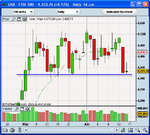
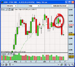
I was just looking closely at the price action at the end of last week to see if I could offer anything in answer to Tom's question when I noticed the attached. Between last night and this morning, there's been an amendment to price movement on the FTSE last week - according to ProRealTime!!! Anyone noticed this sort of thing before and what can be concluded from it? Is this the price one pays for a free resource perhaps?Did anyone else see any signs Friday night that we would have such a down day Monday? What were they?
😱
Tim.
Tom - sorry not to answer your question - but the difference in the charts radically affects the answer I was going to give!
Attachments
dr.blix
Senior member
- Messages
- 2,279
- Likes
- 33
Did anyone else see any signs Friday night that we would have such a down day Monday? What were they?
well there was a boat load of RSI osc div!
tenbobtrader
Guest
- Messages
- 450
- Likes
- 140
consolidation within the range, the rise bottoms formation HH HL, flat top at R, drop of in ATR and volume
imho all signs of false moves to follow shortly, shakeout ! Long and Short retail stops trailing in tight, nervious profit taking from the Long riders
ftse looks to be just holding its range, possible range extention into news event (Long opportunity) and perhaps then we will be able to make a longer term call on direction
watching NDX and OEX, volume interesting on latter (shows up well on a p&f chart) (stockcharts.com) EOD
favour it resolving Long, failure of the trend to continue and perhaps we could see the famous slow decline for ever !
printing a lot of funny money at the minute, must effect number value I would have thought, anybody any good and old enough to remember how it usually pans out ?
Last edited:
Hi Tim - I have heard from Sharescope that they have occasionally uploaded bad data, then the next dauly update corrects it. It is continually annoying that FTSE do not issue an authoritative OHLC set of data for each day (at least not for free). I regularly find that ADVFN and Sharescope use different opening values for the FTSE100. Some chart/information providers seem to use the 0803hrs value: anyone any idea why they pick that time as opposed to 0800, 0801, 0802 or 0804 etc.?
Similar threads
- Replies
- 26
- Views
- 9K


