A Professional Approach to Trading Futures

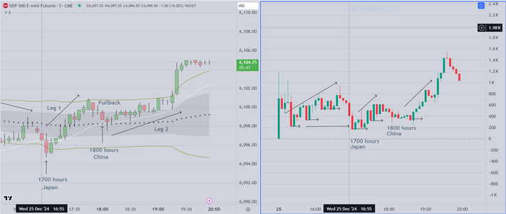
And here is the follow up to the previous post

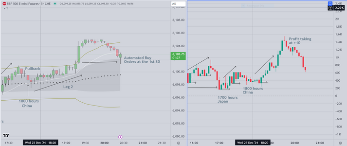
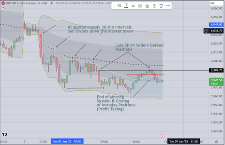
Looking at the right side, you can see profit taking
signaling the end of trade (for the moment at least)
Most of this is automated, in that institutional programs
are activated at +10 pts, or what is (for this time period)
defined as a "measured move".

On the right side, this chart shows the profit taking, followed
the programmed buy orders that occur at the 1st SD band
This isn't coincidence. The programs run independently
and are meant to contain (or to try to contain) price within
the envelope until the open of the next US session.
 

Attachments

  • Asia FU Chart.PNG
    Asia FU Chart.PNG
    98.6 KB · Views: 29
  • Laast.PNG
    Laast.PNG
    96.3 KB · Views: 15
Last edited:
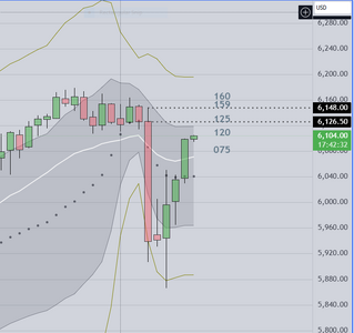
And this will be our final post before sleeping

Price "magnets" for tomorrow above and below
current price on a chart with Daily Candles
The VWAP envelop extends one (1) year.
Twenty period (white) EMA is one of the
downside magnets

Good luck
 

Attachments

  • Tomorrow's Magnets.PNG
    Tomorrow's Magnets.PNG
    48.6 KB · Views: 15
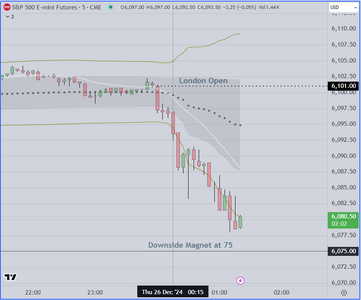
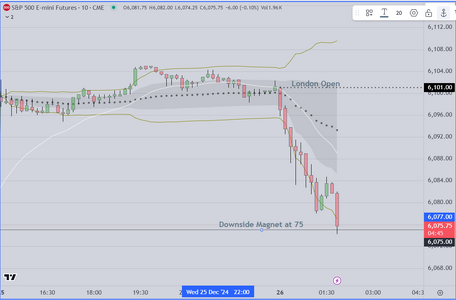
Given the interesting London Open
and the subject of the previous post ("Magnets")
I thought I would post this chart to show how
close we are to a test of the downside Magnet
at 75

Postscript

And we post the actual touch of 75 which happened a minute or
so ago.

As mentioned, we finished trading for the year recently and are
not in the market currently. The entry for this trade would have
been based on our research of previous price action patterns
The WRB (wide range bar) down on the open suggests (to us)
that a further move would be likely. Our standard practice would
have been to wait for the first pullback, then enter short holding
for +10. No magic or secret about this as it is widely known among
professionals. Finally because we trade units of three (3) contracts
we would have left one (1) contract to run.
 

Attachments

  • Test of Downside Magnet.PNG
    Test of Downside Magnet.PNG
    51.5 KB · Views: 14
  • Test of Downside Magnet.PNG
    Test of Downside Magnet.PNG
    66.1 KB · Views: 15
Last edited:
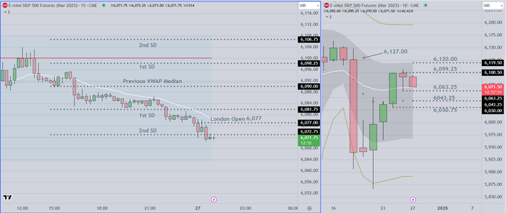
Before getting some sleep
I create this starting point (for context when I wake up)

On the left side, it displays Asia and London Market Price Action relative
to the Previous VWAP envelope

On the right side, we have a Daily chart and I have my price "magnets" above
and below for the next session

With this in hand, I can produce a trading plan that outlines my course of action
depending on what I see (and of course, the pending economic news that occurs
during the "magic hour" (1:30-2:30 pm London)

I add the Statistical Skew and (sometimes) a cumulative delta volume display
and that's it. I am ready for the US session to open.
 

Attachments

  • Overnight Context.PNG
    Overnight Context.PNG
    101.4 KB · Views: 16
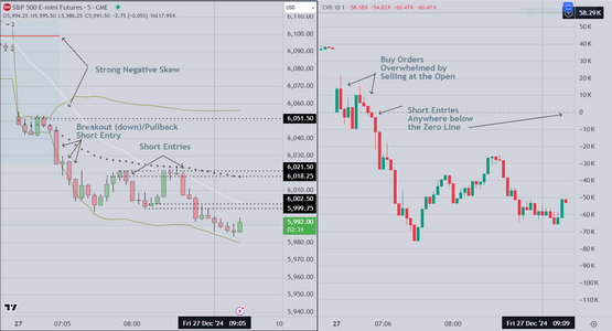
Here is my Markup for today Dec 27
Tax selling and end of year profit taking were expected
because of the shortened Holiday week.

I was NOT in the market today, but served as a "tour guide"
for my friends who do trade. This was an easy day for them
once they understood the perspective. As always we started
with the longer time frame and worked toward the 10 & 5 minute
context (see the previous post for the pre-market prep)

On the open we saw the gap and reviewed the overnight markets
Asia & London. It became apparent that a selloff was possible when
at the open, two (2) attempts to buy were overwhelmed by selling
Notice the Cumulative Delta Volume on the right side chart display
As it dropped below the Zero Line, we mentioned to our observers
that this (in our opinion) was a signal to institutions that buyers
had "given up". The rest of the session was largely selling, followed
by a trading range, and then continued selling (Tax & End/Year Profit
Taking).

As with most days, it is about understanding context first, followed by
outlining the possible scenarios, and then at the open, evaluating the
price action. If the various signals align, in this market you always
"go with" volume based indicators (volume profile/skew for instance)
The early skew was negative, which foretold the possible drop, and
then the cumulative delta failed and finally, buyers "gave up" then
price dropped precipitously (wide range bar). Skilled trader saw this
and simply took the easy money.


Good luck
 

Attachments

  • Dec 27 Tax Selling.PNG
    Dec 27 Tax Selling.PNG
    105.7 KB · Views: 17
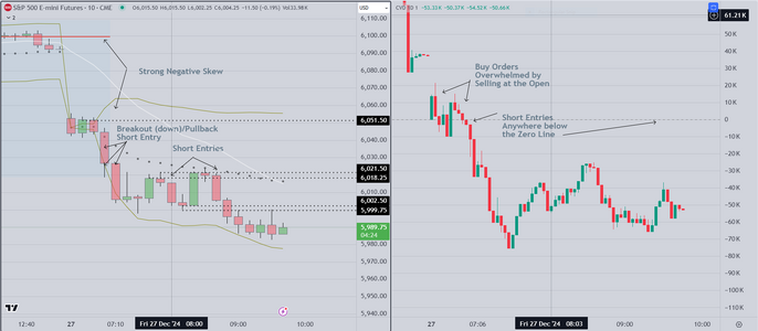
and here is the same chart using 10 min candles

I produce this because for newbies and those who
struggle with 5 min charts, this seems to be easier
to read and react to.

Good luck
 

Attachments

  • Dec 27th 10 Min Candles.PNG
    Dec 27th 10 Min Candles.PNG
    112.5 KB · Views: 19
As 2024 draws to an end, we offer a couple of thoughts as follows

1) What we have learned over a period of years, is that the "charts tell you
everything, if you will become a skilled, patient observer". This was one of
the most important things said to me by my mentor some 15 years ago

2) To that end, I watched patiently and learned by making just about every mistake
that a person could make, (to my dismay) often repeatedly. As I became more disciplined
and less sleep deprived, I learned that good decision making is what separates skilled
(and profitable) traders from amateurs.

3) Also recently, I was asked by my mentor's widow to provide a class to amateurs, in memory
of his contribution to my education. On the plus side, several attendees seemed to make good progress and
recently I was able to confirm that they continue to make a consistent profit in the markets, using
the same tools shown in the charts below. I may decide to hold another class in the next month.

The Chart attached below shows the basic price action we would expect during the holiday season.
We did not trade (see our previous posts) because we have already hit our goals for this taxable year
We did however provide commentary for observers who were trading, and to our surprise, several
of the traders were able to a) follow the logic and b) enter at approximately the right time, and c) hold
for the required time period (in this environment, about 15 minutes), in order to take a decent profit.
It was a good experience, and a good day.
 

Attachments

  • Mon 30 Dec Markup.PNG
    Mon 30 Dec Markup.PNG
    179.3 KB · Views: 11
Last edited:
Interesting

When I look at the forum I see that almost 600 people are reading, presumably to try to
understand what I am doing. My Mentor (we will call him "George") and his wife would
be pleased that I have provided a basis that works well in any market with volume.

Interested parties should know that I send out a questionnaire. I try to restrict my class
to persons who have al least a basic understanding of statistics.

To those who may be interested, I suggest you contact me if you want a place in this
next class. I won't waiting long before starting

Good luck
 
I continue to be surprised at the interest my posts have
created.

My mentor used to say that "Context is Everything"
and the longer I trade, the more certain I am that he was
right.

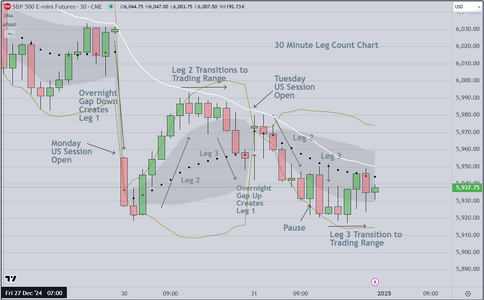
Attached below, is a chart that I have used for years to obtain
the following objectives

1) Market Direction
2) Levels at which Institutions may enter
3) Identification of entries & profit targets

Notice if you will that at the top & bottom of the 2 day chart
price "transitions into a trading range". At these areas (and other
areas) institutions are operating to find that liquidity that fuels
the next trending move. I spend time working with students to
interpret these charts and show them how to use the information
within to trade the sessions that follow using shorter time frame
charts (typically either 10 or 5 min candles)

Good luck
 

Attachments

  • 30 Min Leg Count.PNG
    30 Min Leg Count.PNG
    129.2 KB · Views: 8
Last edited:
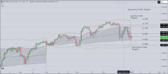
And here is the Quarterly Profit Target Chart as I was taught to
create it over 15 years ago.

Although it may seem simple, a lot of thought goes into
it, and I won't be posting it (or anything like it) again.

And while I welcome folks to analyze as they may, the important part
of this is not what on these charts, but how we proceed from this point
onward.

Based on information we derive (in part) from these charts, we estimate
that the odds (about 62%) favor a move to the upside..

Good luck
 

Attachments

  • Quarterly Profit Targets.PNG
    Quarterly Profit Targets.PNG
    118.5 KB · Views: 6
Last edited:
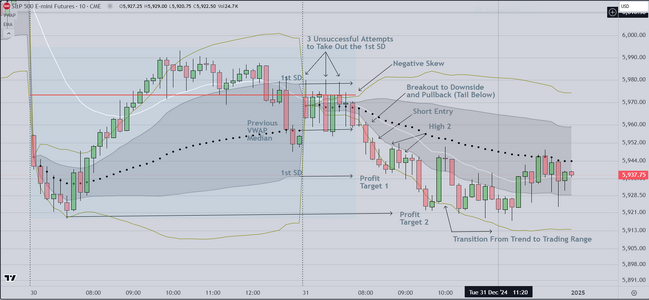
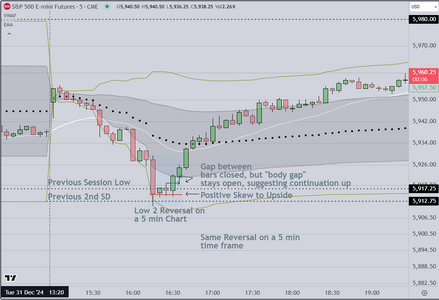
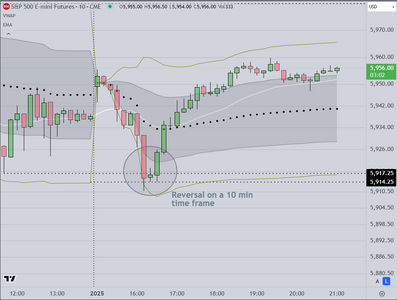
This is a post about reversals, specifically one type of reversal

Referencing the charts attached below, notice in the 10 min version
the reversal showing a down candle, a doji, followed by a reversal
up. Ordinarily this is a low percentage trade. When I see this I know
that my next step is to toggle from the 10 min time frame the next
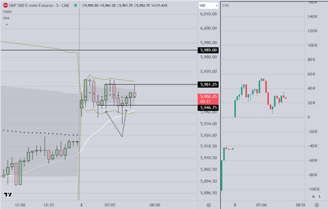
lower time frame (5 minutes) to provide additional data. On the next
chart, which is a 5 min chart, notice that we have a L2, which is a setup
used almost entirely by commercials (I won't discuss it further). Once
I see this pattern I review the context (because context is everything)
and I see that the planets are lining up.

After the entry, I want to see evidence (data) that tells me to stay in this
reversal, and it comes in the form of a gap that closes, followed by a
"body gap" that stays open, suggesting that buyers are in control. Seeing
this I am adding to my position, and holding for the ride to the opposite
SD (Standard Deviation Band). Why? Because I know that it is likely that the
move will continue.

A critical difference between skilled and unskilled traders is all about this
kind of kind of knowledge, about recognition, of what is right in front of you
and putting it all together IN TIME TO MAKE USE OF IT.

The final step is execution and managing the trade in a disciplined
fashion.
 

Attachments

  • Reversal Setup Example 10min.PNG
    Reversal Setup Example 10min.PNG
    83.7 KB · Views: 6
  • Reversal Setup Example 5 min.PNG
    Reversal Setup Example 5 min.PNG
    102.9 KB · Views: 8
Last edited:
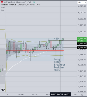
Trading again in the New Year

As expected this was a trading range early, due to Economic News (ISM primarily)
Our preparation is simple (we have outlined it previously) and it served us well
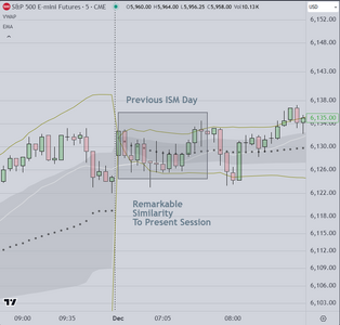
today. The price action was virtually the same as the last date (Dec 2)

Because the skew was to the upside, we took two (2) longs, each almost 10 pts
Flat now and waiting for the next time period at 8am local time

And a further comment while I wait for the next window of opportunity

Once again I have visitors observing my trades. I assume some of them are
copying my trades, I expect it. I have cautioned everyone to be careful
when the market exhibits trading range patterns. Most of them do not know
how to use limit orders, and so they at a disadvantage as regards the fills
they will get (compared to the professionals). what this means is that they are
at the back of the queue both when they enter, and importantly when they
try to exit. That is why I caution them to watch and ask questions (to learn
without risking money if possible). Some of them used market orders to enter
and still were able to make money (because the volatility was sufficient to
provide more than 7 pts. Also a couple of them reported that they made
+2 and +3 pts on each of the two trades I took.

Look at both charts. Today's chart is on the left of course and DEC 2nd on the
right. I find the similarity interesting. It is not coincidental. Same report, and
same result (essentially).

Good luck
 

Attachments

  • Trading Range Examples.PNG
    Trading Range Examples.PNG
    66.6 KB · Views: 11
  • DEC 2nd ISM.PNG
    DEC 2nd ISM.PNG
    62.2 KB · Views: 30
Last edited:
And trade #3

As mentioned, we segment the market into 30 min & 60 min periods
framing it (technique is called "Bookends"). When we see a significant
skew, we take the trade IF it is accompanied by one of two setups
either a simple breakout, or a H2/L2. After that it is a matter of managing
the trade to a profitable exit, or (if our stoploss is hit) exiting and moving
on to the next trade.

One final item to cover is the use of statistical skew in our system. Because
this provides a significant edge, all entries have to align WITH the skew. The
numbers do not lie. As seen in the chart on the right, the skew was strongly
pointed to the upside, so no short entries. On the minus side, we did not
"stay with" our final trade, and that was a mistake. We left money on the table.
One of the visitors asked how we decide whether to scalp or swing, and we
explained that it is contingent on how the candles close. If they close "strong"
(without tails) and above the 1st SD (standard deviation above the VWAP median)
then we hold (and monitor Cumulative Delta). If we see a bar close "weak" (prominent
tails for example, or a "doji"), we usually elect to close the position. Also our system
requires that we take at least partial profit at +10, again at +20 and depending on our
position size, at intervals of 10 pts thereafter, if the market runs in our favor.
 

Attachments

  • Trade #3.PNG
    Trade #3.PNG
    56.6 KB · Views: 43
Last edited:
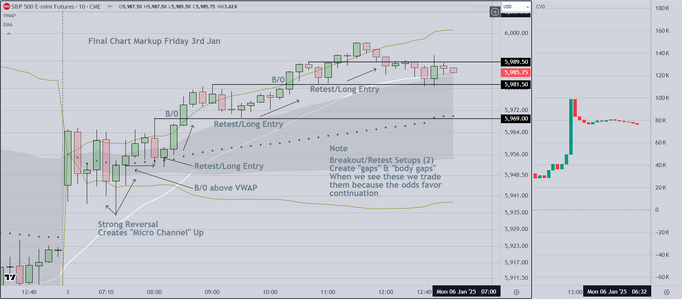
Here is my "Final Markup" chart for today 3rd Jan
At the conclusion of the day I always analyze the price action
and the setups, to show the trades and the results.

The primary lesson to take from this chart relates to the B/0 Pullback
Setup. I am always interested in identifying gaps and body gaps. When I
see successive gaps, it tells me that the computers that create automated
entries are being activated to (in this case) send out "buy orders". You can see
them at specific times (where price retests the B/0. These are high probability trades

A reasonably good day, however as mentioned I exited one of my trades too soon, leaving money
on the table. The criteria used to decide whether to stay with or exit a position have already
been covered.

At this point I have received quite a few inquiries for my next class. I have sent out my standard
questionnaire and will evaluate the responses. Once that class starts I may limit or stop posting
(depending on what my students request).

Finally please note that I show this Markup on a chart using 10 min candles. Personally I do not have
a preference (5 or 10 min candles are both fine with me) however I notice that 10 min candles are easier
for struggling traders. Apparently it is easier for the setups to be recognized on this time frame.

Good luck
 

Attachments

  • Final Markup 3rd Jan 2025.PNG
    Final Markup 3rd Jan 2025.PNG
    139.3 KB · Views: 34
Last edited:
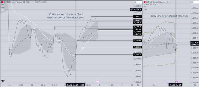
Institutions use line charts for various purposes, one of which is to identify (and track)
"Reaction Levels". These are levels where inventory can be staged as needed, to
add or subtract from existing positions. I won't be going into further detail in this
post. To make use of these charts, I add another tool, and with that I am able to
forecast where significant moves are likely to occur on several time frames.

In addition, the line chart makes it possible to evaluate Market Structure (if one knows
how to read it). A thoughtful analysis should reveal that the structure of the market
often changes at specific times, and on specific days of the week, month and quarter.

Good Luck
 

Attachments

  • Line Chart Example.PNG
    Line Chart Example.PNG
    148.9 KB · Views: 7
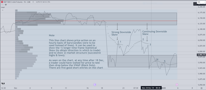
Attached below find one last line chart, this one uses a one (1) hour time frame
(if bars or candles were to be used instead of line).

As mentioned in the note on the chart, this is one of the ways that professionals
monitor market structure, and statistical skew on the longer time frame. With the
information gained from this chart, the trader knows 1) that the preferred direction
to trade is short, and that market structure (successive lower highs & lows) continued
to support short entries. As I have mentioned before, this is one of the reasons why
skilled professionals can consistently win by trading on the right side of the market.

As a final note to readers, recent price action suggests that a possible change in
market structure has occurred. I wonder if anyone knows how to trade it?

Good luck
 

Attachments

  • One Hour Line Chart.PNG
    One Hour Line Chart.PNG
    138.9 KB · Views: 12
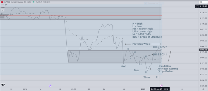
First, Thanks Trader333 for your interest and kind words. I was going to stop
however you expressed an interest in learning more, so this additional chart
is for your consideration.

It is the same chart as above, with an added analysis of "Market Structure"
This is part of our standard (weekend) preparation, prior to Monday's US
session open

1) We start with the larger context (by scanning left) and what is apparent
is an area of support
2) Then we look at the previous week and what we see is known as a
"liquidation" as price probes below support, where it activates resting (stop)
orders, before reversing back up. This is very common. Institutions know
that stop orders exist below support, so they try to activate those orders
before starting a reversal (leg 1) move higher.
3) This is the advantage of analyzing market structure. Once professionals see
price "take out" the VWAP, then the lower high, they know buyers are in control.
That is why price moved up strongly from the LL. As price moves higher, "taking out"
the VWAP (black dots) and then the LH, institutions see this as a signal to buy and
they create the HH (break of structure 1) followed by yet another HH (break of structure 2).
Aggressive buyers entered after the first break of structure.

The final step in our preparation is creation of a trading plan. To do that we watch the
overnight market including the "magic hour" (when Economic News affecting the US is
released). Then we create scenarios for the various kinds of price action that we may see.
We won't go into that detail here however it is typical for price to 1) retest the previous
breakout level, or 2) to continue higher with bars closing strong to trap traders "out of"
Leg 1 of a multi-leg move.

Good luck
 

Attachments

  • Market Structure Example.PNG
    Market Structure Example.PNG
    96 KB · Views: 8
Last edited:
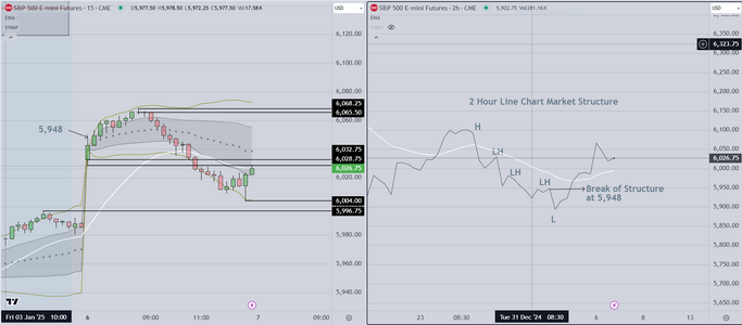
This evening, we attach a chart that we have been working on
to simplify the analysis of Market Structure. The reason this analysis
is so important is that professionals make decisions involving significant
amounts of money based (at least in part) on whether they see the market
as trending, or trading in a range.

As mentioned, the process has been simplified. Using a line chart (right side of the
screen) we identify successive highs & lows. Using this chart, you can quickly see
not only the trend, but what professionals call "break of structure". It is this feature
that allows the trader to identify the price where a position can be taken, with high
odds of success (with an edge over others).

Looking at the chart on the right, you can see that price was trending lower, then
at some point it reversed. That reversal isn't enough to create a good reversal setup
however, if you waited until price closed above 5,948, then your long entry had a
very good chance of success

Referencing the chart on the left side, you can see what would have happened if
you entered at that price and held.

Before we begin our next class, we are going to complete the process of simplifying
our system, so that a retail (amateur) with basic math skills, willing to work, can learn
how to approach ANY market in a systematic (disciplined) fashion.
 

Attachments

  • Simplified Market Structure Tool.PNG
    Simplified Market Structure Tool.PNG
    114.8 KB · Views: 3
Top