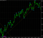
Just to explain the last chart a little - the pink histogram as the bottom of the chart is a collection of fib time projections from the low of the 24th March.
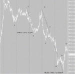
I know the wave counts are wrong, am having a little trouble with the FTSE 100 at the meoment.
I know the wave counts are wrong, am having a little trouble with the FTSE 100 at the meoment.


