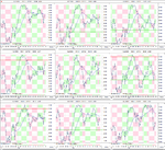
Best Thread Market Breadth

Market Breadth Update

I've been away for the last few weeks having a break from work and trading. I feel refreshed and ready to get trading again, although the 13 hour overnight flight from Singapore has dampened that a little bit. Maybe I'll stick closer to home in the future unless I'm going away for longer than two weeks. Anyway lets look at what's happened to the main breadth charts while I was away...

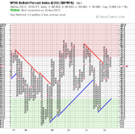
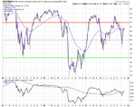
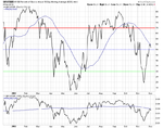
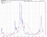
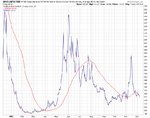
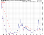
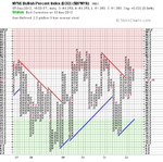
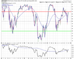
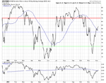
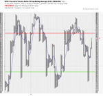
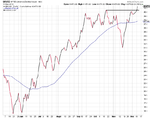
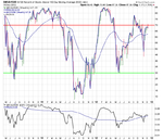
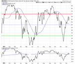
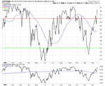
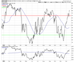
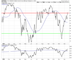
Interestingly, there was no changes in statuses in any of the main four in the last two weeks since all three moving average breadth charts reversed on the 19th November. So they remain on a short term bull alert, and a medium and long term bear correction - i.e the major trend is still bearish, but we've had a strong short term recovery rally, which has pushed the columns of Xs up close to their recent highs in the short term. For example the short term needs to move above 58% in order to give a new bull signal, which can also be clearly seen on the line chart version also, which has stalled at it's falling 50 day MA, and below the relative performance 200 day MA. The only comparison in the last year on the chart can be seen in April when the recovery rally failed under it's falling 50 day MA and relative performance 200 day MA.

So my analysis from the charts is that we are currently lingering around a point of relative fair value within a overall down trend still. So hence I personally feel that the risk reward is very good for a short trade around these levels, but that's just my opinion from what I'm seeing on these charts and you may interpret them differently.

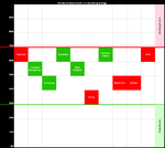
Anyway attached is the updated charts and table:

attachment.php


Longer Term Charts

attachment.php


attachment.php


attachment.php


Medium Term Charts

attachment.php


attachment.php


Short Term Charts

attachment.php


attachment.php
 

Attachments

  • $BPNYA_4-12-12.png
    $BPNYA_4-12-12.png
    18.2 KB · Views: 810
  • NYA200R_4-12-12.png
    NYA200R_4-12-12.png
    19.3 KB · Views: 787
  • NYA150R_4-12-12.png
    NYA150R_4-12-12.png
    18.5 KB · Views: 808
  • NYA50R_4-12-12.png
    NYA50R_4-12-12.png
    16.8 KB · Views: 781
  • sc-57-200.png
    sc-57-200.png
    37.1 KB · Views: 807
  • market-breadth-table_4-12-12.png
    market-breadth-table_4-12-12.png
    10.8 KB · Views: 746
  • sc-56-50.png
    sc-56-50.png
    39.9 KB · Views: 793
  • sc-58-150.png
    sc-58-150.png
    41.4 KB · Views: 839
Attached is the secondary breadth charts of the NYSE Advance Decline line, The New High New Lows and the NYSE Advance Decline Line Volume.

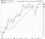
As was discussed in the blog post that dentist007 highlighted. The short term advance decline line 10 day MA reached an extreme level on the 30th November and has come off a bit since then, indicating a short term top. The cumulative advance decline line has moved back above it's 50 day MA (which has gone flat), but didn't make a new high.

The advance decline volume has made a swing high back above it's 50 day MA which is falling and is currently pulling back again.

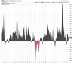
The new highs and new lows charts show a slight bullish tone, but the level has been very weak and doesn't indicate a lot of conviction in the recent rally imo as it's pulled back below the crucial 100 level again.
 

Attachments

  • sc-48_NHNL_D.png
    sc-48_NHNL_D.png
    34.6 KB · Views: 164
  • sc-47-AD_Vol.png
    sc-47-AD_Vol.png
    35.8 KB · Views: 270
  • sc-54_AD_10DMA.png
    sc-54_AD_10DMA.png
    38.1 KB · Views: 218
  • sc-53_AD_W.png
    sc-53_AD_W.png
    27.5 KB · Views: 177
  • sc-52-AD_D.png
    sc-52-AD_D.png
    29 KB · Views: 245
  • sc-49_NHNL_W.png
    sc-49_NHNL_W.png
    42.3 KB · Views: 218
  • sc-50_NHNL_D_Net.png
    sc-50_NHNL_D_Net.png
    30.4 KB · Views: 218
  • sc-51_NHNL_W_Net.png
    sc-51_NHNL_W_Net.png
    32.6 KB · Views: 262
Volatility Breadth Charts

Attached is the volatility breadth charts, of which the moving average breadth volatility charts are back below their 50 day MAs and so in the bullish zone again for the time being. But the Bullish % volatility chart isn't confirming the move and is still well in bearish territory.
 

Attachments

  • sc-11.png
    sc-11.png
    30.7 KB · Views: 181
  • sc-14.png
    sc-14.png
    29.1 KB · Views: 241
  • sc-12.png
    sc-12.png
    34.4 KB · Views: 227
  • sc-13.png
    sc-13.png
    29.5 KB · Views: 240
S&P 500/US Treasuries Ratio's

Attached is the P&F charts of the S&P 500/US 30 Year Treasuries Ratio and the S&P 500/US 10 Year Treasuries Ratio. Although in a column of Xs currently, both are still below their October breakdown levels and in medium term downtrends.

attachment.php


attachment.php
 

Attachments

  • SharpChartv05-4.png
    SharpChartv05-4.png
    37.5 KB · Views: 715
  • SharpChartv05-5.png
    SharpChartv05-5.png
    36.1 KB · Views: 721
There was a change in the short term breadth status on Friday as the NYSE Percent of Stocks Above their 50 Day Moving Averages made a triple top breakout above the 58% level. This moves the short term status from the Bull Alert that was made on the 19th November to Bull Confirmed now.

The moving averages medium and longer term breadth charts also gained further percentage points in their Xs column, however, they remain on Bear Correction status still with the medium term NYSE Percent of Stocks Above their 150 Day Moving Averages chart currently testing the breakdown resistance level.

It is important to remember that the medium and longer term charts have more weighting than the short term chart. Weinstein said recently that the short term should be considered a "2" on the Richter scale, whereas the longer term trends should be considered a "10" on the Richter scale.

Below is the updated data table short term NYSE Percent of Stocks Above their 50 Day Moving Averages P&F and line chart, and attached are the rest of the charts.

attachment.php


attachment.php


attachment.php
 

Attachments

  • sc-1-200.png
    sc-1-200.png
    37.7 KB · Views: 158
  • NYA50R_7-12-12.png
    NYA50R_7-12-12.png
    16.9 KB · Views: 733
  • NYA150R_7-12-12.png
    NYA150R_7-12-12.png
    18.5 KB · Views: 173
  • NYA200R_7-12-12.png
    NYA200R_7-12-12.png
    19.4 KB · Views: 167
  • $BPNYA_7-12-12.png
    $BPNYA_7-12-12.png
    18.2 KB · Views: 151
  • sc-150.png
    sc-150.png
    41.5 KB · Views: 175
  • sc-2-50.png
    sc-2-50.png
    39.9 KB · Views: 719
  • market-breadth-table_7-12-12.png
    market-breadth-table_7-12-12.png
    11.3 KB · Views: 709
US Industry Sectors Breadth

In my last sectors breadth post before my holiday on the 17th November the sectors were all negative and some had began to move into the oversold zone. Over the last three weeks all of the sectors have recovered with between 7% and 20% of stocks in each sector moving back above their 150 day moving averages. This has abated the oversold condition and we now have a very mixed neutral market picture with four sectors on sell signals and five on buy signals in the middle normal market condition zone.

There were no changes over the last week with only very minor moves up or down in each sector as was reflected in the S&P 500 closing only a few points higher and having a very flat week.

Over the last three weeks Health Care has been the weakest sector only gaining 7.34% of stocks above their 150 day MA, whereas the strongest sectors were Industrials (+20.46%) and Consumer Staples (+20.30%).

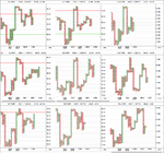
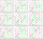
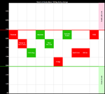
Below is the data table for the Percent of Stocks Above 150 Day Moving Average in each sector which I've ordered by relative strength, with the highest to the lowest percentage in each sector. Also attached is the visual diagram of the 9 sectors and the overall NYSE Percentage of Stocks above their 150 day Moving Averages, plus the 1% P&F chart and line chart of the nine sectors.

attachment.php
 

Attachments

  • sector-breadth-table_7-12-12.png
    sector-breadth-table_7-12-12.png
    15.3 KB · Views: 707
  • sector-breadth-visual_7-12-12.png
    sector-breadth-visual_7-12-12.png
    15.6 KB · Views: 220
  • sector_breadth_1pc_PnF_7-12-12.png
    sector_breadth_1pc_PnF_7-12-12.png
    56.3 KB · Views: 197
  • sector_breadth_7-12-12.png
    sector_breadth_7-12-12.png
    124.8 KB · Views: 179
Last edited:
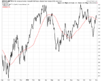
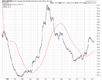
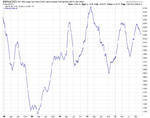
Thanks for the update dentist. I've been playing around in stockcharts and have made a breadth chart that might be interesting to look at every now and again. It's the ratio between the S&P 500 and the CBOE Put/Call Equity Options. I've used a 50 day MA to smooth the data and make it useable. Attached is the 5 year chart which shows that the three week rally hasn't registered as by this measure it is still moving lower. But also note in the long term that it made higher highs in 2010 and 2011, but started making lower highs this year.

attachment.php
 

Attachments

  • sc.png
    sc.png
    23.4 KB · Views: 697
Last edited:
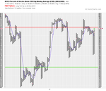
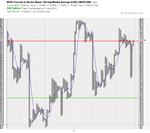
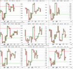
I thought it would be interesting to look at the moving average breadth charts on a faster scale of a 1% box size by 1 box reversal for a change instead of the standard 2% box size by 3 box reversal that is used for the breadth statuses. I also like to include a 5 column simple moving average as it helps to filter some of the additional noise on the faster chart. I look for breakouts above a swing high that formed above the moving average line and vice versa for breakdowns, as well as the overall chart position of the signals. These current charts are giving bullish signals by that measure. However, the longer and medium term signals are forming near the higher risk zone and so are less likely to be successful imo, as you ideally want a buy signal in the lower half of the chart following a move into or close to the oversold zone and a sell signal in the upper half of the chart following a move into or close to the overbought zone imo. Below are the charts.

Long term chart - NYSE Percent of Stocks Above their 200 Day Moving Averages

attachment.php


Medium term chart - NYSE Percent of Stocks Above their 150 Day Moving Averages

attachment.php


Short term chart - NYSE Percent of Stocks Above their 50 Day Moving Averages

attachment.php
 

Attachments

  • NYA200R_1BoxR_1pc_11-12-12.png
    NYA200R_1BoxR_1pc_11-12-12.png
    27.2 KB · Views: 656
  • NYA150R_1BoxR_1pc_11-12-12.png
    NYA150R_1BoxR_1pc_11-12-12.png
    28.7 KB · Views: 706
  • NYA50R_1BoxR_1pc_11-12-12.png
    NYA50R_1BoxR_1pc_11-12-12.png
    30.8 KB · Views: 677
Last edited:
Cumulative Advance Decline Line

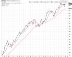
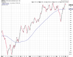
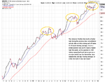
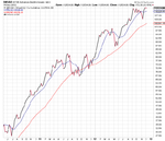
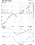
The Advance Decline line made a higher high during the previous two consolidation periods after an initial strong sell off below it’s 10 week (50 day) moving average. It is in a similar position now as it’s made a higher high this week, so the question is: Will history repeat itself and hence give us a stronger selloff than the November drop towards the 200 day moving average, or is this the start of new medium term bull move? The weight of evidence from the other breadth measures is still weighted towards to bearish side in the medium to long term, so I'm leaning towards the history repeating itself case personally. Is anyone seeing anything in the breadth charts to support a more bullish case medium term?

attachment.php


attachment.php
 

Attachments

  • NYAD_Weekly_11-12-12.png
    NYAD_Weekly_11-12-12.png
    32.2 KB · Views: 670
  • NYAD_Daily_11-12-12.png
    NYAD_Daily_11-12-12.png
    24.5 KB · Views: 689
Last edited:
There was another change on Friday with the short term NYSE Percent of Stocks Above their 50 Day Moving Average chart reversing back to a column of Os. This moves the short term to Bull Correction status on the NYSE as the column of Xs didn't manage to get above the 70% level before reversing back to Os. If it had got above 70% then the status would have been Bear Alert instead, like we got on Friday on the more specific S&P 500 Percent of Stocks Above their 50 Day Moving Average and the Nasdaq 100 Percent of Stocks Above their 50 Day Moving Average charts. So whatever status, bull correction or bear alert - caution is the message to the bulls from the moving average breadth charts in the short term.

The medium term and long term moving average breadth charts remain on Bear Correction status, as they are still on a sell signal, but in a column of Xs for the time being still. Although a move below 64% will move the NYSE Percent of Stocks Above their 150 Day Moving Average chart back to Bear Confirmed status, and a move below 62% will do the same for the 200 Day chart. So with the short term reversal this could happen in the next week.

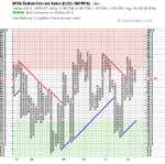
Finally the long term NYSE Bullish Percent Index remains on Bear Alert and in a column of Os. So the weight of evidence is tilting towards the bears again as you can see on the updated P&F and line charts and the data table below.

attachment.php


Long term

attachment.php


attachment.php


attachment.php


Medium term

attachment.php


attachment.php


Short term

attachment.php


attachment.php
 

Attachments

  • market-breadth-table_14-12-12.png
    market-breadth-table_14-12-12.png
    11.5 KB · Views: 670
  • NYA50R_14-12-12.png
    NYA50R_14-12-12.png
    16.4 KB · Views: 694
  • NYA150R_14-12-12.png
    NYA150R_14-12-12.png
    18.6 KB · Views: 676
  • NYA200R_14-12-12.png
    NYA200R_14-12-12.png
    19.3 KB · Views: 685
  • $BPNYA_14-12-12.png
    $BPNYA_14-12-12.png
    18.2 KB · Views: 686
  • sc-26-50.png
    sc-26-50.png
    34.9 KB · Views: 694
  • sc-24-150.png
    sc-24-150.png
    39.9 KB · Views: 680
  • sc-25-200.png
    sc-25-200.png
    36.8 KB · Views: 674
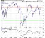
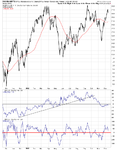
Attached is the secondary breadth charts. Advance Decline, Advance Decline Volume, Momentum Index, 10-Day MA Advance Decline Oscillator, New High New Lows and the S&P 500 / 10 & 30 Year Treasuries Ratios.

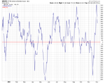
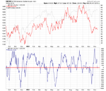
Note the cumulative Advance Decline line reversed from it's new high to end the week lower and back in the range. New Highs - New Lows also dropped back into the neutral zone below 100. Whereas the momentum index continues to show a large divergence with the price action.
 

Attachments

  • AD_Vol_Daily_14-12-12.png
    AD_Vol_Daily_14-12-12.png
    49.3 KB · Views: 187
  • AD_Cum_Daily_14-12-12.png
    AD_Cum_Daily_14-12-12.png
    25.8 KB · Views: 220
  • AD_Cum_Weekly_14-12-12.png
    AD_Cum_Weekly_14-12-12.png
    26.8 KB · Views: 184
  • momentum_index_14-12-12.png
    momentum_index_14-12-12.png
    43.7 KB · Views: 175
  • New_Highs_New_Lows_D_14-12-12.png
    New_Highs_New_Lows_D_14-12-12.png
    32.4 KB · Views: 194
  • SharpChartv05-20.png
    SharpChartv05-20.png
    36.1 KB · Views: 140
  • SharpChartv05-19.png
    SharpChartv05-19.png
    37.4 KB · Views: 156
  • New_Highs_New_Lows_W_14-12-12.png
    New_Highs_New_Lows_W_14-12-12.png
    30.3 KB · Views: 212
  • NYHL_Cum_14-12-12.png
    NYHL_Cum_14-12-12.png
    38.6 KB · Views: 168
Last edited:
US Industry Sectors Breadth

The sectors continued another week in the middle of the range with only small changes. So the overall picture is still very mixed.

Below is the data table for the Percent of Stocks Above 150 Day Moving Average in each sector which I've ordered by relative strength, with the highest to the lowest percentage in each sector. Also attached is the visual diagram of the 9 sectors and the overall NYSE Percentage of Stocks above their 150 day Moving Averages, plus the 1% P&F chart and line chart of the nine sectors.

attachment.php
 

Attachments

  • sector_breadth_14-12-12.png
    sector_breadth_14-12-12.png
    124.6 KB · Views: 203
  • sector_breadth_1pc_PnF_14-12-12.png
    sector_breadth_1pc_PnF_14-12-12.png
    54.8 KB · Views: 178
  • sector-breadth-visual_14-12-12.png
    sector-breadth-visual_14-12-12.png
    15.7 KB · Views: 161
  • sector-breadth-table_14-12-12.png
    sector-breadth-table_14-12-12.png
    15.9 KB · Views: 813
Short term Breadth Status Change

The short term NYSE Percent of Stocks Above their 50 Day Moving Averages breadth chart reversed from Bull Correction to Bull Confirmed status yesterday, although it hasn't yet broke the swing high from last week. But it is close and is back in a column of Xs, so the bulls are still in control for now in the short term.

The recent changes have however, given us a new breakdown level to watch. So a break below 56% on the short term chart will give a new double bottom sell signal. Below is the updated data table and short term moving average charts.

attachment.php


attachment.php


attachment.php
 

Attachments

  • market-breadth-table_17-12-12.png
    market-breadth-table_17-12-12.png
    11.4 KB · Views: 769
  • NYA50R_line_17-12-12.png
    NYA50R_line_17-12-12.png
    31.7 KB · Views: 772
  • NYA50R_17-12-12.png
    NYA50R_17-12-12.png
    16.3 KB · Views: 802
Last edited:
Short Term Charts

Below is the major short term moving average breadth charts for the S&P 500, Nasdaq 100 and the NYSE. The S&P 500 and Nasdaq 100 Percentage of Stocks above their 50 day moving averages charts have reached the upper overbought levels of the chart, while the NYSE chart is just moving into the lower part of the overbought zone.

attachment.php


attachment.php


attachment.php
 

Attachments

  • sc-31.png
    sc-31.png
    38.2 KB · Views: 756
  • sc-32.png
    sc-32.png
    38.6 KB · Views: 741
  • sc-33.png
    sc-33.png
    35.5 KB · Views: 766
NYSE Volume Advancing / Declining Ratio

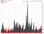
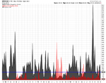
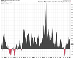
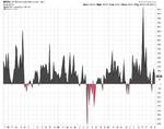
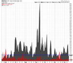
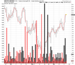
I've made up a new breadth chart to have another way of looking at the volume from the NYSE. I've created a ratio chart of the NYSE volume that's advancing ($NYUPV) divided by the NYSE volume that's declining ($NYDNV) to give the up volume bars - which is the grey bars on the histogram; and I've done the inverse and overlaid it on top to get the declining volume bars - the red bars on the histogram. Finally, I've overlaid the S&P 500 in the background.

attachment.php
 

Attachments

  • sc-36.png
    sc-36.png
    23 KB · Views: 725
Re: NYSE Volume Advancing / Declining Ratio

I've made up a new breadth chart to have another way of looking at the volume from the NYSE. I've created a ratio chart of the NYSE volume that's advancing ($NYUPV) divided by the NYSE volume that's declining ($NYDNV) to give the up volume bars - which is the grey bars on the histogram; and I've done the inverse and overlaid it on top to get the declining volume bars - the red bars on the histogram. Finally, I've overlaid the S&P 500 in the background.
Hi isatrader,
Something tells me this is very cool indeed. Just a slight shame I can't quite get my head around it! Am I right in thinking that the grey bars show the net advancing volume while the red bars show the net declining volume? If so, what do the pink bars show?

Sorry if I'm being really dim!
Tim.
 
Re: NYSE Volume Advancing / Declining Ratio

Hi isatrader,
Something tells me this is very cool indeed. Just a slight shame I can't quite get my head around it! Am I right in thinking that the grey bars show the net advancing volume while the red bars show the net declining volume? If so, what do the pink bars show?

Sorry if I'm being really dim!
Tim.

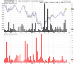
It's just where it's overlaid as it's slightly see through. So the declining volume is the pink bars, but where it overlays the grey bars it goes dark red.

Below is the same chart but with the data separated. The benefit of overlaying them both though is that the scale is then the same. Where as on this one it is not.

attachment.php
 

Attachments

  • sc-37.png
    sc-37.png
    18.8 KB · Views: 770
Thanks isatrader - and it is very cool!
Next question: can this only be plotted using EoD data - or could it also be plotted on intra-day timeframes?
Cheers,
Tim.
 
Thanks isatrader - and it is very cool!
Next question: can this only be plotted using EoD data - or could it also be plotted on intra-day timeframes?
Cheers,
Tim.

Looks like it works intraday too. Here's a one hour chart for the last month with the stockcharts settings to copy if you want to recreate it for yourself. Plus I've attached a two year 60 min chart to give the recent data some context. Note the huge positive advancing volume at the December 2011 low.
 

Attachments

  • NYUPV_NYDNV_19-12-12.png
    NYUPV_NYDNV_19-12-12.png
    65.1 KB · Views: 191
  • sc-40.png
    sc-40.png
    44.2 KB · Views: 201
Last edited:
Top