Best Thread Market Breadth

US Industry Sectors Breadth

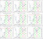
I've updated the US Industry Sectors Breadth charts. Six of the nine sectors moved higher this week with Consumer Staples regaining it's buy signal. However, Utilities was the biggest mover and broke down from the overbought zone with 7.97% of stocks in the sector breaking below their 150 day MAs and took it onto a sell signal.

Below is the data table for the Percent of Stocks Above 150 Day Moving Average in each sector which I've ordered by the percentage change since last week in each sector.

attachment.php


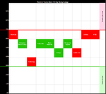
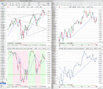
Attached is the charts of the 9 sectors and a visual diagram to show where the sectors are relative to each other and the NYSE Percent of Stocks Above 150 Day Moving Average.

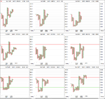
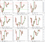
I've also created the point and figure versions of the US Industry Sectors Breadth charts now, so that I can see the standard breadth status such as Bear Confirmed, Bull Correction etc. For example Utilities double bottom breakdown from above 70% this week puts it onto Bear Confirmed status. My software doesn't plot P&F in the same way as proper point and figure programs in that it shows 3 box reversals before they complete. i.e. note the single O on the XLP chart which is actually still in a column of Xs as it needs 3 Os (6%) to actually reverse. Attached is the standard 2% box size by 3 reversal and faster 1% box size by 3 reversal.
 

Attachments

  • sector_breadth_2-11-12.png
    sector_breadth_2-11-12.png
    121.4 KB · Views: 657
  • sector-breadth-imag_2-11-12.png
    sector-breadth-imag_2-11-12.png
    15.3 KB · Views: 316
  • sector-breadth-table_2-11-12.png
    sector-breadth-table_2-11-12.png
    15.5 KB · Views: 1,112
  • sector_breadth_PnF_2-11-12.png
    sector_breadth_PnF_2-11-12.png
    37.9 KB · Views: 642
  • sector_breadth_1pc_PnF_2-11-12.png
    sector_breadth_1pc_PnF_2-11-12.png
    54.8 KB · Views: 724
Last edited:
Attached is the updated market breadth charts for the NYSE. Yesterday's Bear Correction signal on the short term NYSE Percent of Stocks Above 50 Day Moving Average chart proved to be correct as the Percent of Stocks Above 50 Day Moving Average moved lower once again today and reversed back to Bear Confirmed status.

So currently the short and medium term percentage of stocks above their moving averages charts are both on Bear Confirmed Status, and the longer term percentage of stocks above their 200 day moving average charts is on Bear Alert status.

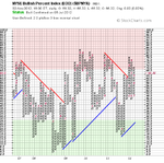
There was little change in the long term NYSE Bullish Percent chart which is still in the column of Xs.

So the breadth indicators continue to favour the bearish side of the market for the time being and for this to reverse the NYSE Percent of Stocks Above 50 Day Moving Average chart would need to make a double top breakout above 58%.

attachment.php
 

Attachments

  • NYA150R_line_2-11-12.png
    NYA150R_line_2-11-12.png
    150.2 KB · Views: 235
  • NYA50R_2-11-12.png
    NYA50R_2-11-12.png
    16.8 KB · Views: 239
  • NYA150R_2-11-12.png
    NYA150R_2-11-12.png
    18.1 KB · Views: 217
  • NYA200R_2-11-12.png
    NYA200R_2-11-12.png
    19.1 KB · Views: 175
  • $BPNYA_2-11-12.png
    $BPNYA_2-11-12.png
    18 KB · Views: 262
  • market-breadth-table_2-11-12.png
    market-breadth-table_2-11-12.png
    11.6 KB · Views: 1,018
Last edited:
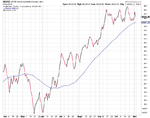
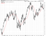
Attached is the secondary breadth charts. The New High New Lows broke out of the neutral zone and closed the week in more bullish territory than it's been in for a while, with the new lows not picking up above the recent average. The NYSE Advance Decline Volume failed to get back above it's 50 day MA and so is in a precarious position. The NYSE Advance Decline Line move slightly higher on the week but is still hovering in it recent range just above it's 50 day MA.
 

Attachments

  • sc-23.png
    sc-23.png
    29.5 KB · Views: 243
  • sc-30.png
    sc-30.png
    39.7 KB · Views: 232
  • sc-29.png
    sc-29.png
    34.6 KB · Views: 303
  • sc-26.png
    sc-26.png
    41.8 KB · Views: 245
  • sc-25.png
    sc-25.png
    35.5 KB · Views: 296
  • sc-24.png
    sc-24.png
    26.8 KB · Views: 280
bullish percent from nyse against spx
as seen by stockcharts
a divergence is there/bearish ..i think
30culo5.gif
 
bullish percent from nyse against spx
as seen by stockcharts
a divergence is there/bearish ..i think
30culo5.gif

so reversal means divergence with the graph = bearish. Based on Momentum + NYA advance decline seems to be still going okay. I don't sense a huge recession just yet.
 
Last edited:
so reversal means non divergence? which is a bullish sign right?

I wouldn't recommend focusing too much on the divergence that stockcharts highlighted in their blog personally as it's a very long term thing and is evident in most major uptrends if you look at the NYSE Bullish Percent as far back as 1974. As invariably less stocks lead the market higher the longer a trend continues before it eventually rolls over. My counter argument would be that during the 2004 to summer 2007 period the Bullish percent only once dropped below the 50% level by a small amount. But we've had two moves below 50% since 2009 and the October 2011 low was a major flush out from which we've recovered back into the above 70% overbought zone. So it could be that that particular divergence has already played out in 2011 and that we are in a new phase now, which is currently starting to turn more bearish as the short and medium term have topped out for the time being.
 
I wouldn't recommend focusing too much on the divergence that stockcharts highlighted in their blog personally as it's a very long term thing and is evident in most major uptrends if you look at the NYSE Bullish Percent as far back as 1974. As invariably less stocks lead the market higher the longer a trend continues before it eventually rolls over. My counter argument would be that during the 2004 to summer 2007 period the Bullish percent only once dropped below the 50% level by a small amount. But we've had two moves below 50% since 2009 and the October 2011 low was a major flush out from which we've recovered back into the above 70% overbought zone. So it could be that that particular divergence has already played out in 2011 and that we are in a new phase now, which is currently starting to turn more bearish as the short and medium term have topped out for the time being.

In Stan's book he also notes divergence for advance decline issues which i haven't seen much divergence at the moment. I still think we are in a correctional phase until more things occur. There was some interesting volume at the peak of this correction though. Did you notice the huge volumen change on one day?
 
It's why I think it's important not to focus on any single breadth measure and instead look across the breadth indicators as a whole. As at major turning points in the past there was various signs in all of them, and as you said, that's not the case at the moment with some like the cumulative Advance Decline and cumulative New High New lows still pushing up close to new highs.

As for volume change, I haven't seen any major differences above the average personally in my index charts, but the cumulative volume in the S&P 500 is close to breaking down, but it hasn't yet.
 
Last edited:
It's why I think it's important not to focus on any single breadth measure and instead look across the breadth indicators as a whole. As at major turning points in the past there was various signs in all of them, and as you said, that's not the case at the moment with some like the cumulative Advance Decline and cumulative New High New lows still pushing up close to new highs.

As for volume change, I haven't seen any major differences above the average personally in my index charts, but the cumulative volume in the S&P 500 is close to breaking down, but it hasn't yet.

Yeah your right. The volume change i was discussing was on sept 21. I guess that was one tell tale sign that stuff might get a bit interesting for the time being.
 
S&P 500/US 30 Year Treasuries Ratio

Attached is the S&P 500/US 30 Year Treasuries Ratio charts that I forgot to post. You might notice that I've switched from using the SPY/TLT ratio as I noticed a change on the one box P&F chart this week where I'm assuming the data has been adjusted for dividends or something along those lines. So I'm going to use the pure index data from now on for the ratio chart.

So currently the 1% by 1 Box reversal P&F chart has made triple bottom breakdown and closed the week right on the four month up trend line after making a lower high in October. So it's given a short term sell signal, but if it breaks the trend line it will also be a medium term sell signal by this measure imo. Attached is the charts and I've also added the 1% by 1 Box reversal P&F chart for the S&P 500/US 10 Year Treasuries Ratio as well.

attachment.php


attachment.php
 

Attachments

  • sc-28.png
    sc-28.png
    42.8 KB · Views: 219
  • sc-27.png
    sc-27.png
    33 KB · Views: 238
  • SharpChartv05-37.png
    SharpChartv05-37.png
    37.3 KB · Views: 756
  • SharpChartv05.png
    SharpChartv05.png
    36.1 KB · Views: 734
Last edited:
Your attachment are very important to show the up and down position of the trading.
I think no trading business is complete without up or down position.

And no thread is complete without pathetic statements like that
 
And no thread is complete without pathetic statements like that

malaguti, it's just yet another spammer. I've had 3 or 4 nonsense posts in the last few days from spam bots that I've had removed. Please don't add to the crap that they post, as now I've got three off topic posts which gets away from the discussion and could have been avoided.

:eek:fftopic:
 
Last edited:
Short term Breadth Status Change

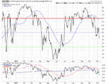
The short term NYSE Percent of Stocks Above 50 Day Moving Average chart changed status yesterday as it reversed back to a column of Xs with 6.73% of stocks now back above their 50 Day Moving Averages since last Friday's close. This puts the short term status back to Bear Correction again and it only needs an additional 1.4% move higher above 58% to give a new buy signal. However, it has also made a higher low and so a close below 48% would give a new double bottom sell signal.

Below is the updated table of the four major breadth charts and the NYSE Percent of Stocks Above their 50 Day Moving Average charts.

attachment.php


attachment.php


attachment.php
 

Attachments

  • NYA50R_6-11-12.png
    NYA50R_6-11-12.png
    16.6 KB · Views: 816
  • NYA50R_line_6-11-12.png
    NYA50R_line_6-11-12.png
    38.6 KB · Views: 870
  • market-breadth-table_6-11-12.png
    market-breadth-table_6-11-12.png
    12.3 KB · Views: 803
Last edited:
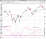
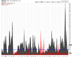
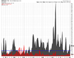
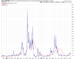
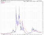
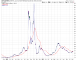
I've done a bit of experimenting with the breadth charts today by creating some ratio charts that divide the S&P 500 by the major breadth charts that I post on here.

I created charts the S&P 500 / NYSE Bullish Percent Index ($SPX:$BPNYA), S&P 500 / NYSE Percent of Stocks Above 150 Day Moving Average ($SPX:$NYA150R) and the S&P 500 / NYSE Percent of Stocks Above 50 Day Moving Average ($SPX:$NYA50R)

The results I think are very interesting as they look very much like the VIX and highlight the intensity of each move. I've also added the 50 day MA as a signal line to help. See what you think...

S&P 500 / NYSE Bullish Percent Index ($SPX:$BPNYA)

attachment.php


S&P 500 / NYSE Percent of Stocks Above 150 Day Moving Average ($SPX:$NYA150R)

attachment.php


S&P 500 / NYSE Percent of Stocks Above 50 Day Moving Average ($SPX:$NYA50R)

attachment.php
 

Attachments

  • sc-7.png
    sc-7.png
    25.7 KB · Views: 905
  • sc-6.png
    sc-6.png
    25.3 KB · Views: 844
  • sc-8.png
    sc-8.png
    23.9 KB · Views: 858
Last edited:
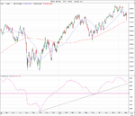
S&P 500/US 30 Year Treasuries Ratio

The S&P 500/US 30 Year Treasuries Ratio broke it's medium term trend line today on the 1% by 1 Box reversal P&F chart. So it's now on a medium term sell signal which favours treasuries over equities until we get a new buy signal. Attached is the P&F chart.

attachment.php


Also attached is the S&P 500/US 10 Year Treasuries Ratio chart which made a similar move today below it's medium term trend line.

attachment.php
 

Attachments

  • SharpChartv05-10.png
    SharpChartv05-10.png
    37.6 KB · Views: 839
  • SharpChartv05-15.png
    SharpChartv05-15.png
    36.3 KB · Views: 859
Last edited:
Short term Breadth Status Change

As you've probably already assumed from today's price action the short term NYSE Percent of Stocks Above 50 Day Moving Average chart changed status back to Bear Confirmed with a continuation double bottom breakdown after yesterdays short lived bear correction change.

The medium to long term charts also added an extra O and stay on Bear Confirmed for the 150 day and Bear Alert for the 200 day. But the longer term NYSE Bullish Percent Chart still needs another 1.96% move to reverse as well.

So the weight of evidence is leaning further towards the bearish side of the market currently, with the short term NYSE Percent of Stocks Above their 50 Day Moving Average nowhere near oversold levels yet and a current vertical price objective of 30%.

Below is the updated table of the four major breadth charts and the 2% by 3 reversal P&F charts.

attachment.php


attachment.php


attachment.php


attachment.php


attachment.php
 

Attachments

  • market-breadth-table_7-11-12.png
    market-breadth-table_7-11-12.png
    11.7 KB · Views: 773
  • NYA200R_7-11-12.png
    NYA200R_7-11-12.png
    19.2 KB · Views: 797
  • NYA150R_7-11-12.png
    NYA150R_7-11-12.png
    18.6 KB · Views: 832
  • NYA50R_7-11-12.png
    NYA50R_7-11-12.png
    17.1 KB · Views: 848
  • sc-10.png
    sc-10.png
    42.5 KB · Views: 860
Last edited:
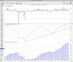
Momentum Index (MI)

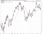
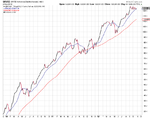
Attached is the Advance Decline Momentum Index (MI) - which is the 200 day moving average of the advance decline line. Currently like the price action in the S&P 500 it is close to it's uptrend line. However, it has made a clear divergence over the course of the year making lower highs when the market broke out in September and so suggests a weakening trend imo.
 

Attachments

  • Momentum-Index_7-11-12.png
    Momentum-Index_7-11-12.png
    107.1 KB · Views: 272
Re: Momentum Index (MI)

Attached is the Advance Decline Momentum Index (MI) - which is the 200 day moving average of the advance decline line. Currently like the price action in the S&P 500 it is close to it's uptrend line. However, it has made a clear divergence over the course of the year making lower highs when the market broke out in September and so suggests a weakening trend imo.

Great job!
 
Momentum Index (NHNLMI)

Thanks bearsworth. I appreciate it.

I've done a bit more experimenting today after I thought about how there's similarities in the advance decline and new high new low data. So attached is another version of the Momentum Index that is instead based on the new high new low data. I've used a 50 day MA instead of the 200 day MA that's used on the Advance Decline version. See what you think...
 

Attachments

  • New-Highs_Momentum-Index_7-11-12.png
    New-Highs_Momentum-Index_7-11-12.png
    63.9 KB · Views: 253
  • New-Highs_Momentum-Index_long_7-11-12.png
    New-Highs_Momentum-Index_long_7-11-12.png
    116.4 KB · Views: 247
  • New-High_New-Lows_7-11-12.png
    New-High_New-Lows_7-11-12.png
    76.8 KB · Views: 283
Last edited:
Re: Momentum Index (NHNLMI)

Thanks bearsworth. I appreciate it.

I've done a bit more experimenting today after I thought about how there's similarities in the advance decline and new high new low data. So attached is another version of the Momentum Index that is instead based on the new high new low data. I've used a 50 day MA instead of the 200 day MA that's used on the Advance Decline version. See what you think...

The more I look at these graphs, the more I see bad things coming.
 
Top