Soloquan
Established member
- Messages
- 646
- Likes
- 24
solo
I think reksa pointed out the ig things way back in the thread - I think when I looked it I was more happy with numbers. Be interested to know what you think.
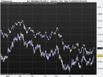
The sort of thing I had in mind for what I want is about how I knocked up a small excel thing (thumbnail). FTSE is blue line and pink line is FTSE as calculated by reference to DOW.
The common starting point is last Thursdays close - so real FTSE = 5573 and calculated FTSE = 5573 at that point. From there it runs through to Friday's FTSE close and you see the "extreme" gap reached at A after which the gap was gradually closed, but not completely.
If we can get something like that which shows it in continuous real time (the thumbnail is based on hourly closes) we'd be quids in 🙂 - but getting the common starting point is crucial. There are some combo charts that always start from a common point wherever the left hand edge of the chart is - that would be ideal.
Okay I see what you're saying Barjon, as opposed to having the dow and ftse on the one chart you have the ftse 'real' and ftse 'dow calculated'.
I don't know much about coding but I do know a guy who is pretty damn good with MQL4. I'll see if I can get hold of him tonight.