FAQ: How to create the Mansfield Relative Strength Indicator
One of the core components of Stan Weinstein's method is the use of Relative Performance compared to an index such as the S&P 500, to a sector or to another stock. Which was referred to in his book as Relative Strength.
However, this should not to be confused with the popular RSI (Relative Strength Index developed J. Welles Wilder), which is a momentum oscillator that measures the speed and change of price movements on a single stock. And so, to avoid any confusion when talking about the kind of Relative Strength we are interested in, I've renamed to be
"Relative Performance".
Weinstein defines it as the following on page 18 of the book:
"How a given stock (or group) acts in relation to the overall market. For instance, if stock XYZ rallies 10 percent while the market moves ahead 20 percent, that's poor relative strength even though the stock has advanced. On the other hand, if stock XYZ declines 10 percent while the market averages decline 20 percent, that's favorable relative strength even though the stock has moved lower. The formula for measuring relative strength is simply the price of a stock ( or group average) divided by the price of a market average."
Relative Performance Indicators
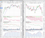
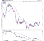
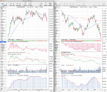
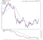
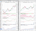
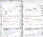
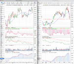
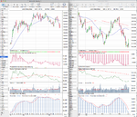
On here I have two ways of representing the Relative Performance on a chart. The first version I show is the representation that people are used to from the book (#1 on the below chart) which is the Mansfield Relative Strength Indicator. The second version that I show immediately below (#2 on the below chart) is the standard relative performance line that you get if you divide the closing price of the stock by the index that you want to reference, which in the majority of cases will be the S&P 500 Index unless otherwise stated.
So as you can see, these two indicators are identical, however, they show the Relative Performance data in slightly different ways, which I personally find useful to see. For example, the "zero line" on the Mansfield version is a flattened 52 week moving average which shows the data more like an oscillator and so is easier to see when it reaches extremes. However, on the standard relative performance line the slope of the 52 week moving average (zero line) can be seen, which can give further clues to the relative performance of the stock versus the index on a longer term basis.
Below is a weekly chart of Apple (AAPL) showing the two versions of the Relative Performance Indicator versus the S&P 500 Index.
Standard Relative Performance indicator
The formula for calculating standard relative performance indicator is quite simple:
Code:
RP = ( stock_close / index_close ) * 100
And then a 52 week moving average is added to the indicator to show the zero line.
So the longer version is:
Standard Relative Performance = (today's close of the stock divided by today's close of the index) * 100
Mansfield Relative Performance indicator
The formula of this indicator is a bit more difficult than the regular Standard Relative Performance indicator:
Code:
MRP = (( RP(today) / sma(RP(today), n)) - 1 ) * 100
Where:
RP = Standard Relative Performance indicator (see above)
SMA = Simple moving average over n days.
n = 52 for weekly charts, and n = 200 on daily charts
So to make it a bit clearer:
Mansfield Relative Performance = (( Today's Standard Relative Performance divided by Today's Standard Relative Performance 52 Week Moving Average )) - 1) * 100
I hope the above calculations all make sense, but if you need further assistance then chartmill.com did a good article on it which you can find here:
ChartMill.Com | Articles on Technical Analysis Indicators and Screeners


