Stan Weinstein's Stage Analysis

Re: Breakdowns and Breakouts - S&P 500

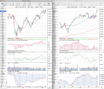
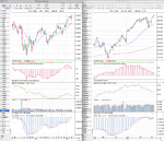
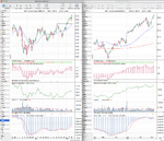
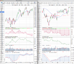
I've also been thinking about the best way to screen for opportunities without having to spend hours going through charts. I started with the idea of making lists of the constituents of the strongest and weakest sector SPDR ETFs and then manually go through the charts picking the strongest and weakest stocks respectively. That is how I found the XLF constituents I posted up recently. However the sector ETFs don't include all the stocks in the sectors, it is a bit labourious and the constituents change now and again. I did think about trying to code a screener in PRT for the methods volume characteristics but I think we've established that this is not very reliable now.

Your idea seems to be much better, I presume you are using a screener included in your ProTA package. I don't know anything about P&F charts yet but do you reckon it could be coded into PRT?

I'm actually using the stockcharts screener, as I don't think PRT can identify the P&F breakouts, as P&F in it is more of an afterthought, whereas on stockcharts the site was built as much for P&F as standard charting. So I've setup a custom scan that looks for double top breakouts and double bottom breakdowns that can be done at the end of the day or intraday. But you can only do the custom coded scans if you subscribe to the extra service unfortunately.
 
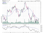
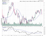
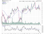
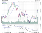
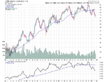
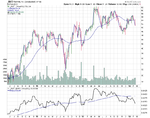
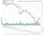
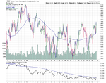
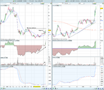
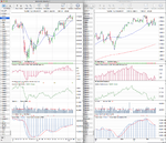
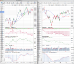
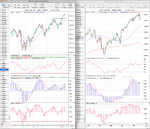
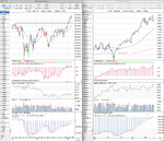
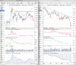
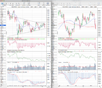
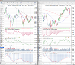
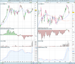
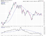
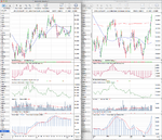
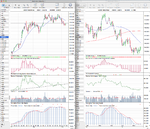
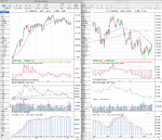
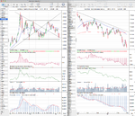
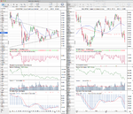
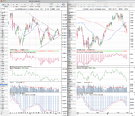
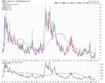
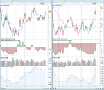
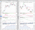
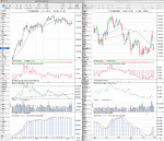
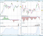
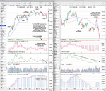
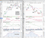
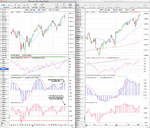
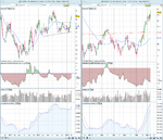
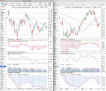
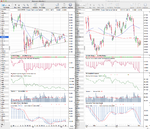
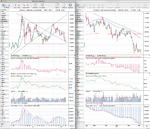
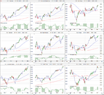
There was only one breakout today JCP, and 8 breakdowns of which CCL, DQX and HES are of possible interest. CCL is making an early Stage 4 breakdown, but the 30 week MA hasn't turned down yet and it's right on it's 200 day MA as well, hence the early part and so might still rebound. DQX is further through the process and has a declining 30 week MA and negative relative performance and so I'd put as a Stage 3B. HES is a different breakdown though, as it's in early Stage 2 following it's breakout at the start of the year and so this could present a potential pullback entry in the coming weeks if it can hold above the breakout level of around 57. And finally JCP which is attempting to make an early Stage 2 breakout. The 30 week MA is flattening, but it's still below it and it's 200 day MA, and relative performance is still well below the zero line, and there's near term resistance. So it wouldn't be a buy until a close above the 30 week MA and so it's still quite early for it.
 

Attachments

  • sc-12.png
    sc-12.png
    36.1 KB · Views: 340
  • sc-13.png
    sc-13.png
    37.8 KB · Views: 301
  • sc-14.png
    sc-14.png
    38.5 KB · Views: 321
  • sc-15.png
    sc-15.png
    34.3 KB · Views: 329
Last edited:
I believe Klockner corp is another classic example of a stage 2 advance on it's very start. For 7 months the price ranged from 6.8 to 8.7 and the last three months it created a smaller base in the 9.2/ 9.6 area. Just 3 days ago price jumped and managed to stay above the 210 Day MA. Volume in the 19th of February is the largest for the last 1 year and a half. Only thing that worries me is the negative relative strength though it seems to be improving somewhat. Chart is an attached word file print screened from prorealtime, sorry but I didn't know how to upload it directly on my thread post. Hope everything is visible :/
 

Attachments

Last edited:
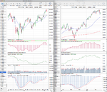
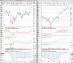
There were two breakouts and three breakdowns today in the S&P 500, of which TAP, HPQ, RHT and LTD could be of interest in different stages. Attached is the weekly charts and lists of the weeks six breakouts and sixteen breakdowns:

Week ending 22nd February 2013

Breakouts

attachment.php


Breakdowns

attachment.php
 

Attachments

  • sc-19.png
    sc-19.png
    31.3 KB · Views: 284
  • sc-18.png
    sc-18.png
    34.8 KB · Views: 261
  • sc-17.png
    sc-17.png
    25.5 KB · Views: 292
  • sc-16.png
    sc-16.png
    39.5 KB · Views: 333
  • SP500_Breakouts_22_2_13.png
    SP500_Breakouts_22_2_13.png
    12.8 KB · Views: 982
  • SP500_Breakdowns_22_2_13.png
    SP500_Breakdowns_22_2_13.png
    27.5 KB · Views: 1,026
I believe Klockner corp is another classic example of a stage 2 advance on it's very start. For 7 months the price ranged from 6.8 to 8.7 and the last three months it created a smaller base in the 9.2/ 9.6 area. Just 3 days ago price jumped and managed to stay above the 210 Day MA. Volume in the 19th of February is the largest for the last 1 year and a half. Only thing that worries me is the negative relative strength though it seems to be improving somewhat. Chart is an attached word file print screened from prorealtime, sorry but I didn't know how to upload it directly on my thread post. Hope everything is visible :/

Hi LiboNZT, Klockner looks like a strong Stage 2 breakout this week and has all the right stuff from the method and so could be a good pick. It just needs to clear the resistance level from early 2012 before it has a clearer run. I've attached my chart of it for you to compare to the examples on here.
 

Attachments

  • KCO_Weekly_22-2-13.png
    KCO_Weekly_22-2-13.png
    74.5 KB · Views: 363
I believe Klockner corp is another classic example of a stage 2 advance on it's very start. For 7 months the price ranged from 6.8 to 8.7 and the last three months it created a smaller base in the 9.2/ 9.6 area. Just 3 days ago price jumped and managed to stay above the 210 Day MA. Volume in the 19th of February is the largest for the last 1 year and a half. Only thing that worries me is the negative relative strength though it seems to be improving somewhat. Chart is an attached word file print screened from prorealtime, sorry but I didn't know how to upload it directly on my thread post. Hope everything is visible :/

Hi LiboNZT and welcome to the discussion if it's your first time here.

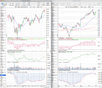
KCO looks to satisfy most of the requirements for the method. The only thing missing is a means of finding out how strong the group it belongs too is in relation to the market. A good stock will be held back by a poorly performing group. The RS is positive, see my charts, I think you need to reconfigure your settings, see ISAtraders post numbers 875 & 876.

Assuming the group is strong then I pull back to around the BO level is where I'd be looking to get in or a break out above 12.33. Do you know where we can find european sector/group charts?

I use the Paint program that comes with windows operating system to copy my charts before uploading to the thread. Alternatively if you want to post them directly inot the thread you will need to find a host i.e. your own website or you can use a free site like photobucket.com. I find it easier to use the former. This is how:

1) Take a screenshot of your chart by pressing the PRTSC key, on a QWERTY board it is at the top right about four keys in. This puts an image of your chart on your clipboard.
2) Open your Paint program, click start and type "paint" into the search box and then click on the paint icon.
3) Once paint is open click on edit and paste, you should see now see your chart.
4) Cilck on "file" then "save as" a .png file type and save on your desktop. You can close "paint" now, unless you want to copy more charts.
5) Go to the discussion thread and click the reply button then under the reply box click on "manage attachments" in the additional options box. A pop box will appear, on the left side click on one of the "Choose File" buttons and then locate your chart on your desktop. Click on it and then on open in the dialogue box. Once the name of your file appears next to the "choose button" in the pop up click on the upload button and it will appear below listed as current attachments. You can close the pop up now.
6) All the that remains to be done is to add the text to your post then preview it . You should also see your chart, then when happy submit reply.
 

Attachments

  • Kleockner Weekly.jpg
    Kleockner Weekly.jpg
    162.7 KB · Views: 301
  • Kleockner Daily.jpg
    Kleockner Daily.jpg
    159.5 KB · Views: 297
Last edited:
I would recommend saving as a .png instead of a .jpg for sharper charts and also smaller files sizes which open quicker and are faster to upload.
 
Considering Weinstein's fondness for the head and shoulders pattern I thought this is an interesting article by tom McClellan on the validity of chart patterns and volume on instruments other than stocks. Excerpt below:

There is one last point about using classic bar chart analysis techniques.* Most of the classic Edwards and Magee style chart analysis ideas come from the days when they were developed for stock price charts.* I am talking about chart structures like head and shoulders, rounding bottom, flags and pennants, triangles, triple tops, etc.* It can be risky to just transplant those analysis techniques to a different market, especially commodities, and to then just assume that they will work the same.*
The psychology of commodities markets, the bond market, currencies, etc. is much different from how traders think about stock prices movements.* People don't buy stocks to consume them, like they do with oil or wheat; the only use for a stock is to (hopefully) earn dividends and capital gains from owning them.* Accordingly, chart pattern analysis does not necessarily work the same in other markets, because the psychology which drives the patterns is different.*
I ignore out of hand all head and shoulders structures outside of stock price charts because I have found that they are just not that reliable.* One also cannot do the volume analysis piece as easily, which Edwards and Magee asserted was essential for validating or refuting a head and shoulders structure.*
By looking at a lot of charts, I have satisfied myself that triangles "work" for gold prices as they did in this case.* Anyone wanting to employ such charting techniques outside the stock market should put himself through a similar process of validating that they work in the other market before just assuming that they do.
*

Just to be clear, as a refresher and we are talking about stocks here, unlike Edwards and Magee, Weinstein dispels any theories that advocate looking for any particular volume characteristics to validate a bottoming head and shoulders pattern but rather advises to look for some symmetry. In regard to a topping head and shoulders patterns he advises to not trust a pattern where the volume is heaviest on the right shoulder as opposed to the left shoulder or head. His premise is that buyers are still present and one third of stocks will go on higher.
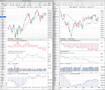
 
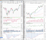
Attached is the updated major charts and the relative performance table. The FTSE 100 holds onto the top spot for another week, while the DAX moves back to second place. The notable mover this week in the table was the Dollar Index (DX) which moved up two places to 8th. The Dollar Index made a closing breakout above the 200 day MA, but didn't close the week above the November high however. The 30 week weighted MA turned up, bu the 30 week SMA is still declining, and so if it breakouts here it wouldn't be considered a valid Stage 2 entry point until the 30 week MA stabilised. It has however, been a big driving force behind the commodity declines this week along with the Chinese market ($SSEC) pullback, which particularly affected Copper and the Base Materials sector.

Treasuries also had a strong week and closed around the top of the one month range and above their reasonably steep downtrend lines, but are still well below declining 30 week MAs.

And as usual I've also updated the market breadth charts for those that are interested in Weinstein's more in-depth weight of evidence approach using the market internals like the advance decline data sets, new highs new lows, put/call ratio, the momentum index etc. Here's the link: http://www.trade2win.com/boards/technical-analysis/147476-market-breadth-27.html#post2080504

attachment.php
 

Attachments

  • DAX_Weekly_22-2-13.png
    DAX_Weekly_22-2-13.png
    135.7 KB · Views: 311
  • NYA_Weekly_22-2-13.png
    NYA_Weekly_22-2-13.png
    132.6 KB · Views: 246
  • IWM_Weekly_22-2-13.png
    IWM_Weekly_22-2-13.png
    121.8 KB · Views: 302
  • NDX_Weekly_22-2-13.png
    NDX_Weekly_22-2-13.png
    137.4 KB · Views: 336
  • SPX_Weekly_22-2-13.png
    SPX_Weekly_22-2-13.png
    141.4 KB · Views: 285
  • FTSE100_Weekly_22-2-13.png
    FTSE100_Weekly_22-2-13.png
    135.4 KB · Views: 319
  • GC_Weekly_22-2-13.png
    GC_Weekly_22-2-13.png
    129.8 KB · Views: 318
  • HG_Weekly_22-2-13.png
    HG_Weekly_22-2-13.png
    136.9 KB · Views: 309
  • CL_Weekly_22-2-13.png
    CL_Weekly_22-2-13.png
    139.4 KB · Views: 308
  • BZ_Weekly_22-2-13.png
    BZ_Weekly_22-2-13.png
    86.5 KB · Views: 305
  • CCI_Weekly_22-2-13.png
    CCI_Weekly_22-2-13.png
    26.7 KB · Views: 295
  • VIX_Weekly_22-2-13.png
    VIX_Weekly_22-2-13.png
    36.5 KB · Views: 286
  • DX_Weekly_22-2-13.png
    DX_Weekly_22-2-13.png
    133.7 KB · Views: 286
  • US_30yr_Treasuries_22_2_13.png
    US_30yr_Treasuries_22_2_13.png
    128.4 KB · Views: 300
  • TY_10yr_Treasuries_22_2_13.png
    TY_10yr_Treasuries_22_2_13.png
    130.3 KB · Views: 255
  • SSEC_Weekly_22-2-13.png
    SSEC_Weekly_22-2-13.png
    28.8 KB · Views: 278
  • TRAN_Weekly_22-2-13.png
    TRAN_Weekly_22-2-13.png
    32.8 KB · Views: 292
  • Major_Charts_RS_list_22_2_13.png
    Major_Charts_RS_list_22_2_13.png
    25.9 KB · Views: 1,327
Last edited:
US Industry Sectors

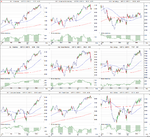
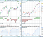
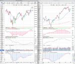
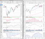
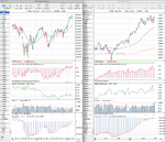
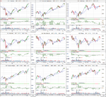
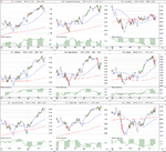
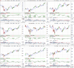
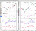
Attached is the the weekly and daily charts of the major sectors and below is the relative performance table in order of strength. Notable changes this week were the crosses above and below the zero line for Consumer Staples (XLP) and Basic Materials (XLB) and the move off the bottom stop for Utilities (XLU). Health Care (XLV) also moved up and so the three defensive sectors showed the best relative performance which is unsurprising considering the volatile week in the US market.

attachment.php
 

Attachments

  • US_Industry_Sectors_list_22_2_13.png
    US_Industry_Sectors_list_22_2_13.png
    21.8 KB · Views: 1,416
  • US_Industry_Sectors_D_22_2_13.png
    US_Industry_Sectors_D_22_2_13.png
    112.9 KB · Views: 325
  • US_Industry_Sectors_22_2_13.png
    US_Industry_Sectors_22_2_13.png
    114.8 KB · Views: 278
Hi LiboNZT and welcome to the discussion if it's your first time here.

KCO looks to satisfy most of the requirements for the method. The only thing missing is a means of finding out how strong the group it belongs too is in relation to the market. A good stock will be held back by a poorly performing group. The RS is positive, see my charts, I think you need to reconfigure your settings, see ISAtraders post numbers 875 & 876.

Assuming the group is strong then I pull back to around the BO level is where I'd be looking to get in or a break out above 12.33. Do you know where we can find european sector/group charts?

I use the Paint program that comes with windows operating system to copy my charts before uploading to the thread. Alternatively if you want to post them directly inot the thread you will need to find a host i.e. your own website or you can use a free site like photobucket.com. I find it easier to use the former. This is how:

1) Take a screenshot of your chart by pressing the PRTSC key, on a QWERTY board it is at the top right about four keys in. This puts an image of your chart on your clipboard.
2) Open your Paint program, click start and type "paint" into the search box and then click on the paint icon.
3) Once paint is open click on edit and paste, you should see now see your chart.
4) Cilck on "file" then "save as" a .png file type and save on your desktop. You can close "paint" now, unless you want to copy more charts.
5) Go to the discussion thread and click the reply button then under the reply box click on "manage attachments" in the additional options box. A pop box will appear, on the left side click on one of the "Choose File" buttons and then locate your chart on your desktop. Click on it and then on open in the dialogue box. Once the name of your file appears next to the "choose button" in the pop up click on the upload button and it will appear below listed as current attachments. You can close the pop up now.
6) All the that remains to be done is to add the text to your post then preview it . You should also see your chart, then when happy submit reply.

Thanks a lot for the info on how to upload charts more easily. Sector strength is something I didn't mention in my previous post, thanks for pinpointing that goodtyneguy! Unfortunately this is the most difficult part for me as it comes to Stan's analysis. All the data that you need to make an analysis for a stock are within the stock's chart, all but market sector info. I haven't found yet any free provider of sector charts though I believe there are still other ways to check sector strength. One that I prefer is to check the relative strength of a particular stock with it's sector leader. It's easier for me to spot the sector leader and then compare my stock with it. It is surely not the most effective way and it might bring misleading results from time to time, but as you increase the number of stocks compared with our own pick you get a fair idea. Another way is to compare the relative strength of the leaders with the perfomance index and then check for any unusual action in relation to our own pick again.

I believe stan's analysis is a very efficient way at looking the markets. There are many reasons why this is happening and it seems to incorporate and blend together a lot of them. Insider trading, investor psychology and technical analysis all perfectly blend together in Stan's analysis providing very interesting results. Good job on this thread guys, one of the most interesting i've come upon, subscribed 4life!

You can also now check the sector strength using the european sectors ETFs provided by State Street who also provide the US sector ETF's - see isatrader's charts.
 
Attached is the updated major charts and the relative performance table.

I've also updated the market breadth charts that I follow, but these have moved to a new website I've built this week, which this thread is also moving to, as it gives me the ability to organize the content across multiple threads, which will make it easier to find the content I want to look at, as this is getting too large to keep track of everything. Although I will continue to post on here too, but less frequently. So I hope you will have a look at the new threads if you follow this thread regularly. PM me if you want the address to check it out or find stage analysis on twitter.

Anyway, back to this weeks update. Below is the relative performance table and updated charts.

Relative Performance Table - week ending 1st March 2013

attachment.php
 

Attachments

  • DJT_Weekly_1-3-13.png
    DJT_Weekly_1-3-13.png
    83 KB · Views: 348
  • NYA_Weekly_1-3-13.png
    NYA_Weekly_1-3-13.png
    131.1 KB · Views: 283
  • IWM_Weekly_1-3-13.png
    IWM_Weekly_1-3-13.png
    122.8 KB · Views: 352
  • NDX_Weekly_1-3-13.png
    NDX_Weekly_1-3-13.png
    133.9 KB · Views: 309
  • SPX_Weekly_1-3-13.png
    SPX_Weekly_1-3-13.png
    143.4 KB · Views: 317
  • DAX_Weekly_1-3-13.png
    DAX_Weekly_1-3-13.png
    135.5 KB · Views: 334
  • FTSE100_Weekly_1-3-13.png
    FTSE100_Weekly_1-3-13.png
    137.2 KB · Views: 328
  • GC_Weekly_1-3-13.png
    GC_Weekly_1-3-13.png
    131.1 KB · Views: 311
  • HG_Weekly_1-3-13.png
    HG_Weekly_1-3-13.png
    136.7 KB · Views: 282
  • CL_Weekly_1-3-13.png
    CL_Weekly_1-3-13.png
    138.4 KB · Views: 290
  • VIX_Weekly_1-3-13.png
    VIX_Weekly_1-3-13.png
    38.3 KB · Views: 323
  • DX_Weekly_1-3-13.png
    DX_Weekly_1-3-13.png
    92.7 KB · Views: 334
  • US_30yr_Treasuries_1_3_13.png
    US_30yr_Treasuries_1_3_13.png
    128.2 KB · Views: 310
  • TY_10yr_Treasuries_1_3_13.png
    TY_10yr_Treasuries_1_3_13.png
    130.3 KB · Views: 310
  • BZ_Weekly_1-3-13.png
    BZ_Weekly_1-3-13.png
    89.3 KB · Views: 333
  • Major_Charts_RS_list_1_3_13.png
    Major_Charts_RS_list_1_3_13.png
    24.1 KB · Views: 1,238
Last edited:
Attached is the the weekly and daily charts of the major sectors and below is the relative performance table in order of strength. Notable changes this week was the cross back below the zero line for Consumer Staples (XLP) and Energy (XLE) also declined two places. Whereas on the stronger side of things Health Care moved up to third in the relative performance rankings.

attachment.php
 

Attachments

  • US_Industry_Sectors_1_3_13.png
    US_Industry_Sectors_1_3_13.png
    114.6 KB · Views: 283
  • US_Industry_Sectors_D_1_3_13.png
    US_Industry_Sectors_D_1_3_13.png
    113.9 KB · Views: 334
  • US_Industry_Sectors_list_1_3_13.png
    US_Industry_Sectors_list_1_3_13.png
    21.8 KB · Views: 1,229
Attached is the lists of this weeks 22 breakouts and 21 breakdowns. So a very mixed week for the S&P 500 stocks, with the breakdowns finally starting to pickup as this has been very one sided for a while now.

These are P&F breakouts and breakdowns where it made a higher high or lower low than the previous column of Xs or Os. It shows the whole week, so some will have failed to close above/below the breakout/breakdown levels. But gives a starting point to scan to see if any good with regards to Weinstein's method.

Week ending 1st March 2013

Breakouts
attachment.php


Breakdowns
attachment.php
 

Attachments

  • SP500_Breakdowns_1_3_13.png
    SP500_Breakdowns_1_3_13.png
    35 KB · Views: 1,187
  • SP500_Breakouts_1_3_13.png
    SP500_Breakouts_1_3_13.png
    35.2 KB · Views: 1,199
Last edited:
US 10 & 30 Year Treasuries Stage Analysis

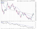
The 10 Year US Treasuries have finally closed below the horizontal support from the August 2012 low, after moving into Stage 4A at the beginning of this year. So the 10 Year US Treasuries are in a confirmed Stage 4 now imo, with relative performance continuing to weaken below it's Mansfield zero line. The 30 week MA is declining, and has been since mid December, and cumulative volume is on a sell signal and declining.

The initial swing target is 127.80 which would see it test the lower horizontal support from the late 2011 Stage 3 range. if that fails to hold then the next support would be at 125. Below is the marked up chart.

US 10 Year Treasuries (TY) chart

TY_10yr_Treasuries_8_3_13.png

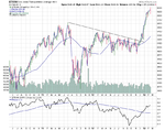
After grinding slowly lower for last nine weeks since the Stage 4 breakdown, the 30 Year Treasuries have made their first continuation move lower. Like the 10 Year Treasuries the 30 week MA is declining, and relative performance is continuing to weaken below it's zero line. And cumulative volume continues to decline also.

The swing target is still 136.69, which like the 10 Year Treasuries would see the 30 Year Treasuries test the bottom of the previous Stage 3 range. A break of which could see a potential move down to the next support at 131. Below is the marked up chart.

US 30 Year Treasuries (US) chart

US_30yr_Treasuries_8_3_13.png

US Treasuries have a largely inverse relationship with US Equities, and so these moves are very bullish for the stock market which also broke out this week to the upside, and hence gives some confirmation to these Stage 4 breakdowns in the Treasuries and vice versa in the stocks.
 
Attached is the updated weekly major charts and the relative performance table.

There were multiple continuation moves this week, with the S&P 500 making a notable continuation, which could propel it too it's 2007 high of 1576.09 - also notable on the S&P 500 chart is that it's now back over 5% above it's 30 week WMA, which is the strong bull zone (not part of the method - just a personal addition).

On the relative performance table the German Dax recaptured the top spot it held for most of the second half of last year and the 10 Year Treasuries moved lower as it confirmed it's Stage 4 breakdown as mentioned in the previous post.

As I mentioned last week, I've created a new home for this thread, as it's getting too difficult to keep up with the previous analysis in this single thread and the discussions we've had. So I built a new free site with multiple threads continuing from this thread that you can find it at: Stage Analysis - Trading and Investing using Stan Weinstein's Four Stage Breakout method

attachment.php
 

Attachments

  • DAX_Weekly_8-3-13.png
    DAX_Weekly_8-3-13.png
    135.1 KB · Views: 314
  • NYA_Weekly_8-3-13.png
    NYA_Weekly_8-3-13.png
    130.7 KB · Views: 286
  • IWM_Weekly_8-3-13.png
    IWM_Weekly_8-3-13.png
    121 KB · Views: 296
  • NDX_Weekly_8-3-13.png
    NDX_Weekly_8-3-13.png
    136 KB · Views: 292
  • SPX_Weekly_8-3-13.png
    SPX_Weekly_8-3-13.png
    146.7 KB · Views: 308
  • DX_Weekly_8-3-13.png
    DX_Weekly_8-3-13.png
    89.2 KB · Views: 256
  • CL_Weekly_8-3-13.png
    CL_Weekly_8-3-13.png
    138.8 KB · Views: 304
  • HG_Weekly_8-3-13.png
    HG_Weekly_8-3-13.png
    134.3 KB · Views: 282
  • GC_Weekly_8-3-13.png
    GC_Weekly_8-3-13.png
    129.9 KB · Views: 305
  • FTSE100_Weekly_8-3-13.png
    FTSE100_Weekly_8-3-13.png
    135.4 KB · Views: 306
  • VIX_8-3-13.png
    VIX_8-3-13.png
    38.1 KB · Views: 283
  • Major_Charts_RS_list_8_3_13.png
    Major_Charts_RS_list_8_3_13.png
    25.2 KB · Views: 1,231
US Industry Sectors

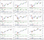
Attached is the updated US Industry Sector charts and the relative performance table, which confirms a lot of what I was seeing in the S&P 500 breakouts every day this week, as Consumer Discretionary stocks featured heavily and hence it moved up two places in the table to second place.

Five of the nine sectors continued to make new highs, and all nine sectors are trading above their 30 week moving averages.

attachment.php
 

Attachments

  • US_Industry_Sectors_8_3_13.png
    US_Industry_Sectors_8_3_13.png
    115 KB · Views: 298
  • US_Industry_Sectors_D_8_3_13.png
    US_Industry_Sectors_D_8_3_13.png
    114 KB · Views: 288
  • US_Industry_Sectors_list_8_3_13.png
    US_Industry_Sectors_list_8_3_13.png
    21 KB · Views: 1,328
Back
Top