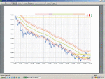
Dow Intraday Charts 26 Jul - 30 Jul

Hi all

Not the best of days today, look forward to the chatroom sessions starting on monday, will be nice to see other peoples views on whats gonna happen..as much as we all appreciate CM's valued input. hope it doesnt add more confusion to our decisions, see you all monday.

Have a good w/e all

Spencer
 
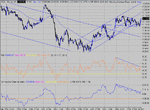
Just recovered into the support channel and with srong buying into the close, perhaps we'll get a nice up day on Monday.There's enough touches on 100 to provide good support with a failure taking us straight down to 10K. You can see that the drop out was at the time of the GDP news, so I'm treating that as a temporary glitch.... So the triangle we have seen may yet deliver to 200.
 

Attachments

  • dow 30-07-04 10.gif
    dow 30-07-04 10.gif
    34.7 KB · Views: 284
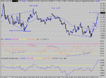
When you find a good entry, it's usually well worth the wait. The expanding triangle looked promising, and did well, coming off 100 and PD for 40 +. The other good entry was after the news and PD again. A confirmation clue was the blow off bottom volume on ES at 3 x normal at 8:24. Note the target T1 was made- surprisingly- as targets near the close seldom deliver. It is strong closes like this that tempt me to take a small trade over the weekend, just for interest's sake. :cheesy:
 

Attachments

  • dow 30-07-04 1.gif
    dow 30-07-04 1.gif
    28.2 KB · Views: 299
I wondered if anyone would be interested in this.

I borrowed your chart CM I hope you don't mind?

The Dow strat. recommends no exit of a trade if within + or - 20 of the 100ema. Some time ago I thought I would add that to my Excel spreadsheet and, although this may be a personal preference, I think it helps. In fact I prefer the + - 15 line.

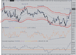
In the attached chart the red lines are at +-20 and dotted red are +- 15. Notice how the price bounces of these limits on a sideways day. If it gets beyond it's like it is in 'nose bleed' territory and does all it can to get back to the comfort zone. In fact if you'd traded when the price touches the outer line and exit at pd/nd you would probably have done Ok today.

From what I've seen, on a trending day the price seems to bounce off the 100ema line but also if you look it bounces off the outside of the +-15 as well [not sure if it should be +-20]. If anyone is interested I'll try to find an example.

What I'm really trying to say is that the +-20/15 idea I think has more significance that perhaps we give it credit for.

I am NOT proposing anyone use it as a sole basis to trade. Background info only.

Speak to you in the chat room Monday?

Bill :D
 

Attachments

  • Dow_300704.gif
    Dow_300704.gif
    53.7 KB · Views: 283
Hi Bill

Excellent observation there....very keltner band(ish)....mmmmm wonder where we've all seen these before. I think it's a company in Cranfield, near MK. I may be wrong of course. LOL
 
Hi Smarwood

Wasn't meant to be a Keltner channel or Bollinger Band just an aid to the Dow strat.

Btw stay as far away from those 'paid for' systems as you can. :devilish:

Although I have to admit that there are some really clever people on these boards that can crack them. Does anyone remember the Chinese numbers of Index King system? I'm sure there are more.

I'll try and keep up to date in future Smarwood...

Bill :)
 
Bill, the +/- 20 band was something I devised a long time ago..... Whether you pick 15/20 or 25 is probably largely irrelevant. The same with the EMA . 80/100/120 EMA or std MA, it probably doesn't matter that much which you use. Any one of them will perform better than the others on any given day. One could do backtests blah blah but life is too short. The values have been shown to provide a broad level of acceptance and usefulness.

It seems you can do worksheets in Sierra. That is an area where this BB is lacking. I had one done for me once, setting an alarm condition as the price broke through the 100MA +/- 20 bands.... If you're up for it could you do a worksheet to detect 3 pk Divergent tops/ bottoms?
 
CM

With regard to the 3pk tops/bottoms.

I had a look at plotting price/rsi ratio around the end of last year. Some of the results were posted on this thread. Simply plotting change in price divided by change in rsi is not helpful. What we need is the ratio between one maximum and the next minimum. This involves identifying the significant peaks/troughs in a chart pattern. Since their height and width [and granularity?] vary widely depending upon overall market volatility this turns out to be a difficult problem to overcome programatically. Visually it looks fairly easy [some might say].

The same problem arises when looking for pd/nd as we need to identify clear peaks/troughs.

Can I take this opportunity to ask the board if anyone has any example code dealing with this type of problem [don't mind what language]. I'm sure there are lots of techies out there.

If I find an answer you'll be the first to know CM - promise.

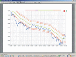
I've attached a chart showing the +- lines for a down tending day 8 April 04 if anyone is interested. You see what I mean about the price bouncing off the outside of the -15 line as well as the 100ema. Don't take it too seriously, academic interest only.

Regards

Bill
 

Attachments

  • dow_080404.gif
    dow_080404.gif
    37.2 KB · Views: 245
That's interesting about the 15 band.... I recall your efforts now regarding the RSI ratio. If it helps on the 3 pk thing, there is a time window from 20 to 90 minutes where you must have the three peaks...It may also help to take just the first and the third, leaving the user to interpret the middle one.... If you would like to "donate" the 15 worksheet, I'll put it on the Dow charts and see how it performs over time. I might need some help though...
 
Great idea about the chatroom, it would be nice to be able to analyse what is happening with other people as it happens, rather then looking back with the benefit of hindsight.

Unfortunately due to new work commitments I won't be able to make it on Monday until about 7pm (just my luck after several weeks where I have been free) but I hope to have more available time very soon.

Justyn.
 
CM

I would be very happy to donate the Excel spreadsheet but I doubt anyone would be able to make head of tail of it there is so much in there.

The +- ema part is fairly simple though. I've never used Sierra chart before so I downloaded a trial today. Unfortunatley without a standard data feed [I have my own, incompatible version] it's difficult to work out what to do.

Anyway here's an attempt [if anyone else can help here please feel free to jump in].

Go to the Dow chart select analysis-studies worksheet-add. Click settings and enter say 'emaChannel' in the box at the bottom right. Click OK Ok then select the window menu option and the newly created 'emaChannel.vts' file which should open an spreadsheet. Now I'm on familiar territory.

Your ema100 data should appear in column at or after column AA

In cell k1 type 'ema+20' and in L1 'ema-20' as the data titles.
In cell k3 type '=AA3+20' and in L3 type '=AA3-20' [don't forget the equals sign]

Ok I got a bit lost from here onward. It seems you have to select the Dow from your window menu and press Insert. That should put the new plots into window 2. To put it into widow 1 select the chart window analysis-studies-emachannel then settings and select the chart region 1.

Hope it's not too confusing!

Bill :confused:

PS here's another one for 13th April. Not so clear cut this time so perhaps more typical.
 

Attachments

  • dow_130404.gif
    dow_130404.gif
    37.4 KB · Views: 260
Last edited:
Top