Daily Market Analysis By FXOpen

USD/CHF Rebounds from Yearly Lows
usdchf.png


The USD/CHF pair tested its yearly low slightly below 0.84100 yesterday but has since recovered to just above 0.84800 today.

The bullish sentiment was supported by positive news about the U.S. economy—data released yesterday showed GDP growth for the second quarter at 3.0%, surpassing the expected 2.8%.

Bulls may find further encouragement from events earlier this year when the head of the Swiss National Bank (SNB) warned that an excessively strong franc could pressure the country's economy. Following this, USD/CHF rose by more than 8% over four months.
usdchf.jpg


TO VIEW THE FULL ANALYSIS, VISIT THE FXOPEN BLOG

Disclaimer: This article represents the opinion of the Companies operating under the FXOpen brand only (excluding FXOpen EU). It is not to be construed as an offer, solicitation, or recommendation with respect to products and services provided by the Companies operating under the FXOpen brand, nor is it to be considered financial advice.
 
Watch FXOpen's 26 - 30 August Weekly Market Wrap Video

Weekly Market Wrap With Gary Thomson: EUR/USD, NASDAQ 100, NVIDIA, Gold and Oil


Get the latest scoop on the week's hottest headlines, all in one convenient video. Join Gary Thomson, the COO of FXOpen UK, as he breaks down the most significant news reports and shares his expert insights.

  • EUR/USD falls below 1.11 support
  • NASDAQ 100 consolidates ahead of NVIDIA report
  • NVIDIA (NVDA) shares fall despite strong earnings
  • Market analysis: Gold and Oil prices signal more upsides

Stay in the know and empower yourself with our short, yet power-packed video.

Watch it now and stay updated with FXOpen.


Don't miss out on this invaluable opportunity to sharpen your trading skills and make informed decisions.

maxresdefault.jpg

FXOpen YouTube


Disclaimer: This article represents the opinion of the Companies operating under the FXOpen brand only (excluding FXOpen EU). It is not to be construed as an offer, solicitation, or recommendation with respect to products and services provided by the Companies operating under the FXOpen brand, nor is it to be considered financial advice.

RISK WARNING: Trading on the Forex market involves substantial risks, including complete possible loss of funds and other losses and is not suitable for all members. Clients should make an independent judgement as to whether trading is appropriate for them in the light of their financial condition, investment experience, risk tolerance and other factors.


#fxopen #fxopenyoutube #fxopenint #weeklyvideo
 
Rising Wedge Pattern: Trading Rules and Strategies
LqvlXsz.jpeg


Numerous technical analysis patterns indicate a reversal in market trends. A rising wedge is a formation that helps traders spot price reversals. This FXOpen article will explain how to identify a rising wedge to analyse market trends and explore whether it provides bullish or bearish signals.

What Does a Rising Wedge Signify?

A rising wedge, also known as the ascending wedge, is a technical analysis chart pattern. The wedge appears when the upper and lower trendlines connecting the higher highs and higher lows converge with the gap squeezing towards the intersecting point.

Is the ascending wedge bullish or bearish? It’s a bearish formation, which is usually considered a reversal setup that is formed in an uptrend, signalling a reversal of a market trend. Still, it can occur in a downtrend, signalling a continuation of an existing bearish trend. Buyers push the price from the downside and face resistance in breaking it towards the upside, which finally triggers a move in the opposite direction.

TO VIEW THE FULL ARTICLE, VISIT FXOPEN BLOG

Disclaimer: This article represents the opinion of the Companies operating under the FXOpen brand only (excluding FXOpen EU). It is not to be construed as an offer, solicitation, or recommendation with respect to products and services provided by the Companies operating under the FXOpen brand, nor is it to be considered financial advice.

RISK WARNING: Trading on the Forex market involves substantial risks, including complete possible loss of funds and other losses and is not suitable for all members. Clients should make an independent judgement as to whether trading is appropriate for them in the light of their financial condition, investment experience, risk tolerance and other factors.
 
September – The Worst Month for the S&P 500
spxm.png


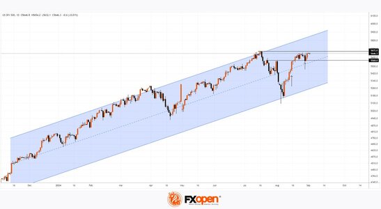
August was a turbulent month for the US stock market. On the 5th, the S&P 500 (US SPX 500 mini on FXOpen) experienced its largest daily drop since 2022, falling by 3%. However, the index ended August up by 3.7% and is now just 0.3% below its all-time high of around 5672 set in July.

What can we expect in September? Historically, it is the worst month for the S&P 500 (US SPX 500 mini on FXOpen). Statistics show that the index has typically declined by an average of 1.1% in September.

The month starts with a long weekend due to Labour Day in the US, but volatility is likely to increase as traders return from their holidays.

Technical analysis of the S&P 500 (US SPX 500 mini on FXOpen) shows:

→ The price is moving within an ascending channel (shown in blue), having tested the lower boundary of the channel on 5 August before returning to the upper half of the channel with a wide candle on 15 August (shown by the arrow).

spxm.jpg

TO VIEW THE FULL ANALYSIS, VISIT FXOPEN BLOG

Disclaimer: This article represents the opinion of the Companies operating under the FXOpen brand only (excluding FXOpen EU). It is not to be construed as an offer, solicitation, or recommendation with respect to products and services provided by the Companies operating under the FXOpen brand, nor is it to be considered financial advice.
 
Hammer Candlestick: Meaning and Signals
amZkDdA.jpeg


Technical analysis is a commonly used approach in the financial markets. It involves studying historical price data to make informed trading decisions. Among the various tools and formations employed in technical analysis, the hammer candlestick pattern stands out as a powerful tool. This article will delve into the meaning of the hammer candlestick pattern and explain how traders can interpret it on a forex, stock, and crypto* price chart.

What Is a Hammer Candle?

A hammer is a price formation that is found on trading charts. It occurs at the end of a downtrend and acts as a bullish reversal signal.

TO VIEW THE FULL ARTICLE, VISIT FXOPEN BLOG

Disclaimer: This article represents the opinion of the Companies operating under the FXOpen brand only (excluding FXOpen EU). It is not to be construed as an offer, solicitation, or recommendation with respect to products and services provided by the Companies operating under the FXOpen brand, nor is it to be considered financial advice.

RISK WARNING: Trading on the Forex market involves substantial risks, including complete possible loss of funds and other losses and is not suitable for all members. Clients should make an independent judgement as to whether trading is appropriate for them in the light of their financial condition, investment experience, risk tolerance and other factors.
 
The Price of Intel (INTC) Shares Rose By 9.5% in a Day
intel (1).jpg


The reason for the optimism is a report from Reuters that CEO Pat Gelsinger is planning to present a comprehensive plan to the board of directors in mid-September:

→ Special attention will be given to reducing capital expenditures, which is part of a broader effort to revitalise the chipmaker, whose shares have experienced a dramatic decline. It’s worth noting that on 2 August, the price of Intel (INTC) shares dropped by 26% in a single day following the release of disappointing quarterly results and projections, which greatly disheartened investors.

→ The plan also considers the sale of businesses, including the Altera division. Reportedly, Intel has enlisted Morgan Stanley and Goldman Sachs to advise on the sale of these assets.

→ Additionally, Intel aims to reduce its workforce by more than 15%, with the majority of the cuts expected to be completed by the end of 2024.

Investors were encouraged by the news that the management is ready to take decisive action. As Gelsinger recently stated, "We respect the scepticism we’ve received from the market. We believe we’re ready to meet the challenge."
intel (2).jpg


TO VIEW THE FULL ANALYSIS, VISIT THE FXOPEN BLOG

Disclaimer: This article represents the opinion of the Companies operating under the FXOpen brand only (excluding FXOpen EU). It is not to be construed as an offer, solicitation, or recommendation with respect to products and services provided by the Companies operating under the FXOpen brand, nor is it to be considered financial advice.
 
XAG/USD Analysis: Bulls May Target $30 Again
xagusd.png


As the XAG/USD chart indicates today, the price of silver has dropped by over 5% in the past week. Bearish signs are also evident in the price of gold. According to Reuters, market participants are focusing on a series of economic data set to be released this week, which could influence expectations regarding a potential rate cut at the Federal Reserve’s September meeting.

Could the price of silver continue to decline? Technical analysis of the XAG/USD chart shows that since late May, the price of silver has been forming a structure resembling a fan of three expanding lines, marked in red.

Bullish Arguments:
→ The price has broken through the red median line and moved into the upper half of the fan.
→ The price is near the bullish breakout level of the median line, which may provide support.
xagusd.jpg


TO VIEW THE FULL ANALYSIS, VISIT FXOPEN BLOG

Disclaimer: This article represents the opinion of the Companies operating under the FXOpen brand only (excluding FXOpen EU). It is not to be construed as an offer, solicitation, or recommendation with respect to products and services provided by the Companies operating under the FXOpen brand, nor is it to be considered financial advice.
 
How Do Traders Spot and Use the Dragonfly Doji Candlestick Pattern?
k6IxvxE.jpeg


The dragonfly doji candlestick pattern holds intrigue and fascination for traders in financial markets. Its distinct shape and positioning on price charts make it a keen subject for observation and analysis. In this article, we will explore this setup, its significance, and how traders use it in their trading strategies.

What Does a Dragonfly Doji Mean?

The red or green dragonfly doji is a candlestick pattern that forms when the opening, closing, and high prices of an asset are equal or almost equal. This formation resembles the shape of a dragonfly because it has an extended lower shadow. It provides bullish signals and is considered a neutral pattern as it provides continuation and reversal signals, depending on its context within a trend. The meaning of a dragonfly doji is that there is uncertainty in the market, and traders are prompted to carefully analyse other factors before making trading decisions.

TO VIEW THE FULL ARTICLE, VISIT FXOPEN BLOG

Disclaimer: This article represents the opinion of the Companies operating under the FXOpen brand only (excluding FXOpen EU). It is not to be construed as an offer, solicitation, or recommendation with respect to products and services provided by the Companies operating under the FXOpen brand, nor is it to be considered financial advice.

RISK WARNING: Trading on the Forex market involves substantial risks, including complete possible loss of funds and other losses and is not suitable for all members. Clients should make an independent judgement as to whether trading is appropriate for them in the light of their financial condition, investment experience, risk tolerance and other factors.
 
Commodity Currencies Retreat from Recent Highs
cad.png


The first trading week of September is packed with significant macroeconomic data releases. On Friday, the US employment report is expected, tomorrow the Bank of Canada will announce its interest rate decision, and the US non-manufacturing PMI and crude oil inventory data will also be published. In anticipation of this data mix, the Canadian and Australian currencies have retreated from their recent highs and are currently in a phase of corrective decline. Let's consider the potential scenarios for the upcoming trading sessions.

USD/CAD

Technical analysis of USD/CAD indicates the potential for a deeper upward correction, as a "bullish engulfing" pattern has formed on the daily timeframe. If the 1.3500 level holds as support, the pair could continue to rise towards 1.3620-1.3580. A drop below 1.3490-1.3470 would invalidate the bullish scenario.

Today, investors and market participants are awaiting the Bank of Canada's interest rate decision. It is expected that the rate will be reduced by 0.25% to 4.25%. Given the pair's movement in recent days, this decision seems to be priced in. What will be important for investors are the Canadian regulator's future plans, including the timing and scale of the next rate cut.

TO VIEW THE FULL ANALYSIS, VISIT FXOPEN BLOG

Disclaimer: This article represents the opinion of the Companies operating under the FXOpen brand only (excluding FXOpen EU). It is not to be construed as an offer, solicitation, or recommendation with respect to products and services provided by the Companies operating under the FXOpen brand, nor is it to be considered financial advice.
 
Nvidia (NVDA) Shares Among the Biggest Losers
nvda.png


On July 31, US labour market data was released, which proved disappointing and contributed to a decline in the Nasdaq 100 index (US Tech 100 mini on FXOpen) by over 10% between August 1 and 5.

This heightens the importance of the upcoming labour market data release, scheduled for tomorrow (15:15-15:30 GMT+3). It seems that concerns are growing among market participants that the news could reveal further negative trends.

This could explain the sell-off that gripped the US stock market yesterday. The Nasdaq 100 index (US Tech 100 mini on FXOpen) dropped by more than 3%, with Nvidia (NVDA) shares losing over 9% of their value.

In the first half of 2024, NVDA was a growth leader, but now it is among the biggest decliners—a bearish signal that suggests the price decline could continue. If so, how significant could it be?
nvda.jpg


TO VIEW THE FULL ANALYSIS, VISIT FXOPEN BLOG

Disclaimer: This article represents the opinion of the Companies operating under the FXOpen brand only (excluding FXOpen EU). It is not to be construed as an offer, solicitation, or recommendation with respect to products and services provided by the Companies operating under the FXOpen brand, nor is it to be considered financial advice.
 
Brent Crude Oil Price Hits Yearly Low
brent.png


Analyzing the oil market on the XBR/USD chart from August 26, when Brent crude was trading around $79 per barrel, we observed the following:

→ The price was forming a descending channel (shown in red) and approaching its upper boundary, which could act as resistance.
→ We identified a key support level (shown in yellow).
→ We suggested that the bulls would need to prove their determination when facing a block of resistance around the $80 level.

Since then, Brent crude oil has:

→ Reversed downward, failing to hold above the $80 level, and continued to decline within the red channel.
→ Accelerated its decline, breaking through the key support around the $75 level.

Bearish sentiment was fueled by OPEC+ plans to increase oil production, signaling a shift away from production cuts aimed at maintaining higher prices.

Could Brent Crude Oil Continue to Decline?
brent.jpg


TO VIEW THE FULL ANALYSIS, VISIT FXOPEN BLOG

Disclaimer: This article represents the opinion of the Companies operating under the FXOpen brand only (excluding FXOpen EU). It is not to be construed as an offer, solicitation, or recommendation with respect to products and services provided by the Companies operating under the FXOpen brand, nor is it to be considered financial advice.
 
Understanding the Inverse Cup and Handle Chart Pattern
riICvQZ.jpeg


Understanding chart patterns is fundamental for market participants. This article delves into the inverse cup and handle formation, a bearish signal indicating a potential downward movement. Explore its identification, trading strategies, psychological underpinnings, common pitfalls, and more to boost your trading knowledge.

What Is the Inverse Cup and Handle Pattern?

The inverse cup and handle, sometimes called an upside-down cup and handle pattern, is a bearish chart pattern that may appear during up- and downtrends. It is the opposite of the traditional cup and handle pattern, which is bullish. The inverse formation consists of two main parts: the "cup," which is an inverted U-shape, and the "handle," a small upward retracement following the cup.

TO VIEW THE FULL ARTICLE, VISIT FXOPEN BLOG

Disclaimer: This article represents the opinion of the Companies operating under the FXOpen brand only (excluding FXOpen EU). It is not to be construed as an offer, solicitation, or recommendation with respect to products and services provided by the Companies operating under the FXOpen brand, nor is it to be considered financial advice.

RISK WARNING: Trading on the Forex market involves substantial risks, including complete possible loss of funds and other losses and is not suitable for all members. Clients should make an independent judgement as to whether trading is appropriate for them in the light of their financial condition, investment experience, risk tolerance and other factors.
 
Market Analysis: EUR/USD Eyes Fresh Increase, USD/JPY Trims Gains
eurusd.png


EUR/USD started a fresh decline from 1.1200. USD/JPY is correcting gains and might test the 144.15 support in the near term.

Important Takeaways for EUR/USD and USD/JPY Analysis Today

  • The Euro started a fresh decline below the 1.1150 support.
  • There is a key bearish trend line forming with resistance at 1.1055 on the hourly chart of EUR/USD at FXOpen.
  • USD/JPY struggled near 147.20 and recently started a downside correction.
  • There was a break below a major bullish trend line with support at 145.80 on the hourly chart at FXOpen.

EUR/USD Technical Analysis
eurusd.jpg

On the hourly chart of EUR/USD at FXOpen, the pair started a fresh decline from the 1.1200 zone. The Euro declined below the 1.1150 support zone to enter a bearish zone against the US Dollar.

The pair even settled below the 1.1110 zone and the 50-hour simple moving average. A low was formed near 1.1026 and the pair is now correcting losses. It is now approaching the 23.6% Fib retracement level of the recent decline from the 1.1190 swing high to the 1.1026 low.

TO VIEW THE FULL ANALYSIS, VISIT FXOPEN BLOG

Disclaimer: This article represents the opinion of the Companies operating under the FXOpen brand only (excluding FXOpen EU). It is not to be construed as an offer, solicitation, or recommendation with respect to products and services provided by the Companies operating under the FXOpen brand, nor is it to be considered financial advice.
 
The Pound Approaches Recent Highs: What Could Happen Next?
gbpusd.jpg


GBP/USD

After a sharp rise at the end of August, the British currency corrected to a key support level around 1.3100. At the start of the week, sterling sellers attempted to push through this support, but so far without success. A false breakout of the 1.3100 level, followed by a rebound, allowed buyers to form a bullish engulfing pattern.

If the 1.3100 level holds, the GBP/USD pair may consolidate around the recent highs in the 1.3240-1.3200 range. A deeper downward correction could occur if the pair breaks below 1.3100. In the coming trading sessions, we might see a surge in volatility as several important macroeconomic reports are expected:

  • Today at 11:30 (GMT +3:00) – UK Construction PMI for August;
  • Today at 15:15 (GMT +3:00) – US ADP Nonfarm Employment Change;
  • Today at 16:45 (GMT +3:00) – US Services PMI.
gbpusd.png


TO VIEW THE FULL ANALYSIS, VISIT FXOPEN BLOG

Disclaimer: This article represents the opinion of the Companies operating under the FXOpen brand only (excluding FXOpen EU). It is not to be construed as an offer, solicitation, or recommendation with respect to products and services provided by the Companies operating under the FXOpen brand, nor is it to be considered financial advice.
 
Canopy Growth Corp (CGC) Shares Drop Below $5
cgc.jpg


As the chart indicates, Canopy Growth Corporation (CGC) shares closed below $5 yesterday for the first time since late March 2024.

In the spring, the stock price of the cannabis production and distribution company surged amid expectations that the US Drug Enforcement Administration (DEA) might downgrade marijuana from a Schedule I to a Schedule III substance.

The decision was indeed made on 30 April, which saw CGC’s share price peak above $14, as investors anticipated that the move would: → accelerate the legalisation of marijuana for both medical and recreational use; → reduce penalties for illegal marijuana trade; → boost profits for companies like Canopy Growth Corporation.

However, the reality was different. The Q2 earnings report released on 9 August showed that Canopy Growth Corporation's (CGC) actual performance fell short of analysts' expectations. For instance, gross revenue was $48.3 million (compared to the forecast of $51.2 million and Q1 revenue of $53.7 million).

Despite favourable conditions, including a rising stock market in 2024, Canopy Growth Corporation's (CGC) shares have disappointed.
cgc.png


TO VIEW THE FULL ANALYSIS, VISIT FXOPEN BLOG

Disclaimer: This article represents the opinion of the Companies operating under the FXOpen brand only (excluding FXOpen EU). It is not to be construed as an offer, solicitation, or recommendation with respect to products and services provided by the Companies operating under the FXOpen brand, nor is it to be considered financial advice.
 
Analysis of USD/CAD: Bank of Canada Cuts Interest Rate
usd-cad.jpg


Yesterday, the Bank of Canada reduced its key interest rate by 25 basis points to 4.25%. Its governor, Tiff Macklem, cited weak economic growth and suggested that a more substantial rate cut could be considered in the future.

While the rate cut was widely expected, the currency market reacted with a surge in volatility. For instance, on the USD/CAD chart:
→ On 3 September, ahead of the decision, the USD/CAD rate was climbing;
→ On 4 September, immediately after the announcement, the rate dropped sharply.

What could be the outlook for the exchange rate, which has fallen by approximately 3% from early August to the end of the month, breaking key resistance at 1.3600?
usdcad.png


TO VIEW THE FULL ANALYSIS, VISIT FXOPEN BLOG

Disclaimer: This article represents the opinion of the Companies operating under the FXOpen brand only (excluding FXOpen EU). It is not to be construed as an offer, solicitation, or recommendation with respect to products and services provided by the Companies operating under the FXOpen brand, nor is it to be considered financial advice.
 
What Is the S&P 500 Index and How to Trade It via CFDs?
ohjsIra.jpeg


The S&P 500 index is a cornerstone of the financial world, providing a snapshot of the US stock market by tracking 500 of the largest companies. This FXOpen article delves into the essence of the S&P 500, its operational mechanics, and how traders can navigate its movements through CFDs.

What Is the S&P 500?

The S&P 500 index, established in 1957, serves as a barometer for the US economic health, tracking the performance of 500 large companies listed on stock exchanges in the United States. It is widely regarded as one of the best representations of the US stock market and a leading indicator of other US equities. The index is managed by Standard & Poor's, a division of S&P Global, and is updated to reflect changes in the market and economy.

Inclusion in the S&P 500 is based on several criteria, including market capitalisation, liquidity, domicile, public float, financial viability, and the length of time publicly traded. Market capitalisation, in particular, is a critical factor, ensuring that the index reflects the largest and most stable companies that meet Standard & Poor's stringent requirements.

The index uses a market capitalisation-weighted formula. In essence, market capitalisation weighting means those with a greater value, like Apple or Microsoft, have an outsized impact on the index’s movements. The calculation involves summing the adjusted market capitalisation of all 500 companies and dividing it by a divisor, a proprietary figure adjusted by Standard & Poor's to account for changes such as stock splits, dividends, and mergers.

TO VIEW THE FULL ARTICLE, VISIT THE FXOPEN BLOG

Disclaimer: This article represents the opinion of the Companies operating under the FXOpen brand only (excluding FXOpen EU). It is not to be construed as an offer, solicitation, or recommendation with respect to products and services provided by the Companies operating under the FXOpen brand, nor is it to be considered financial advice.

RISK WARNING: Trading on the Forex market involves substantial risks, including complete possible loss of funds and other losses and is not suitable for all members. Clients should make an independent judgement as to whether trading is appropriate for them in the light of their financial condition, investment experience, risk tolerance and other factors.
 
Market Analysis: GBP/USD Recovers While EUR/GBP Eyes Gains
gbpusd.png


GBP/USD is attempting a fresh increase from the 1.3090 zone. EUR/GBP is gaining pace and might extend its upward move above the 0.8440 zone.

Important Takeaways for GBP/USD and EUR/GBP Analysis Today

  • The British Pound is attempting a recovery above the 1.3130 zone against the US Dollar.
  • There was a break above a key bearish trend line with resistance at 1.3120 on the hourly chart of GBP/USD at FXOpen.
  • EUR/GBP started a fresh increase above the 0.8420 resistance zone.
  • There is a major rising channel forming with support near 0.8425 on the hourly chart at FXOpen.

GBP/USD Technical Analysis
gbpusd.jpg


On the hourly chart of GBP/USD at FXOpen, the pair started a fresh decline from the 1.3265 zone. The British Pound traded below the 1.3200 zone against the US Dollar.

A low was formed near 1.3090 and the pair is now attempting a recovery wave. There was a break above the 23.6% Fib retracement level of the downward move from the 1.3266 swing high to the 1.3088 low.

TO VIEW THE FULL ANALYSIS, VISIT FXOPEN BLOG

Disclaimer: This article represents the opinion of the Companies operating under the FXOpen brand only (excluding FXOpen EU). It is not to be construed as an offer, solicitation, or recommendation with respect to products and services provided by the Companies operating under the FXOpen brand, nor is it to be considered financial advice.
 
Analysis of XAU/USD: Gold Price Holds Near Key Resistance
gold.png


As shown on the XAU/USD chart today, the price of gold is:

→ above the psychological level of $2,500 per ounce;

→ near a key resistance marked by a red line labelled Support 2. This line has been preventing further price growth several times since 20 August, when the all-time high was reached.

If the bulls manage to break through this line, it could turn into a support level, as happened with Support 1 (as indicated by arrows). This would set the stage for a potential rally within the upward channel, marked in blue. From a technical analysis perspective, a break above the “bull flag” pattern could signal a resumption of the uptrend.
gold.jpg


TO VIEW THE FULL ANALYSIS, VISIT FXOPEN BLOG

Disclaimer: This article represents the opinion of the Companies operating under the FXOpen brand only (excluding FXOpen EU). It is not to be construed as an offer, solicitation, or recommendation with respect to products and services provided by the Companies operating under the FXOpen brand, nor is it to be considered financial advice.
 
NIO Stock Price Surges by 14%
nio.png


On 23 August, while analysing the chart of Chinese automaker NIO, we noted that:

→ For months, the price has been forming a downward channel (shown in red), driven by the company’s inability to turn a profit, with the $4.25 level acting as resistance.

→ Investors may hold out for positive shifts in the fundamentals, as for the first time in the company's history, monthly vehicle deliveries have remained above 20,000.

Indeed, the company’s second-quarter report released yesterday brought pleasant surprises, including reduced losses, a 98.9% year-on-year revenue increase, and improved gross profit margins.

Experts are revising their forecasts, with Deutsche Bank analysts raising their target price for NIO shares, anticipating that the company will sell over 60,000 vehicles in the third quarter.

The market reacted with a sharp price increase – NIO stock surged by 14%.
nio.jpg


TO VIEW THE FULL ANALYSIS, VISIT FXOPEN BLOG

Disclaimer: This article represents the opinion of the Companies operating under the FXOpen brand only (excluding FXOpen EU). It is not to be construed as an offer, solicitation, or recommendation with respect to products and services provided by the Companies operating under the FXOpen brand, nor is it to be considered financial advice.
 
Top