FTSE Beater
Experienced member
- Messages
- 1,518
- Likes
- 6
The Secret to Trading
Hi all
I thought it was time to show you the solution to trading. The hidden secret that will change your life forever, and this is it:
                                                                   

MONEY MANAGEMENT,
Money management is king. In the land of the trader, money management has ruled and killed all the traders who don’t believe in it.
This is nothing new, but few new traders use money management wisely and get “killed” because of it. There is a myth among new traders that you HAVE to be right more times than wrong. This table is one that I’ve taken from “The Master Swing Trader” by Alan Farley:
<table border="1"> <tr><td>%Win</td><td>Trades</td><td>Avg Win</td><td>Avg Loss</td><td>Profit</td></tr> <tr><td>75%</td><td>100</td><td>£800</td><td>£2000</td><td>£10,000</td></tr> <tr><td>50%</td><td>100</td><td>£800</td><td>£600</td><td>£10,000</td></tr> <tr><td>25%</td><td>100</td><td>£800</td><td>£133</td><td>£10,000</td></tr> </table>
What the table shows is that to be profitable, or more profitable, you can either work on being right more often, or reducing the losses. Most new traders will let their losses run and run, which means the trades that follow must be right to claw back the money they have lost.
This is a table that Chris Manning displays, and it really shows the importance of cutting your losers
<table border="1"> <tr><td>% loss   </td><td>% gain needed<br>to break even</td></tr> <tr><td>10%</td><td>11%</td></tr> <tr><td>20%</td><td>25%</td></tr> <tr><td>50%</td><td>100%</td></tr><tr><td>80%</td><td>400%</td></tr> </table>
It shows that the higher the loss the significantly higher % gain it takes just to get back to square one.
The most effective way of controlling your trades is to look at the risk / reward ratio of the trade before you enter into it. This is done by setting a rough price target, and knowing the position of your STOP. From this you can then work out the risk / reward ratio, for example
Current price = 100
Target = 109
Stop = 97
Reward = 9 points
Risk = 3 points (including commission).
Giving a 3:1 ratio
Knowing where to place the stop is a difficult thing, but the rule of thumb is that the stop is placed at the point the chart tells you “you are incorrect” Most people (including myself) rarely take anything less than a 3:1 ratio, especially for stocks. A 3:1 ratio means that you only have to be right 25% of the time to break-even.
Once your in a trade one of 3 things can happen, Either your stop gets hit, the price moves sideways or the price moves into profit. The first 2 you can’t really do much about, but when a price moves into profit, then you move the stop to lock in some profit. This is an art form in itself.
The important thing is to make sure that at any one point, the risk should not be equal or greater than the reward. In the above example, if the price went to 105, and we didn’t move the stop we would have this scenario.
Current price = 105
Target = 109
Stop = 97
Reward = 4 points
Risk = 8 points
Giving a 1:2 ratio
This is where moving the stop to lock in profits really comes in. If we move the stop to 102, we lock in 2 points worth of profit and have the following risk / reward
Current price = 105
Target = 109
Stop = 102
Reward = 4 points
Risk = 3 points
Giving a 1.3:1 ratio, which is a lot better than the 1:2 ratio we had earlier.
Moving stops, and stops placement is very difficult, but I will hopefully find someway of explaining it next week.
If we have a look back at the chart of AAL from last week, we can see that at the close on the 24th January we would have had this risk profile.

Current price = 874
Target = 930
Stop = 859
Reward = 56 points
Risk = 15 points
Giving a 3.73:1 ratio, which is good enough for me 🙂
The other aspect of money management is the stake size. I know a few traders who’s stake size is too large for the account they are trading. The important thing, especially when you are first starting out, is to make sure that you “Stay in the Game” as most of your learning will come when your actually trading.
The accepted level of risk amongst the professional traders and the trading authors is 1% of your capital on every trade. I used to trade with 2% risk, but that was far too much, and it still scares me today to think that I actually had that risk!! When your risk increases, any bad run that you have will be magnified beyond your control.
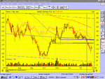
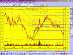
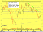
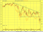
The chart I would like everyone to look at this week is BAY (British Airways) over a 6 month period on a daily chart. The advfn.com url is http://www.advfn.com/cmn/chrt/chrt_...0&ind1_2=&ind2_2=&ind_type3=0&ind1_3=&ind2_3= and if you need help posting up a chart, then this thread should help you. http://www.trade2win.co.uk/boards/showthread.php?s=&threadid=4624
As with the AAL chart, please draw in any support, resistance or trendlines that you think are relevant, and give a breakdown as before with,
An explanation of the trendlines drawn.
Trade : Buy now, Sell now, Buy at x price, Sell at x price or stay away
Risk profile with: Entry price, Target, Stop-loss and the Risk / Reward Ratio.
As always there is no wrong or right answers and I would love to see your analysis.
Take care, 🙂
Hi all
I thought it was time to show you the solution to trading. The hidden secret that will change your life forever, and this is it:
                                                                   

MONEY MANAGEMENT,
Money management is king. In the land of the trader, money management has ruled and killed all the traders who don’t believe in it.
This is nothing new, but few new traders use money management wisely and get “killed” because of it. There is a myth among new traders that you HAVE to be right more times than wrong. This table is one that I’ve taken from “The Master Swing Trader” by Alan Farley:
<table border="1"> <tr><td>%Win</td><td>Trades</td><td>Avg Win</td><td>Avg Loss</td><td>Profit</td></tr> <tr><td>75%</td><td>100</td><td>£800</td><td>£2000</td><td>£10,000</td></tr> <tr><td>50%</td><td>100</td><td>£800</td><td>£600</td><td>£10,000</td></tr> <tr><td>25%</td><td>100</td><td>£800</td><td>£133</td><td>£10,000</td></tr> </table>
What the table shows is that to be profitable, or more profitable, you can either work on being right more often, or reducing the losses. Most new traders will let their losses run and run, which means the trades that follow must be right to claw back the money they have lost.
This is a table that Chris Manning displays, and it really shows the importance of cutting your losers
<table border="1"> <tr><td>% loss   </td><td>% gain needed<br>to break even</td></tr> <tr><td>10%</td><td>11%</td></tr> <tr><td>20%</td><td>25%</td></tr> <tr><td>50%</td><td>100%</td></tr><tr><td>80%</td><td>400%</td></tr> </table>
It shows that the higher the loss the significantly higher % gain it takes just to get back to square one.
The most effective way of controlling your trades is to look at the risk / reward ratio of the trade before you enter into it. This is done by setting a rough price target, and knowing the position of your STOP. From this you can then work out the risk / reward ratio, for example
Current price = 100
Target = 109
Stop = 97
Reward = 9 points
Risk = 3 points (including commission).
Giving a 3:1 ratio
Knowing where to place the stop is a difficult thing, but the rule of thumb is that the stop is placed at the point the chart tells you “you are incorrect” Most people (including myself) rarely take anything less than a 3:1 ratio, especially for stocks. A 3:1 ratio means that you only have to be right 25% of the time to break-even.
Once your in a trade one of 3 things can happen, Either your stop gets hit, the price moves sideways or the price moves into profit. The first 2 you can’t really do much about, but when a price moves into profit, then you move the stop to lock in some profit. This is an art form in itself.
The important thing is to make sure that at any one point, the risk should not be equal or greater than the reward. In the above example, if the price went to 105, and we didn’t move the stop we would have this scenario.
Current price = 105
Target = 109
Stop = 97
Reward = 4 points
Risk = 8 points
Giving a 1:2 ratio
This is where moving the stop to lock in profits really comes in. If we move the stop to 102, we lock in 2 points worth of profit and have the following risk / reward
Current price = 105
Target = 109
Stop = 102
Reward = 4 points
Risk = 3 points
Giving a 1.3:1 ratio, which is a lot better than the 1:2 ratio we had earlier.
Moving stops, and stops placement is very difficult, but I will hopefully find someway of explaining it next week.
If we have a look back at the chart of AAL from last week, we can see that at the close on the 24th January we would have had this risk profile.

Current price = 874
Target = 930
Stop = 859
Reward = 56 points
Risk = 15 points
Giving a 3.73:1 ratio, which is good enough for me 🙂
The other aspect of money management is the stake size. I know a few traders who’s stake size is too large for the account they are trading. The important thing, especially when you are first starting out, is to make sure that you “Stay in the Game” as most of your learning will come when your actually trading.
The accepted level of risk amongst the professional traders and the trading authors is 1% of your capital on every trade. I used to trade with 2% risk, but that was far too much, and it still scares me today to think that I actually had that risk!! When your risk increases, any bad run that you have will be magnified beyond your control.
The chart I would like everyone to look at this week is BAY (British Airways) over a 6 month period on a daily chart. The advfn.com url is http://www.advfn.com/cmn/chrt/chrt_...0&ind1_2=&ind2_2=&ind_type3=0&ind1_3=&ind2_3= and if you need help posting up a chart, then this thread should help you. http://www.trade2win.co.uk/boards/showthread.php?s=&threadid=4624
As with the AAL chart, please draw in any support, resistance or trendlines that you think are relevant, and give a breakdown as before with,
An explanation of the trendlines drawn.
Trade : Buy now, Sell now, Buy at x price, Sell at x price or stay away
Risk profile with: Entry price, Target, Stop-loss and the Risk / Reward Ratio.
As always there is no wrong or right answers and I would love to see your analysis.
Take care, 🙂


