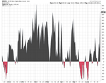
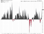
Best Thread Market Breadth

Market Breadth Update

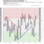
The short term positive signal from last week has turned around to Bull Correction status now, with the medium to longer term status's changing to Bear Confirmed as they both dropped below the key 70% level this week.

The percentage of stocks below their 150 day (30 week) moving average ($NYA150R) is a key one to watch now as it's approaching it's 60% level. Dorsey has done research that they call the 80-60-40 rule which shows that every time it drops to the 60% level from being above the 80% it then will reach the 40% level before it reaches the 80% again, so lets hope it manages to hold above that level this week or the bear case will become stronger.

attachment.php
 

Attachments

  • market-breadth-table_4-5-12.png
    market-breadth-table_4-5-12.png
    10.9 KB · Views: 1,527
  • $BPNYA_4-5-12.png
    $BPNYA_4-5-12.png
    18.2 KB · Views: 362
  • NYA200R_4-5-12.png
    NYA200R_4-5-12.png
    18.9 KB · Views: 340
  • NYA150R_4-5-12.png
    NYA150R_4-5-12.png
    19 KB · Views: 357
  • NYA50R_4-5-12.png
    NYA50R_4-5-12.png
    16.9 KB · Views: 429
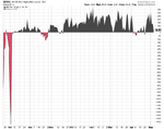
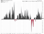
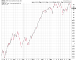
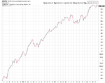
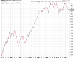
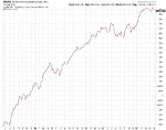
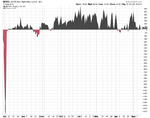
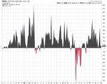
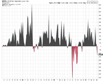
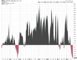
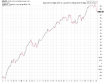
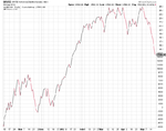
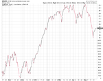
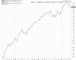
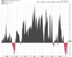
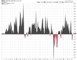
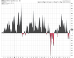
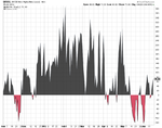
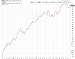
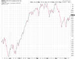
Attached is the latest cumulative weekly and daily Advance Decline charts and the weekly and daily New Highs New Lows charts.
 

Attachments

  • sc-2.png
    sc-2.png
    24.6 KB · Views: 366
  • sc-3.png
    sc-3.png
    34.3 KB · Views: 351
  • sc.png
    sc.png
    24.1 KB · Views: 344
  • sc-1.png
    sc-1.png
    18 KB · Views: 332
The daily Advance Decline line and the daily New Highs New Lows are showing a positive divergence with the price action of the market. So a promising sign that we may have put in a short term bottom last week.

Attached is the latest cumulative weekly and daily Advance Decline charts and the weekly and daily New Highs New Lows charts.
 

Attachments

  • sc-5.png
    sc-5.png
    23.5 KB · Views: 358
  • sc-6.png
    sc-6.png
    18.1 KB · Views: 385
  • sc-7.png
    sc-7.png
    23.7 KB · Views: 386
  • sc-8.png
    sc-8.png
    34.2 KB · Views: 385
love it. subscribed.
thanks for a lot of excellent quality hard work !

Thanks rathcoole. I appreciate it.

Here's this weeks cumulative weekly and daily Advance Decline charts and the weekly and daily New Highs New Lows charts. All of which are confirming the down move now.
 

Attachments

  • sc-12.png
    sc-12.png
    34.3 KB · Views: 431
  • sc-11.png
    sc-11.png
    40.2 KB · Views: 429
  • sc-10.png
    sc-10.png
    18.3 KB · Views: 405
  • sc-9.png
    sc-9.png
    24.9 KB · Views: 391
isa
if you watch the video
at the end he does the market breadth indecators.Jason levitt has some newish ways of interpreting those breadth indecators,which i do like.gives a much more short term veiw
just my opinion
 
attachment.php


The long term NYSE Bullish Percent Index ($BPNYA) is getting closer to breaking down into bear confirmed status, but isn't quite there yet and could still be saved as the short term NYSE Percent of Stocks Above 50 Day Moving Average ($NYA50R) is hugely oversold at levels not seen since the August to September period last year. So short term risk is now in the low category, however, as you can see from previous moves to these levels, a few months of basing can occur. So for a longer term investor it is time to start making your shopping list imo and adding small positions gradually in the quality names that show the best relative strength which will bottom first. As stocks don't all bottom at the same time and the breadth charts aren't indicating any let up in the selling as yet.
 

Attachments

  • market-breadth-table_18-5-12.png
    market-breadth-table_18-5-12.png
    10.3 KB · Views: 1,471
  • NYA50R_18-5-12.png
    NYA50R_18-5-12.png
    16.8 KB · Views: 398
  • NYA150R_18-5-12.png
    NYA150R_18-5-12.png
    18.9 KB · Views: 339
  • NYA200R_18-5-12.png
    NYA200R_18-5-12.png
    19.4 KB · Views: 403
  • $BPNYA_18-5-12.png
    $BPNYA_18-5-12.png
    18.1 KB · Views: 427
Last edited:
Here's this weeks cumulative weekly and daily Advance Decline charts and the weekly and daily New Highs New Lows charts.
 

Attachments

  • sc.png
    sc.png
    26.3 KB · Views: 399
  • sc-1.png
    sc-1.png
    18.2 KB · Views: 348
  • sc-2.png
    sc-2.png
    40.6 KB · Views: 380
  • sc-3.png
    sc-3.png
    34.4 KB · Views: 430
attachment.php


The medium to long term breadth indicators have moved to bear correction status, while the head coach (NYSE Bullish Percent) is still on bear alert status and hovering around the neutral 50% level indicating that neither side is in control. However, the short term Percentage of stocks above their 50 day moving average ($NYA50R) has managed to turn around to Bull alert status from it's deeply oversold level with almost 10% of stocks in the NYSE recovering above their 50 day moving average last week.
 

Attachments

  • NYA50R_25-5-12.png
    NYA50R_25-5-12.png
    16.4 KB · Views: 313
  • NYA150R_25-5-12.png
    NYA150R_25-5-12.png
    17.8 KB · Views: 360
  • NYA200R_25-5-12.png
    NYA200R_25-5-12.png
    18.2 KB · Views: 327
  • $BPNYA_25-5-12.png
    $BPNYA_25-5-12.png
    18.1 KB · Views: 351
  • market-breadth-table_25-5-12.png
    market-breadth-table_25-5-12.png
    10.7 KB · Views: 1,345
Last edited:
Today's market moves have given a short term buy signal on the Percentage of stocks above their 50 day moving average ($NYA50R). As it's given double top buy signal and moved above the key 30% level. So the short term is now on bull confirmed status.

Below is the chart:

attachment.php
 

Attachments

  • SharpChartv05-5.png
    SharpChartv05-5.png
    28.4 KB · Views: 1,031
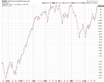
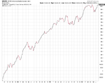
Here's this weeks cumulative weekly and daily Advance Decline charts and the weekly and daily New Highs New Lows charts.

Thursday's short term buy signal on the Percentage of Stocks above their 50 day moving average was given further weight by the daily cumulative Advance Decline line also giving a buy signal on Thursday and breaking above it's recent highs and back into the February to April range. So the short term breadth indicators are positive.

The weekly is starting to look more promising again as well, but it needs to make a new cumulative high to give a longer term buy signal imo. So it's got some more work to do yet.
 

Attachments

  • sc-7.png
    sc-7.png
    36 KB · Views: 388
  • sc-6.png
    sc-6.png
    41.2 KB · Views: 352
  • sc-5.png
    sc-5.png
    18.6 KB · Views: 343
  • sc-4.png
    sc-4.png
    25.9 KB · Views: 320
As I mentioned earlier in the thread. One tool I find really useful is the Dorsey Sector's Bell Curve, as it shows the distribution of all of their 40 stock sectors bullish percent chart levels on a bell curve. So you can see where the relative strength and weakness is in the market.

Currently the average for this is at 39.48%, and is near the lowest levels it's been at since November 2011.

It's not a free resource, so you need to have a subscription to their site, but as I mentioned before in post #3 you can create your own free version using stockcharts.com

attachment.php
 

Attachments

  • Sector-Bell-Curve_15-6-12.png
    Sector-Bell-Curve_15-6-12.png
    28.8 KB · Views: 1,242
attachment.php


There have been a number of positive developments on the breadth indicators over the last week, with the short term Percentage of stocks above their 50 day moving average ($NYA50R) giving a buy signal last Thursday, and now yesterday the medium term Percentage of stocks above their 200 day moving average ($NYA200R) going positive also, with the Percentage of stocks above their 150 day moving average ($NYA150R) not far from going positive as well.

However, the long term head coach (NYSE Bullish Percent) continues to be on bear alert status and is struggling to not break down and give a bear confirmed signal. This has already happened on the S&P 500 Bullish Percent, so the long term picture remains unclear at the moment with a battle at the neutral zone around 50%.

So the breadth charts are short term positive, but the long term picture is decidedly unclear at the moment.
 

Attachments

  • $BPNYA_19-6-12.png
    $BPNYA_19-6-12.png
    18.1 KB · Views: 310
  • NYA200R_19-6-12.png
    NYA200R_19-6-12.png
    19.1 KB · Views: 421
  • NYA150R_19-6-12.png
    NYA150R_19-6-12.png
    18.6 KB · Views: 361
  • NYA50R_19-6-12.png
    NYA50R_19-6-12.png
    16.9 KB · Views: 303
  • market-breadth-table_19-6-12.png
    market-breadth-table_19-6-12.png
    10.4 KB · Views: 1,409
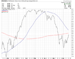
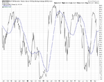
For people that don't like point and figure charts, or don't understand them you can also use line charts for the breadth indicators to good effect. They do this regularly on stockcharts market reports and add trend lines, moving averages etc.

So as an example, attached is the weekly and daily chart of the Percentage of stocks above their 150 day moving average ($NYA150R) as a line chart. I've also added a 30 week moving average to the weekly chart and a 50 day and 200 day MA to the daily chart.

As you can see there's some good short term entry and exit points if you use horizontal trend lines on the daily charts and also medium term entry and exit points if you use crosses above and below the 30 week MA on the weekly chart. As with anything, it's not perfect, but it's clear it's useful to keep an eye on imo.
 

Attachments

  • sc-9.png
    sc-9.png
    28.8 KB · Views: 326
  • sc-8.png
    sc-8.png
    44.7 KB · Views: 372
I've been experimenting with the line versions of the breath indicators and marked up a chart comparing the S&P 500 with the NYSE percentage of stocks above their 150 day moving average ($NYA150R). As I believe the breadth indicators are forward-looking and so peak before the index does and hence give advance buy and sell signals before the index price moves.

It is not perfect, but by using breaks above and below horizontal trend lines at close prices and the 30 week weighted moving average it has generated some good advance signals over the last few years.

The 30% and 70% are key levels also to watch, so the signal will be stronger if it moves above or below them also.

Attached is the marked up chart. The circles on the S&P 500 denote the price level of the signals.

attachment.php
 

Attachments

  • SPX_stages_21_6_12_breadth.png
    SPX_stages_21_6_12_breadth.png
    78 KB · Views: 1,054
Below is the latest breadth charts:

attachment.php
 

Attachments

  • $BPNYA_25-6-12.png
    $BPNYA_25-6-12.png
    18 KB · Views: 272
  • NYA200R_25-6-12.png
    NYA200R_25-6-12.png
    18.7 KB · Views: 239
  • NYA150R_25-6-12.png
    NYA150R_25-6-12.png
    18.4 KB · Views: 348
  • NYA50R_25-6-12.png
    NYA50R_25-6-12.png
    16.7 KB · Views: 318
  • market-breadth-table_25-6-12.png
    market-breadth-table_25-6-12.png
    10.7 KB · Views: 1,230
Last edited:
We've had some more changes with this weeks market movements, so below is the latest breadth charts, which the short to medium term charts are now all in Bull Confirmed status and a good field position.

attachment.php
 

Attachments

  • market-breadth-table_29-6-12.png
    market-breadth-table_29-6-12.png
    10.1 KB · Views: 1,006
  • NYA50R_29-6-12.png
    NYA50R_29-6-12.png
    16.9 KB · Views: 238
  • NYA150R_29-6-12.png
    NYA150R_29-6-12.png
    18.7 KB · Views: 317
  • NYA200R_29-6-12.png
    NYA200R_29-6-12.png
    18.7 KB · Views: 316
  • $BPNYA_29-6-12.png
    $BPNYA_29-6-12.png
    18 KB · Views: 313
Here's this weeks cumulative weekly and daily Advance Decline charts and the weekly and daily New Highs New Lows charts, which are confirming the short term strength imo. The cumulative Advance Decline is close to breaking out to a new high after a consolidation, which has proved to be a good buying point in the past imo from looking back over the long term chart.
 

Attachments

  • sc-4.png
    sc-4.png
    25.8 KB · Views: 358
  • sc-5.png
    sc-5.png
    18.8 KB · Views: 345
  • sc-6.png
    sc-6.png
    42.1 KB · Views: 364
  • sc-7.png
    sc-7.png
    35.5 KB · Views: 318
Top