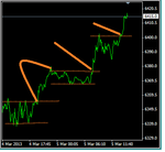
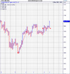
Best Thread learning to read price action with p/f charts

Chart attached.

See the horizontal support you talked about? The price did bounce off today
from the horiz support.
wat.png

But i cant be using this as PF buy strategy.

On other thing.
From the point of view of candles, the stock is in range state no clear trend.
I tried different settings for 1%, i could not get a decent support line drawn.
Then i tried 2% and i have some better support. see the chart attached below. which shows the uptrend has been broken. So as per PF strategy that I use, I will wait till there is an uptrend and a double top or a double top created at the reversal of the downtrend.wat2.png

wat3.png
 
Last edited:
hi oracle
good to hear from you
stock with no clear trend....
then down to 1 box/close or hilo
see which side of the pattern has most filled boxes
look for the breakout point
try to get in within that consolidation..hence s/r map
 
oracle
horizontal supp is important aswell,especially 3 box
gaps also and sometimes
ma
try this
no scanning
go thru the stocks and identify wher you think an upside breakout will occurr
you might need to move between 1,1.5% and 2% box sizes and possibly in increments between these
mark them
then with s/r ...look at the opposite side,where you want to take a position with a high reward...mark that
it will take longer than scanning..but i think you will make more
 
oracle..answers to questions
not sure if they are right...but i will give it a go
1.volatility...need to see nice long columns with hardly any retrace
care with poles..though
there is no way of determining how many boxes you will get.that is the $640000 question
 
hi oracle
good to hear from you
stock with no clear trend....
then down to 1 box/close or hilo
see which side of the pattern has most filled boxes
look for the breakout point
try to get in within that consolidation..hence s/r map

You mean 1%1 setting? on close or H/L
"which side of the pattern has most filled boxes", what did you mean?
by break out you mean "double top"? or break of horizontal res or 45 resist?
"within that consolidation" ???

If you have a chart where you applied all of the above, pls share it.

I know its not a good chart but to clear my doubts, see these two attached.
wat1%x1hl.png

wat1%x1.png
 
oracle
horizontal supp is important aswell,especially 3 box
gaps also and sometimes
ma
try this
no scanning
go thru the stocks and identify wher you think an upside breakout will occurr
you might need to move between 1,1.5% and 2% box sizes and possibly in increments between these
mark them
then with s/r ...look at the opposite side,where you want to take a position with a high reward...mark that
it will take longer than scanning..but i think you will make more

What is the significance of gaps in PF chart and how do we read and react/adjust to them?
ms means moving average? I thought moving averages are lagged indicators but did you mean using moving avg to know if the current price is above or below say 50dma ?
When you said upside break out, you meant brake of resistance? (horiz or 45).
But I am doing that, usually i take the pf chart which looks rather perfect and wait for the double top to appear and ensure the context in which double top has occurred with respect to the surrounding parameters like trend, break of previous how many x columns, how far to the support, or whether the double bottom is close to any resistance (in that case wait for the double top to break that resis).
it would be great help if you can paste a ph chart and circle these points you mentioned above.
cheers
 
oracle..answers to questions
not sure if they are right...but i will give it a go
1.volatility...need to see nice long columns with hardly any retrace
care with poles..though
there is no way of determining how many boxes you will get.that is the $640000 question

In other words, if i have two charts giving buy signals, I will favor the chart which has had longer X columns and that too formed in lesser time(low box to high box time).
 
This is an intra-day strategy.

I wait for the break of the 45 resistance and then enter long at the points marked arrow.
my stop loss would be the double bottom

pf5min.png

Anythin to add here?
 
oracle
have a look at this
ftse 100
5 min line chart
can you see the breakout points ??
there are 2
can you see the other side ?
the p/b area ?
that is where you want to be
no need for a p/f chart
157btj5.gif
 
sorry...there are 3 breakout points for this trend
no need for p/f.you can see this on the charts on youre phone..just a line chart needed
no more
 
sorry...there are 3 breakout points for this trend
no need for p/f.you can see this on the charts on youre phone..just a line chart needed
no more

That's what I thought.
And there is a bullish H&S pattern as well before the last break out.

I have a couple of questions.

1. I can draw the support and resistance but it is a manual process or a visual representation by looking at the chart where your eyes will see those support and resistance areas bypassing the noise. However PF chart gives you a precise system where you see all of the same auto calculated by the charting. But I get your point.

2. I thought you opened this thread to share and enhance other folks knowledge about PF strategy and so am here for it. I hope you would continue sharing your experience for the pf point of view.


breakout.png
 
ok
good..you understand what i mean
the last breakout was a bit trickier.note the bigger pullback..but no break of trend.these one"s allow you in with a very tight stop.hence the s/r map
 
I have never used relative strength in PF charts. What I understood from relative strength analysis is that you plot the stock against the main exchange and find out if the stock is above or below (close line), thereby assessing the stock's relative strength with respect to the main exchange.
Now I have seen that the stock performs terrible while the index gain up several points and the same goes for the opposite. What looks logical to me was not assessing the individual stock but the sector.
For example, the cement sector ,the IT sector, the telecomm sector, real estate sector.
I have noticed that plotting a chart of the sector helps to understand better. For example plotting a chart on real estate sector and similar was rather more predictive.
In dorsey book, he has written a lot on this and am not sure if it is applicable to my stock exchange or not.
I personally believe that fundamentals play little then people manipulating the stock market.
Whats your stand on this and how do we chart this in PF?
 
how do we chart this in PF?

..in updata, when you have your P&F chart loaded, go to chart=draw chart=relative strength and then choose the instrument you are looking to compare the strength to. In your case, it would be the Tadawul sector chart. You would obviously need the sector chart as an instrument for this.
Typically, you would look at the sector vs the main index, and then a stock vs that sector. Dorsey goes into a lot of detail, and there is equally a whole chapter in Duplessis.
 
Is Dax, just going to explode?
Look at the target on the 50x3 box size, and you would think so, but then look at the target on the 100x3 that hasn't been achieved yet. Two slightly different stories, and on the 100x3 we can see long term support right above

something tells me we will get a retracement once the immediate target is met, before we see the heights of 9500
 

Attachments

  • DEX.jpg
    DEX.jpg
    1.2 MB · Views: 193
  • DEX 100.jpg
    DEX 100.jpg
    1.4 MB · Views: 260
..in updata, when you have your P&F chart loaded, go to chart=draw chart=relative strength and then choose the instrument you are looking to compare the strength to. In your case, it would be the Tadawul sector chart. You would obviously need the sector chart as an instrument for this.
Typically, you would look at the sector vs the main index, and then a stock vs that sector. Dorsey goes into a lot of detail, and there is equally a whole chapter in Duplessis.

I tried that but not able to make a sense out of it.
For example when I plot a pf chart of a stock or a sector. Then choose to plot Rel Str from the menu, it gives me options like plot RS as line or P chart. When I choose PF chart , then it actually draw the same pf chart again, no comparison.
When I choose the line, this time however it draws the line close for the compared instrument. And all i can asses if the PF chart boxes are belowor above that line. Above means the pf chart instrument is performing better than the sector or the secotr performing better than the main index.
I mean we could do this from drawing a line close of the RS, what is so imp and worthy of RS in pf chart?
What do we look for? What is the trading strategy we need to adopt in using RS?

Cheers

I'd suggest taking Dorsey's free P&F University lessons which explain about how to utilise relative strength with P&F charts. There are six lessons with questions to take at the end of each lesson to take to make sure you understand it. Here's the link: Dorsey PnF University - click on the Lesson # 01 to start (see attached)

attachment.php
 

Attachments

  • lesson1.png
    lesson1.png
    20.2 KB · Views: 696
I tried that but not able to make a sense out of it.
For example when I plot a pf chart of a stock or a sector. Then choose to plot Rel Str from the menu, it gives me options like plot RS as line or P chart. When I choose PF chart , then it actually draw the same pf chart again, no comparison.
When I choose the line, this time however it draws the line close for the compared instrument. And all i can asses if the PF chart boxes are belowor above that line. Above means the pf chart instrument is performing better than the sector or the secotr performing better than the main index.
I mean we could do this from drawing a line close of the RS, what is so imp and worthy of RS in pf chart?
What do we look for? What is the trading strategy we need to adopt in using RS?

Cheers

I'll try and explain, I'll use EXPN as an example
There are two charts attached, one shows EXPN, as well as EXPN relative to the FTSE, and then FTSE (I have chosen to draw as a line chart rather than P&F as its easier to see. The FTSE P&F chart is the same box setting as EXPN, or else its meaningless
I have drawn in arrows where for the same time periods, FTSE is going up, whilst EXPN is going up...the relative strength is flat (because they are both going up then EXPN is effectively no stronger than FTSE. But for the last year, where FTSE has gone flat, but EXPN is trending strongly, then the relative strength is going up, as EXPN is outperforming the FTSE

The idea is to choose, or invest in those stocks that are going up, whilst the FTSE (or the sector) is not. The theory being, that as soon as the sector catches up, our stock will get even stronger.
 

Attachments

  • EXPERIAN RS.jpg
    EXPERIAN RS.jpg
    1.1 MB · Views: 285
  • FTSE 100.jpg
    FTSE 100.jpg
    698.7 KB · Views: 291
Is Dax, just going to explode?
Look at the target on the 50x3 box size, and you would think so, but then look at the target on the 100x3 that hasn't been achieved yet. Two slightly different stories, and on the 100x3 we can see long term support right above

something tells me we will get a retracement once the immediate target is met, before we see the heights of 9500

You mean to say that the chart with smaller box size says next target to
achieve as 9550, while the chart with a larger box size has had a target
7900 not achieved, so how come the 50 box suggests a target past the 7900?
The current price is 7870.

The chart of 100 looks tending enough as an up trend suggesting the target
7900 is quite achievable and is more likely to happen.
While the chart 50 size is accumulation or consolidation phase for the past
size columns. So a box size can make a market looks choppy vs trending
because of the way the symbol ADR varies for the given time, I guess.

This means the target on size 50 as 9550 was made when that column of double
top was progressins so well and perhaps updata calculate that with such
good pefrmance the taget is gonna be 9550. However then comes whole bunch of
6 columsn with no clear trend, seemsupdata is not able to adjust the prev
target, so when you switch to bigger size 100, the trend is there .
So it seems it will reach 7900 and then retrace back to say 7550 and then goes up again, unless there is a strong break out from the current range trend
 
that's kind of how see it..and who am I to question the targets set by Updata :cheesy:Their targets are incredible, and I'm led to believe somewhat proprietary
gives us some advantage perhaps..I doubt it😉
 
Back
Top