You are using an out of date browser. It may not display this or other websites correctly.
You should upgrade or use an alternative browser.
You should upgrade or use an alternative browser.
<b>Update</b>
The following is what I am forward testing with. More data was added to the spreadsheet which brought it up to date. A quick THANKYOU to all the contributors at this point.
Testing with the up to date data (09 June 1999 to 01 Dec 2003) gave:-
positive average: 93.65
negative average: -93.99
I then took the last 100 trading days and calculated the averages for these.
last 100 positive average: 57.33
last 100 negative average: -54.76
My plan is to round the above averages and then use the last 100 days plus/minus the difference between the last 100 and the overall.
For the positive trigger for today this gives:
100 day average + (overall average - 100 day average)/2
57 + (94 - 57) / 2
57 + 18.5
positive trigger is 75.5
For the negative trigger for today this gives:
100 day average - (overall average + 100 day average)/2
-55 - (-94 + 55) / 2
-55 - 19.5
negative trigger is -74.5
So, triggers are go long at yesterdays close + 75.5 and short at yesterdays close - 74.5
Long at 9899 + 75.5 = 9974.5
Short at 9899 - 74.5 = 9824.5
Stop for both is at yesterdays close of 9899
I've gone for this method in preference to others at the moment as I do not want to risk getting whipped out too often. The closer you are to the previous days close for your entry the more probable it is that you will be stopped out. The interesting bit now is going to be to find that optimum value which minimises losses and maximises returns. Its in there somewhere 🙂
John
Glenn
Experienced member
- Messages
- 1,040
- Likes
- 118
Hi John
Have you plotted equity (capital growth) charts for your results ?
I find looking at the Capital column hard work compared to a chart of it.
The better equity charts have a pretty smooth consistent increase in capital without ragged behaviour, big steps or falls and minimal flat spots.
I have produced a few, using various '96' figures and some parameters make the equity chart pretty ragged over time, despite good profits in the end.
This can mean months of little or no growth in capital.
Problem with looking at a list of results over such a long period is that it's easy to focus on the final returns. When you come to actually trade, everything seems so almighty slow, especially when you hit a flat spot or a string of losers.
Systems like this are akin to a buy and hold strategy imo. A long timescale with the 'slings and arrows of outrageous fortune' along the way 🙂
For anyone who hasn't tried it, it's easy enough to produce a chart in Excel, and it gets updated automatically when you change parameters. Plot a trend line under the equity line and see how much the line deviates from the trend etc.
Glenn
Chowclown,
The 20 day moving average that I posted was really only an example of a way of making the system future proof and more dynamic. I suggest you have a play around with the MA and see what works the best and what you feel comfortable with.
Two other things regarding the system:
1. It really needs to be fully tested using the actual data from the instrument you intend to trade, ie the YM which can be rather different to the cash index. If you are spreadbetting then the YM will give a better idea of feasibility than the cash index as the sb is based on the futures not the cash index. You would, of course, need to allow for the increase in spread, so if the YM comes to within 5 pts of the stop - the sb co would have taken you out with their spread.
2. Just from the ohlc data we don't know whether the system hit the stop during the day before rebounding into profitability. Eg open long at 9050 with a stop a 9000. It could have dropped to 8990 before closing at 9060, in which case it would have been stopped at 9000 for -50 but the s/s would show a +60.
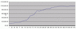
Hi Glenn
attached is the capital growth for the latest version as posted by mombasa.
Looks OK until the last 50 or so days when it is flat. This could well be a reflection of the current market (silly thing to say when I think about it 🙂 ) with the current smaller day ranges. I'll stick with what we have for the time being but appreciate that due to the nature of the system we could be looking at a lengthy test period.
I put the capital in the spreadsheet to assist in tuning the money management aspects of the system. It was really to get an idea of the stop levels and stake values which offered a good compromise between risk and reward and kept the pot positive.
I am wary of trying to tune it too much to the current market as I think there is a risk of creating results which are 'fitted' to the data. I think all we can do at this point is forward test and then modify at some point in the future or perhaps run a number of systems in parallel.
John
Attachments
sidinik and jp,
"2. Just from the ohlc data we don't know whether the system hit the stop during the day before rebounding into profitability. Eg open long at 9050 with a stop a 9000. It could have dropped to 8990 before closing at 9060, in which case it would have been stopped at 9000 for -50 but the s/s would show a +60."
I must be missing something here, surely the 'with stop' column in the spreadsheet takes account of this situation and would record the trade that day as a -50!!
regards
Neil
PS JP well done on what looks to be a great system and thanks for sharing it.
Hi John, Sorry for the delay I have been at work hence the need for a simple end of day strategy!
I didn't make myself very clear in my earlier post I meant OHLC Data for the previous four days on an end of day basis. In the book Williams states, 'Over the years I have tried various time periods to see whether there are any ideal number of days to use in my calculations my original thought was that one would want to use a 10 day period to arrive at the best average. After all the longer the period the more stable the answer should be or so I thought I was wrong on that in almost all cases the previous 1 to 4 days produce the best values in trading or developing systems.
He goes on to describe a system he used as a basis to make a million pounds in 1987. This involves volatility breakouts he describes as follows.
I will take the diiference from open to high for each of the past four days and divide that by four to get the average 'buy swing' I want real proof that the market is entering new ground so I will be a buyer above the opening at an amount equal to 180 percent of the 4-day swing value average.
The sell signal is a mirror image in that I take the distance from the open to the low for each of the last four days and divide it by four to get the average.This is multiplied by 180 percent and subtracted from the opening to give me the sell entry.
I've never used this system and it sounds a bit complicated in the book but it may give you some idea's to combine with your system.
Mark.
Hi Mark
thanks for the post and the clarification. I'm going to have to test this both standalone and as a part of the system.
It did give me an idea though as soon as I read it. Why not generate the entry point from a combination of a long term average, a near term average and an immediate average. This should have stability whilst still being able to respond to changes in the market.
Anybody got any thoughts on this or tested anything similar?
John
<b>Set up for 3rd Dec</b>
As per previous update the following are the figures for tomorrow based upon the current calculation method.
Plus trigger factor : 75.48
Minus trigger factor: -74.23
Go long @ 9929
Go short @ 9779
Stop @ 9853
I wont be doing this every day by the way 🙂
As per previous update the following are the figures for tomorrow based upon the current calculation method.
Plus trigger factor : 75.48
Minus trigger factor: -74.23
Go long @ 9929
Go short @ 9779
Stop @ 9853
I wont be doing this every day by the way 🙂
john
Sorry if I've missed it but have you tested the data without the stop? It really isn't that unusual for the Dow to clear 70 points then retrace thru the opening price. In fact, the regularity of something similar has formed the basis of my relatively profitable strategy of the past few months.
Sorry if I've missed it but have you tested the data without the stop? It really isn't that unusual for the Dow to clear 70 points then retrace thru the opening price. In fact, the regularity of something similar has formed the basis of my relatively profitable strategy of the past few months.
Hi John
Did you see the last part of robbers post about the stop? I was also wondering about that, as it appears you included stops in your S/S, but agreed with Sidinuk about needing Intraday data for the stops.
Does this mean some of the positive trades in the S/S may,
in practise, on that day, have been stopped out and been a loss rather than a gain? This, of course, could alter the recorded gains considerably.
Could you clarify this point.
Thanks
Darren
Hi Darren
yes - thats been considered. That was one of the reasons why when I first put the system together it used 96 points as an entry trigger as this minimised the possibility of false stops. However, as the market has changed and the consensus seems to be that the system should have a dynamic element to better cater for future changes I have modified it.
The advantage of earlier entries is when the system works the gains are greater, offsetting this is the probability of more reversals and stops being hit. Somewhere in the middle is a value (which may be changing) which maximises returns and minimises losses. This is further complicated by the need to do some work on optimising the stop levels.
I'm not saying its right or will even work in its current or original formats but I think its worth forward testing with a small amount of money at this stage. The other option is to backtest using intraday data which I do not have access to. If tested with intraday data this would allow for the testing of tighter stops and trade re-entries if stopped out.
I think we need to be clear on this. It is not a finished system, it is a concept which needs further testing and may well fail. Having said this I think its worth a test at this stage so I will run it for a while (6 months) and review its performance at the end of this period. If it is obviously failing in this period I will ditch it. The backtesting gives us some idea of the length of negative runs and the size of drawdown this involves. If the system cannot perform in a similar fashion to the test system then I will have to reconsider running it.
John
This system is very good and should not be abandoned.
It only need more people that are willing to input their views and add further research into it to make it viable in the long term.
I am sure there are people on this board who has intraday data for the dow who can find a good stop point as this appears to be the weak link in this system.
Personally I use a stop of 27pts but I am sure there is a better stop that will make more money.
edit
I have deleted my question as I think it was poorly worded
there has been some discussion about stops but I wonder if the
issue might relate to opening gaps.
maybe there should be a rule that if the
opening gap exceeds some level ?96? then scrap the day?
There seem to be very few days following a large opening gap
that would have been profitable ?
Last edited:
Just a thought, but this system uses the same figure for the sell/buy trigger as it does for the stop loss.
i.e. open at Yesterdays close +/- "Trigger" and stop loss at Yesterdays close which is entry point less/plus "Trigger"
What would happen if these figures were set differently? A trigger level - say +/- 75 and stop loss at +/- 50
This is easy to do on the spreadsheet but more difficult to analyse the results.
Any statisticians out there?
Similar threads
- Replies
- 25
- Views
- 8K