DashRiprock
Experienced member
- Messages
- 1,650
- Likes
- 482
Re: Get Long My Schlong, by Dash Riprock Esq. - serialisation
so I was just playing about with TOS (i hate this time on a sunday) and anyway it turns out that in a roundabout way I can explain graphically what i said earler about the NOB spread . Not the "on your FACE!" bit though.
just before i get into it, anybody looking at this and trying something similar, i emphasise that the only thing that translates onto a forum is words and pictures; i dont want to make anyone think that actually you can trade like this just from graphs, because you can't (at least I cant). entries, exits, stops and things are all focused on the tape/DOM and obviously there are other considerations but the graphs are just for an idea of context / structure mkay? it's not the be-all and end all
also, real money / bank / hedge fund bond/rates people are usually pretty quanty - bonds are alot about maths, and fundamental / economicy - bonds are also alot about economics. so please don't start doing rsi divergence on yield curve OK?
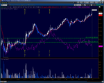
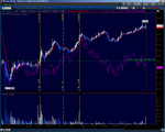
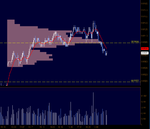
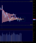
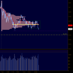
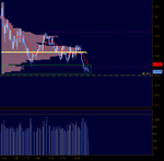
right anyway here are two graphs of friday's RTH session in the ZN future and the ZB future. On both, in purple, I've put on the close of the tradeable NOB spread which is 5 ZN futures for every 3 ZB futures. The green sideways lines are the highs of the NOB, ZN and ZB respectively until it broke out above the highs from the high volume area that i was on about on friday. The yellow time lines are points i will discuss in order:
1st at 15:09
this is when both ZB and ZN made new highs on the back of some dudley comments on cnbc iirc, before pulling back and then both going on to print higher and move towards other areas. What matters is that they were both going up..... BUT - look at the space inbetween the 1st and the 2nd lines! ZB and ZN are both going up but the NOB is just staying where it is :-0
2nd 16:11
An hour after the futures broke higher, the NOB joins in. This mean that up until here, ZB and ZN had both been going up by roughly the same amount Schwiiing 🙂 something else moderatly interesting to note is that it is only on the pullback that the NOB went anywhere. at the ZB and ZN highs of that move, NOB was in the middle of its daily range.
3rd 16:57
this is really just an observational point, not something that you could necessarily trade in real time. It's just the highs of the NOB and the disparity between the ZB and the ZN in terms of where it was in terms of that days range (ZB below daily high, ZN printing new one). after that point, ZB outperformed the ZN which brought the NOB back to where it was at the beginning of the day EVEN THOUGH both ZN and ZB finished on their highs.
Points:
the NOB spread is also traded on the exchange (a bit like crack spreads), which I can't get in TOS, and since I dont trade it dont pay that much attention to it anyway. But I think you can get price improvement through it instead of dicking about with legs in.
these are 2m graphs because I can't do tick charts like before with the NOB on it, so I just eyeballed the one that looked most like my tick charts from friday.
I removed the volume profile just to make it easier to see what I'm talkin about
these are percentage charts (and log percentages at that) which is not ideal.
I tried to make the yellow time lines at identical times on both charts but couldn't.
the NOB, either by legging or the ICS, is an attempt are replicating the Bond yield vs Note yield curve trade. As a broad generality it's the changes in yields on the cash bonds that are the dog thats wagging this tail.
Attachments
Last edited:

