Capitalspreads platform - 2 requests...
Hi Simon,
I've not asked you a question for a while, so I'm glad to see you're still making time for t2w.
I have 2 requests for your consideration.
First, like most of your customers I imagine, I use your service from work, and sometimes from home when I've got a week off for example. Recently I emailed customer services from home, to request a refund of funds, but wasn't allowed to proceed as my home email address wasn't my registered one - so I could only make this request from work... This causes an unnecessary delay, and so here is a simple solution. Can we have two registered email addreses - work and home, that customer services will accept? Taking this idea further, your platform doesn't have an 'Account details' tab, which would allow us to set personal details like these addresses, and perhaps even have a 'check box' to choose whether we are trading from home or work at any time!
Ok, secondly, and on the theme of using your platform from work. As many products, like FTSE 100, are only tradable monday to friday, during office hours, and most of your customers probably work for a living, it's inevitable that most are running your platform on their work computers. Your platform has a huge advantage over, say TDWaterhouse - which is blocked by our firewall, obviously because of the technology you have used - please don't change it!
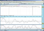
So my only problem is to do with discretion. The Portfolio view etc are fantastically discreet, with just a few gray and white lines with numbers dotted over them. Fine. But your big "Capital Spreads" logo on the top left attracts the wrong kind of attention - people walk past my screens and notice it - and make comments about spread betting, which becomes a conversation about betting etc etc. Not ideal in an office environment. I like to keep my financial affairs very private, and although we have a relaxed attitude to internet usage in moderation, it makes me feel uncomfortable, and therefore likely to close it down more often than not.
Ok enough waffling - can you make this section collapsible, or have a button to blank it, or make it a setting per customer that can be requested, so it is never displayed? It's not good enough to simply make the window smaller and scroll down, as when any option is pressed the screen redisplays from the top - and up it pops again! Forget about the pride you take in your brand - we all know it's a good one - this feature would allow more customers to have your platform open more of the time - ie more trades - so good for you?
I hope some of this feedback interests you ( and I know programming changes take a long time to rollout! ), regards,
EGO2

