You are using an out of date browser. It may not display this or other websites correctly.
You should upgrade or use an alternative browser.
You should upgrade or use an alternative browser.
dbphoenix
Guest Author
- Messages
- 6,954
- Likes
- 1,266
:|
Attachments
-
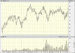 XLY.gif27.6 KB · Views: 256
 -
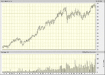 XLU.gif26.3 KB · Views: 276
 -
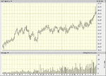 XLP.gif26.8 KB · Views: 260
 -
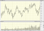 XLK.gif28.8 KB · Views: 278
 -
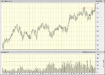 XLF.gif42.3 KB · Views: 288
 -
 MktCap.gif39.9 KB · Views: 302
 -
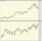 DJTA-IA.gif56.3 KB · Views: 301
 -
 SPX.gif14.2 KB · Views: 300
 -
 NYA.gif12.9 KB · Views: 283
 -
 NDX.gif16.2 KB · Views: 278
 -
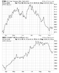 YC.gif24.4 KB · Views: 265
 -
 USD-USB-CRB.gif38.1 KB · Views: 278
Last edited:
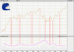
Hi db,dbphoenix said:The Forest
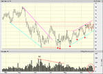
I can't figure out what the red and green dots signify. Don't know if this is the place to ask for explanations, but if you don't mind?
Also, as for the circled volume, on the one hand I think slowly increasing volume after the selling climax that is consolidating near the highs of the uptrend is bullish. But isn't accumulation supposed to happen in a low volume environment? On the other hand, thats a whole lot of volume spread out over the last 11 days for essentially a $1 dollar price area(distribution?)
Also, what do you think about $69 as s/r. I kinda think that's going to be the "line in the sand"
dbphoenix
Guest Author
- Messages
- 6,954
- Likes
- 1,266
:|
Attachments
-
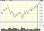 DIA.gif31 KB · Views: 312
 -
 NYSE.gif17.5 KB · Views: 273
 -
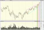 SPY.gif31.8 KB · Views: 262
 -
 SPX.gif26.3 KB · Views: 264
 -
 NYSE.gif25.4 KB · Views: 246
 -
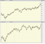 XLP-Y.gif36.2 KB · Views: 271
 -
 XLF.gif18.3 KB · Views: 252
 -
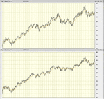 XLB-I.gif35 KB · Views: 282
 -
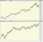 DJTA-IA.gif61.7 KB · Views: 259
 -
 MktCap.gif38.9 KB · Views: 241
 -
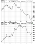 YC.gif23.6 KB · Views: 280
Last edited:
In hopes of understanding the p/v relationship better.dbphoenix said:
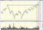
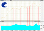
DIA
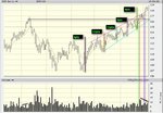
GREEN LINE - price moves up to resistance on low volume. ( bullish because no sellers )
RED LINE - price goes through resistance but on heavy volume. ( lots of supply comes into the market but still moderately bullish as price closes above resistance in the upper end of days range. )
DAY AFTER RED LINE - more supply comes into the market but price holds its ground ( bullish )
2 & 3 DAYS AFTER RED LINE - price is dropping on low volume but price is still holding previous resistance line ( moderately bearish )
BLUE LINE - price accelerates and closes at a new high with less volume (effort) than the RED line. ( extremely bullish)
PURPLE LINE - price breaks out and closes above upper channel on still low volume as compared to the RED line. ( as bullish as it gets )
QUESTION - What holds better support, the upper channel or the RED line bar?
Assuming that I read the right side of the chart correctly, how can I correlate that to the left side of the chart, specifically the May highs.
It seems that it took a lot more effort to move prices higher now than in May ( distribution ) but its hard not to be bullish right now, if once again my interpretation is correct?
Attachments
dbphoenix
Guest Author
- Messages
- 6,954
- Likes
- 1,266
I don't understand why you would want to be "bullish" or "bearish" or to adopt any sort of attitude toward the price action. A more accurate characterization would be that the wave of buying pressure is greater than that of selling pressure. However, the wave of buying pressure may already be cresting.
As to support, there was a consolidation at the level of the May highs. Price points exist independently of the individual trader. "Channel" lines do not. You'll have to determine what that implies regarding suport.
As to support, there was a consolidation at the level of the May highs. Price points exist independently of the individual trader. "Channel" lines do not. You'll have to determine what that implies regarding suport.
Fair enough, waves it is. What constitutes "cresting"? Please don't answer price.dbphoenix said:I don't understand why you would want to be "bullish" or "bearish" or to adopt any sort of attitude toward the price action. A more accurate characterization would be that the wave of buying pressure is greater than that of selling pressure. However, the wave of buying pressure may already be cresting.
As to support, there was a consolidation at the level of the May highs. Price points exist independently of the individual trader. "Channel" lines do not. You'll have to determine what that implies regarding suport.
Attachments
dbphoenix
Guest Author
- Messages
- 6,954
- Likes
- 1,266
As I said at the beginning of the "thread", this is solely for posting images. If you have comments or questions, I'd appreciate your posting them to my journal: http://www.trade2win.com/boards/journal.php?s=&journalid=4767&action=view
Otherwise, this becomes a discussion thread, and that is not its intent. If you want to post your own charts, I suggest you open a journal of your own so that everything you're working on is in one place.
Otherwise, this becomes a discussion thread, and that is not its intent. If you want to post your own charts, I suggest you open a journal of your own so that everything you're working on is in one place.
dbphoenix
Guest Author
- Messages
- 6,954
- Likes
- 1,266
Retail investors missed most of recent rally
But as indexes hit records, individuals have begun piling back in
http://www.marketwatch.com/news/story/Story.aspx?guid={2AA569C9-01E1-472F-A8F8-CEB9155F8208}&siteid=
dbphoenix
Guest Author
- Messages
- 6,954
- Likes
- 1,266
Similar threads
- Replies
- 1
- Views
- 3K


