fletch
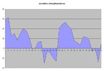
Don't forget it's a cumulative graph so every up slope indicates the ftse being strong and down slope being weak. It's also a touch misleading because it should have started from the zero line (the first day was over 60 strong which is why it starts up there) so in relative to dow terms ftse is pretty much back where it started.
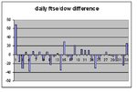
So what you are seeing is a reversion to mean, albeit that the strong extremes have been much higher than the weak extremes have been low - if you see what I mean 😕 The daily histogram might explain it better - you'll see, for example, that the opening strong day was followed by weak days as it tries to revert. This happens on an intraday basis, too.
For pairs trading you are basically looking for strong or weak extremes and assuming an attempt at reversion.
I am conscious that this is not what the thread is about - although whether ftse is trading weak or strong does have relevance - and I wouldn't want to "litter" it too much.
jon