Trading with point and figure

spx

2z89mw6.gif
 
Time to wrap up for me, its been a very good week and some great calls from you guys and its good to see other members contribute.

:clap::clap::clap:
 
spx
new uptrend/column of X"s
will that break 2060 ??...possibly
we could get a fake..lol
the pullback should be important for bulls to get some traction
otherwise...dump
 
change inputs

ygdb4.gif

2064-2067 ..a real dog for the bulls
bulls really need to keep it above 2040..ish
 
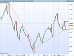
As part of my occasional contributions to this thread, the chart below shows how I see the Dax currently - and what the coming week(s) might bring.

Germany 30 (DFB).png

What you're looking at is, IMO, a woefully under utilized charting method: 3 line break. Although, in this case, it's a 5 line break and, instead of basing it on (x) minutes, hours or days, each 'line' is 10,000 ticks. You can see that it characterizes the key swings rather well. The trend is down from the start of the year until a turn around in early to mid February. The current up trend remains in tact, but only just. A lower swing high printed on 10th May and, last week, saw price flirting with the green trend line and a possible breach of the previous higher swing low.

A clear breach of the upper horizontal black resistance line would indicate to me that the up trend is set to continue. Whereas, a clear breach of the lower horizontal black support line would indicate that the up trend is over and price is once again set to head south. Self evidently, it's slap bang in the middle between the two at the moment with no clear bias in either direction.
Tim.
 
As part of my occasional contributions to this thread, the chart below shows how I see the Dax currently - and what the coming week(s) might bring.

View attachment 224856

What you're looking at is, IMO, a woefully under utilized charting method: 3 line break. Although, in this case, it's a 5 line break and, instead of basing it on (x) minutes, hours or days, each 'line' is 10,000 ticks. You can see that it characterizes the key swings rather well. The trend is down from the start of the year until a turn around in early to mid February. The current up trend remains in tact, but only just. A lower swing high printed on 10th May and, last week, saw price flirting with the green trend line and a possible breach of the previous higher swing low.

A clear breach of the upper horizontal black resistance line would indicate to me that the up trend is set to continue. Whereas, a clear breach of the lower horizontal black support line would indicate that the up trend is over and price is once again set to head south. Self evidently, it's slap bang in the middle between the two at the moment with no clear bias in either direction.
Tim.


Did you trade those entry points Tim?
 
Did you trade those entry points Tim?

:LOL:
I wish! Unfortunately not, lol.

As I think you know (although everyone else won't), I've been a fairly long time sufferer of MT4. I use the term 'sufferer' advisedly. Finally, I've had enough, due to it's unbelievable limitations. frustrations and any other 'ions' you care to mention. I am seeking solace elsewhere, and I think (please note emphasis) that I may have found it with ProRealTime - which I'm trialling on a demo account with IG - as they offer it for free as an incentive for using them. So far, I'm extremely impressed. (Again, please note emphasis.) Until now, I've never really looked very closely at 3 Line Break charts but, for reasons which I hope my last post makes clear, that could well be about to change.
Tim.
 
All trading platforms are made by the sell side, mt4 and prorealtime included, meaning none should be trusted imo. So many clear flaws easily corrected, but not fixing those flaws serve the sell sides best interests (i.e. for us retailers to trade and earn them commissions like there is no tomorrow) so the flaws don't ever get fixed. Roll your own is the best solution, if u can code and have shedloads of time!
 
As part of my occasional contributions to this thread, the chart below shows how I see the Dax currently - and what the coming week(s) might bring.

View attachment 224856

What you're looking at is, IMO, a woefully under utilized charting method: 3 line break. Although, in this case, it's a 5 line break and, instead of basing it on (x) minutes, hours or days, each 'line' is 10,000 ticks. You can see that it characterizes the key swings rather well. The trend is down from the start of the year until a turn around in early to mid February. The current up trend remains in tact, but only just. A lower swing high printed on 10th May and, last week, saw price flirting with the green trend line and a possible breach of the previous higher swing low.

A clear breach of the upper horizontal black resistance line would indicate to me that the up trend is set to continue. Whereas, a clear breach of the lower horizontal black support line would indicate that the up trend is over and price is once again set to head south. Self evidently, it's slap bang in the middle between the two at the moment with no clear bias in either direction.
Tim.

I personally do not see much benefit of that kind of chart.
The lines are usually only drawn and clear after the event and yes you can say the downtrend in February was broken to the upside but in truth if not that line was headed to zero by April so not really an indicator.
You could have drawn the upline from Feb earlier and it would have been different and again it only looks good now after the event.
Nothing personal meant to you Timsk just not getting any benefit from these period.
 
Top