Gring0
Well-known member
- Messages
- 264
- Likes
- 128
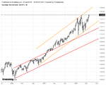
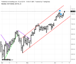
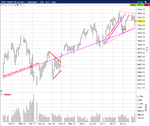
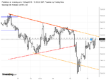
Remember why Wyckoff drew these channels in the first place. A chief reason was to provide a graphic display of overbought and oversold conditions, defined as those which drop below or rise above the channel (though Wyckoff didn't phrase it as such, this is what Steidlmayer was referring to with regard to value and how far traders will move away from it before returning to the median). Altering the trajectories of the upper and lower limits of the channel should be done only if absolutely necessary. Otherwise, all that information regarding overextension is lost and the channels become relatively useless.
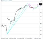
I know you follow this in real time, but take care not to draw these in hindsight just for the sake of shortcutting or summarizing anything. Knowing when to alter these channels in real time is challenging, and one has to focus on trader behavior as manifested in the bars rather than on lines. Even then, one can't be too eager to jump in. There will nearly always be tests of one sort or another.
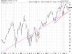
In this case, go back to your beginning, with the demand line drawn from February '16 to June '16. Draw a parallel supply line. This will stretch from April '16 to July '16 and beyond. Extend this line. Traders break through it the following February. Is this line tested afterward? When? What is the result of the test?
Those red channels aren't adding much to my understanding. Price has left the orbit and is so far away from them that I am not sure about the relevance.

