I have always found it very interesting, how many different ways people look at charts and all the different pieces of information people try to attain from a price chart. How could so many people look at the same chart and have so many different opinions? Fascinating.
With all the different schools of thought on money, markets, charts and so on, what should we really be looking for on a price chart? I mean, conventional technical analysis books have hundreds of pages in them with information on so many indicators, oscillators, chart patterns and more. With all this, there must be some edge to be gathered, right? I speak with thousands of traders around the world and everyone is trying to make something “work”. This is where I see most people get it very wrong. They spend more time trying to make the latest strategy or indicator “work” instead of taking a moment and thinking about how money is made and lost in the markets, because after all, isn’t that what everyone is really trying to figure out?
Let’s go down the simple and logical path for a moment and ask ourselves a few questions to make sure we are very focused on what information we need to get from a price chart:
Q) How are profits derived when trading or investing in a market?
A) Buy low and sell higher or sell high and buy lower.
Therefore…
Q) How do we buy low and sell high?
A) Figure out where price will turn and where it will go.
Therefore…
Q) How do we figure out where price will turn and where it will go?
A) Identify where willing demand exceeds willing supply and vice versa.
Which leads to the final question…
What does this look like on a price chart?
When we think in these simple terms, we see that the last question is all we need to focus on. The good news is, we have the answer. Beyond these questions, there is literally nothing else needed to consider when it comes to proper trading and investing, but most people don’t ever get to this level of simplicity because they are blinded by the illusion of complexity offered by the world of conventional technical and fundamental analysis, as well as so many opinions from various sources. Let’s look at a recent income trade.
Income Trade – 12th June 2017

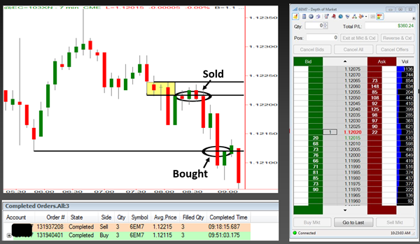
Notice the supply zone in the yellow box. Price was trading in a range and then fell from that level, telling me supply exceeded demand in that area (yellow box). I know this because the only reason why price would fall from that level is because supply exceeded demand; there can be no other reason.
The black line below is from that pivot low over to the left. While I would not call that a demand zone, there is likely some demand in that area which is why we have that low. So, I now know I have a profit zone from the new supply zone down to the black line. I gather all this information well before I enter the trade. Next, price rallies back up to that supply zone, meaning someone is buying after a rally in price and at a price level where the smart money is selling (supply/retail).
Like any smart buyer and seller of anything, I sold to whoever was buying at supply and profited from a decline in price. If this all sounds too simple, think again. From my experience, the biggest challenge people have is keeping it this simple. People, in general, are not comfortable with simple; we tend to over complicate everything. All the information you need to be a successful trader and investor is right in front of your eyes on the price chart, if you know what you’re looking for.
Sam Seiden can be contacted by email on this link: Sam Seiden
With all the different schools of thought on money, markets, charts and so on, what should we really be looking for on a price chart? I mean, conventional technical analysis books have hundreds of pages in them with information on so many indicators, oscillators, chart patterns and more. With all this, there must be some edge to be gathered, right? I speak with thousands of traders around the world and everyone is trying to make something “work”. This is where I see most people get it very wrong. They spend more time trying to make the latest strategy or indicator “work” instead of taking a moment and thinking about how money is made and lost in the markets, because after all, isn’t that what everyone is really trying to figure out?
Let’s go down the simple and logical path for a moment and ask ourselves a few questions to make sure we are very focused on what information we need to get from a price chart:
Q) How are profits derived when trading or investing in a market?
A) Buy low and sell higher or sell high and buy lower.
Therefore…
Q) How do we buy low and sell high?
A) Figure out where price will turn and where it will go.
Therefore…
Q) How do we figure out where price will turn and where it will go?
A) Identify where willing demand exceeds willing supply and vice versa.
Which leads to the final question…
What does this look like on a price chart?
When we think in these simple terms, we see that the last question is all we need to focus on. The good news is, we have the answer. Beyond these questions, there is literally nothing else needed to consider when it comes to proper trading and investing, but most people don’t ever get to this level of simplicity because they are blinded by the illusion of complexity offered by the world of conventional technical and fundamental analysis, as well as so many opinions from various sources. Let’s look at a recent income trade.
Income Trade – 12th June 2017

Notice the supply zone in the yellow box. Price was trading in a range and then fell from that level, telling me supply exceeded demand in that area (yellow box). I know this because the only reason why price would fall from that level is because supply exceeded demand; there can be no other reason.
The black line below is from that pivot low over to the left. While I would not call that a demand zone, there is likely some demand in that area which is why we have that low. So, I now know I have a profit zone from the new supply zone down to the black line. I gather all this information well before I enter the trade. Next, price rallies back up to that supply zone, meaning someone is buying after a rally in price and at a price level where the smart money is selling (supply/retail).
Like any smart buyer and seller of anything, I sold to whoever was buying at supply and profited from a decline in price. If this all sounds too simple, think again. From my experience, the biggest challenge people have is keeping it this simple. People, in general, are not comfortable with simple; we tend to over complicate everything. All the information you need to be a successful trader and investor is right in front of your eyes on the price chart, if you know what you’re looking for.
Sam Seiden can be contacted by email on this link: Sam Seiden
Last edited by a moderator:
