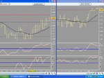
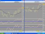
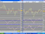
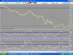
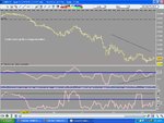
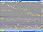
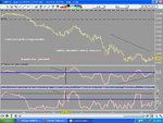
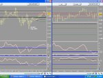
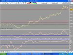
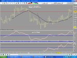
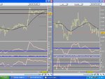
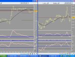
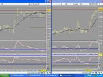
Last post of charts and this is what the cycle analysis has evolved into. By writing different codes in the pro real time the 'cycles' have turned into something a bit more visual.
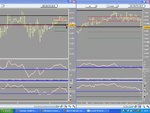
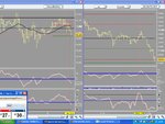
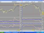
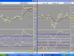
The chart on the left is around the 1 hour time frame and shows how powerful the set up is when both cycles line up and cross the blue line.
The chart on the right is a scalping chart and shows how selective you have to be. Sub five minutes.
You can see from the chart on the left the advance warning you get that the price cycle is about to change. The price is coming down while the first cycle indicator is starting to rise up from the overnight range. But the trade entry doesn't come until just before the usa open. Once it does happen though you only want to scalp trades in that direction on the scalping chart. Because even by taking all the 'right' signals you still get bad trades.
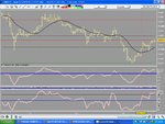
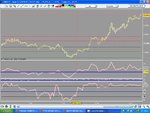
I'm saying 'scalp'. But some of these trades are going 20/40 points. These charts are ftse charts by the way. The left hand chart move was good for around 114 ftse points.

