Hi Andy,
Glad to hear you're trading with profits only - and that you can 'afford' to lose the £52k drawdown. It means your gonads only need to be made of steel rather than titanium! 😎
I understand your frustration with stops of any kind - I feel the exact same way myself. The problem is the rogue trade that refuses to play ball and just keeps going in the wrong direction until you receive a margin call from your broker. Sooner or later, your luck will run out. No prizes for guessing how I know! Still, if you have a hedging strategy in place to deal with these rogue bad apples in the barrel - fair play to you.
Now, with regard to your specific request for a technical indicator for exiting trades, there are any number - and I mean any number - of options. Hopefully, other peeps reading your thread will chip in with their suggestions. What I'm going to propose is incredibly simple, but it will take work on your part to fine tune. Additionally, it will require you to familiarise yourself with the basics of TradingView charting software - which is free to use in the way I outline - no need for a subscription. For the purposes of my illustration, I've used a daily chart, but the principles apply equally well to other time frames.
1. Open up a (daily) chart of the instrument to be traded in TradingView.
2. From the drop down menu, change the bars/candles to Heikin Ashi.
3. Under 'Indicators', search for 'Optimized Trend Tracker' (OTT). Of the options available, choose the Editor's Pick (EP) version by KivancOzbilgic.
4. Go into the indicator settings and change the 'OTT Period' to 1 and, also, the 'OTT Percent' to 1. Uncheck all the boxes under 'Inputs'. (Personally, I like the highlighter and have left that box checked - as you'll see from the attached charts, below.)
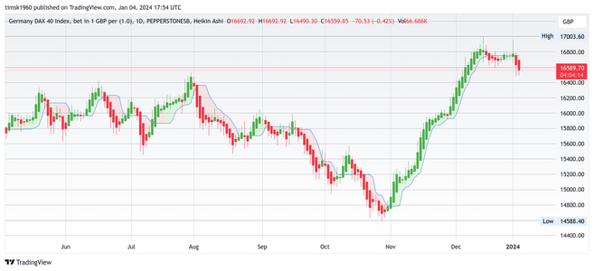
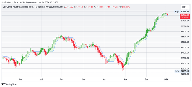
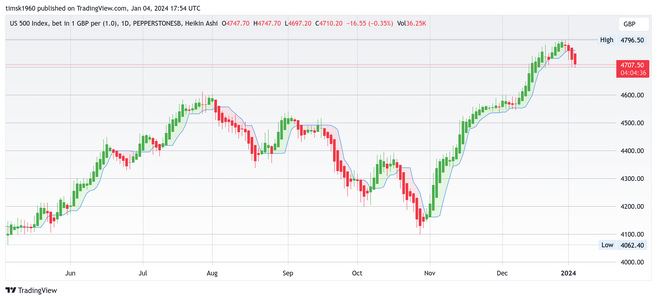
All the above sounds tedious and daunting, but trust me when I say you'll get there in a couple of hours (or less) and that if I can do it then anyone can! I'm not going to explain what Heikin Ashi candles are or what the indicator is or how it works. If you want to know, just punch them into Google (other search engines are available) and research them yourself. If you do all the above, you'll end up with charts that look - roughly / ish / mas o menos - like the ones I've attached, below.
The basic exit strategy rules could not be simpler . . .
If you're in a long trade, the candles will be green, highlighted in pale green and printing above the blue line. Exit the trade when the current candle turns red and price closes below the blue OTT line.
If you're in a short trade, the candles will be red, highlighted in pink and printing below the blue line. Exit the trade when the current candle turns green and price closes above the blue OTT line.
Don't close the trade unless and until both conditions are met. If you want to be cautious, you could close half the trade at the first red candle (in a long trade) and the other half of the position when price closes below the blue OTT line.
You can tweak the parameters of the indicator to your heart's content to find the settings that gels the best with your strategy. Needless to say, the more leeway you give the trade, then this can pay huge dividends in terms of the potential upside. The downside to this is that when price eventually turns against you and your stop is triggered, you'll have given up many, many points in profit. Also, it's a killer in range bound markets. So, here's what I suggest you do. . .
1. Of the profitable trades from your IG analytics, ignore the outliers and then work out the average profit of the 'normal' trades that represent the majority. This will give you a precise figure in £'s. This is your benchmark. I know you don't 'do' ratios, but trust me - this is important.
2. Using the chart set up outlined above and illustrated below, enter the trades as per the IG history data, and then use the simple methodology outlined above to determine where you could have exited the trade (as opposed to where you actually exited the trade). In some cases this will be before you closed the trade and in other cases after you closed the trade.
3. Do this with all trades in the historical sample and then total up the profits and compare them to the actual realised profits.
4. If the profits are less than what you achieved in reality, then the methodology is either fundamentally flawed or it needs tweaking to give trades more 'wiggle room'. This means changing the setting on the OTT indicator such that there are fewer closes above/below the blue line (which will be further away from price action).
5. With the new indicator settings, repeat the process - and again if necessary - until a better outcome is achieved.
6 This is called curve fitting and is problematic because it's based on the past and does not take account of the future and the fact that the markets are constantly changing in order to shake you off - much like a bronco shakes off a rodeo cowboy. So, before getting too excited at the potential profits - forward testing is required.
7. Assuming you arrive at a point where you can observe (to your complete satisfaction) that this methodology produces better profits on historical data than the one you're currently using then, as I say, the next step is to forward test it. Ideally, this would be done paper trading, i.e. not using your live account, in case there is some major glitch not apparent in the back testing.
8. If the forward paper trading goes well after a few months (or X number of trades), implement it using your live account using small stakes to start with until the methodology is proving to work consistently well over time.
I think that's all for the time being and gives you ample food for thought. Let me know if anything is unclear and requires further explanation. Hopefully, the charts attached below of the Dax, Dow and S&P will pique your interest sufficiently to give this a go. If not - no worries. As I say, others may have much better suggestions.
Tim.


