vil-trader
Newbie
- Messages
- 6
- Likes
- 0
Hi folks, just want to share with you all my ideas about the nowadays stockmarkets situation.
I write it here to discuss it and share ideas and maybe correct wrong calculations or interpretations.
I think the recent historical spike in the 12 months rolling Price to Earning Ratio is saying us that this market is unsustainable.
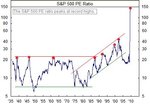
First of all, this is a chart about the PE ratio: (source: Chart of the Day - Dow Jones Index Charts + Gold, Oil, REITs, Sectors, Interest Rates, Economy, etc. - www.chartoftheday.com)
As you see, this chart usually shows quick spikes. From the beginning of the data to the mid 80s, an spike above 20 was an extreme reading. Later, the spikes are in a upward trend showing spikes each time higher. Nowadays the reading is 129.
Well, then I went to the Dow Jones IA to see where was the market in those hard spikes. To find the data of this readings in the PE you can go here: http://www2.standardandpoors.com/po...ices_500/2,3,2,2,0,0,0,0,0,0,5,0,0,0,0,0.html
Is a quaterly data and the last two quarters are not still delivered by S&P.
This exactly points are:
12/1938 PE= 20.64
06/1946 PE= 21.94
12/1961 PE= 22.43
06/1987 PE= 21.48
12/1991 PE= 26.12
06/1999 PE= 33.46
03/2002 PE= 46.45
The reason to select these points is to be extreme readings above PE 20. Just I see the spikes in the chart, and go to see how this extreme readings developed.
Of these 7 occasions 4 were all times markets highs: 1961,1987,1991 and 1999.
Other one was 1946, but still the market was below the 1929 high.
The other situations were after heavy bearish markets. 1938 and 2002. Exactly as today.
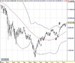
Better than show in a table what happened after these extreme readings in the PE, wich was the Maximum positive/negative excursión, the average loss or win, I think is better to just see the structure of the price.
The PE is about the sp500, but im showing here the Dow cause i have longer data. I know is not the same, but both market move quite close.
As you see in all those charts, this extreme readings in the PE is not a good new. 1938,1946,1961,1987 and 2002 markets suffered a sharp decline. 1987 still went 10% higher, but the extreme reading was very similar in september than in june.
1991 and 1999 had not sharp declines but, the perfomance a year after was not to launch fireworks.
As I said before, the only two markets are very similar to the actual one. A powerful bear market rally of a lengh around 6 months. You know what happened later.
Looks like in an extreme reading, to sell short is not a risky bet. Anwyay I think that trade the crash or a bearish market since the beginning, is needed a good set up for entry.
I continue with other post to describe the price structure in the two markets I think are the most similars to this one.
Attachments
-
 spikesabove20.jpg24.9 KB · Views: 746
 -
 elcrashqueviene1938.jpg143.9 KB · Views: 752
 -
 elcrashqueviene1946.jpg135.4 KB · Views: 1,075
 -
 elcrashqueviene1961.jpg142.2 KB · Views: 566
 -
 elcrashqueviene1987.jpg134.6 KB · Views: 998
 -
 elcrashqueviene1991.jpg132.5 KB · Views: 619
 -
 elcrashqueviene2002.jpg138.4 KB · Views: 557
 -
 elcrashqueviene1999.jpg149.1 KB · Views: 892


