Quick? on Wyckoff Analysis

diogenes13

Newbie
Messages
3
Likes
2
as of this posting the attached image is a current 4 hour candle chart of the ES ... i have marked out on the chart the 1. Preliminary Supply 2. Buying Climax 3. Automatic Reaction 4. Secondary Test . it appears as though the bars as it breaks through the top of the trading range that it is an UTAD or an upthrust after distribution ... the UTAD is far above the distribution channel. i have used the extremes of the buying climax and the automatic reaction as anchor points for the top and bottom of the distribution ranges which seems to extreme. the range doesnt seem to have a SOW after the secondary test and because i expect the market to continue upwards for "insert your reason" how would i be able to tell that this distribution range has become an accumulation range?

also in terms of Wyckoff or not, how do you deal with Ranges inside Ranges ... i can find a near unlimited number of them and with them all marked out at this range the chart becomes far too cluttered with over half a dozen support and resistance lines inside the main range. any suggestions on what can be ignored?
 

Attachments

  • Wyckoff Re-Accumulation.png
    Wyckoff Re-Accumulation.png
    182.9 KB · Views: 216
as of this posting the attached image is a current 4 hour candle chart of the ES ... i have marked out on the chart the 1. Preliminary Supply 2. Buying Climax 3. Automatic Reaction 4. Secondary Test . it appears as though the bars as it breaks through the top of the trading range that it is an UTAD or an upthrust after distribution ... the UTAD is far above the distribution channel. i have used the extremes of the buying climax and the automatic reaction as anchor points for the top and bottom of the distribution ranges which seems to extreme. the range doesnt seem to have a SOW after the secondary test and because i expect the market to continue upwards for "insert your reason" how would i be able to tell that this distribution range has become an accumulation range?

also in terms of Wyckoff or not, how do you deal with Ranges inside Ranges ... i can find a near unlimited number of them and with them all marked out at this range the chart becomes far too cluttered with over half a dozen support and resistance lines inside the main range. any suggestions on what can be ignored?
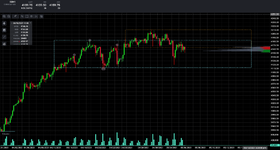
Don't become too distracted and misled by jargon. What looks like "preliminary supply", for example, is no different from other bars that result in a slight pullback. These are more easily labeled in hindsight than in real time. Nor is there anything "climactic" about the "buying climax" (therefore, there's no automatic reaction nor secondary test). Again, in hindsight one can see that price reverses and declines, but there's nothing climactic about the move. The key here is volume. Unless price rolls over as a result of exhaustion, the reversal will be accompanied by climactic volume and look more like a spike, and this isn't found here. Rather price declines due simply to lack of demand, or buying power. Volume does kick in on the 20th, which tells you that there is greater participation, and it reverses and rises, which tells you where the strength of that participation lies, i.e., with buyers. This is one of the indications that you're not looking at distribution but rather ranging. That this dynamic repeats itself on the 22nd suggests that you're just as likely looking at absorption, particularly since price reverses at the the level as on the 20th.

Focus more on the behavior of buyers and sellers and how that behavior is illustrated by price movement, as well as the degree of participation by buyers and sellers as illustrated by volume. Getting rid of the colors may help here.

Db
 
Top