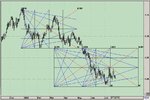
Gann Fan

aricho

Junior member
Messages
31
Likes
0
G'day everyone,

I have 3 large handdrawn charts, and no charting software.

I was wondering with the gann fan, how i would asjust it. It's supposed to be used on a ration of 1:1 for price and time. i.e. one square of time to one square of price.

for every bar on my chart it is two 2mm boxes. For price i have each box worth 2 points.

How do i adjust the angles to fit my chart?

Thanks for your help
 
2:1 was also a gann angle as well. as was 3:1 and 4:1. cant you just fit 2 bars into 1 box to fiddle things? if not, then just use the 2:1 angles.

every angle has its uses. just not the gann ones, IMHO.
 
Not sure how helpful this will be.

The first chart is EURUSD Daily with 2 Gann Fans in MetaStock with the Red fan showing the 'nodes'.
MS Help:
" Gann Angles are drawn between a significant bottom and top (or vice versa) at various angles. Deemed the most important by Gann, the 1 x 1 trendline signifies a bull market if prices are above the trendline or a bear market if below. Gann felt that a 1*x*1 trendline provides major support during an up-trend and when the trendline is broken, it signifies a major reversal in the trend. Gann identified nine significant angles, with the 1 x 1 being the most important:
1 x 8 - 82.5 degrees 1 x 4 - 75 degrees 1 x 3 - 71.25 degrees 1 x 2 - 63.75 degrees
1 x 1 - 45 degrees 2 x 1 - 26.25 degrees 3 x 1 - 18.75 degrees 4 x 1 - 15 degrees
8 x 1 - 7.5 degrees
Note that in order for the rise/run values (e.g., 1 x 1, 1 x 8, etc.) to match the actual angles (in degrees), the x- and y-axes must have equally spaced intervals. This means that one unit on the x-axis (i.e., hour, day, week, month, etc.) must be the same distance as one unit on the y-axis. The easiest way to calibrate the chart is make sure that a 1 x 1 angle produces a 45 degree angle.
Gann observed that each of the angles can provide support and resistance depending on the trend. For example, during an up-trend the 1*x*1 angle tends to provide major support. A major reversal is signaled when prices fall below the 1 x 1 angled trendline. According to Gann, prices should then be expected to fall to the next trendline (i.e., the 2 x 1 angle). In other words, as one angle is penetrated, expect prices to move and consolidate at the next angle. "

Second chart is from Advanced GET showing the Gann Box. Using 'fixed increments', different sized boxes can be drawn and a small box has been used to illustrate what I believe to be the box's superiority to the fan. Besides Advanced GET, Ensign Software has a Gann Square, see Newsletter scroll down to Tools: http://www.ensignsoftware.com/

AG Help:
" The Gann Box can be used in a variety of individual ways. One recommended method of drawing the Gann Box is to take the previous Major Pivot point (usually the end of the last 5 Wave sequence) and draw it so that the 1 X 1 line follows the current market support areas to a good degree. This is a very subjective method of drawing the Gann Box, but experience will teach you the best origin for the Gann Box. Also, try using in conjunction with Auto GANN Angles.
Menu Functions: The Colors selection list allows you to change the color of the 1 X 4, 1 X 2, 1 X 1, 2 X 1, and 4 X 1 lines that comprise the Gann Box.
The Scaling: selection list allows you to choose between a Gann Box made using Fixed Increments for scaling and a Gann Box drawn using a Free Form scaling. The Fixed Increments scaling is used when you want the Gann Box to be drawn with the computer generated fixed interval patterns that are built into GET. This is the setting that is most often used by the individuals at Trading Techniques, Inc. The Free Form scaling should be used when you want the Gann Box to be drawn at any scale and in any increment that you want. With the Free Form scaling, you have total control on the size of the box.
" . . . uses the Gann Box from a major pivot, he then makes the 1 X 1 line plot near the trading opportunity, and he makes sure to plot the box in 45 bar increments 45, 90, 135, 180, 225. The number on the top left is the points from the bottom of the box, and the number in the lower right is the bars from the start of the box to square."
 

Attachments

  • g f.jpg
    g f.jpg
    90.7 KB · Views: 1,516
  • g b.jpg
    g b.jpg
    110 KB · Views: 8,433
My first post here.

I don't want to confuse things but you might want to consider scaling either your chart or Gann fann lines based on the ratio between a recent high to low or low to high move. For instance in the chart below I am establishing my gann fann angles from the High on 7/21 to the Low on 7/27 - ie 192 time increments in 288 price increments. This yeilds a ratio of 1.5 (288/192) by which I multiply my angles. The 45° degree line I have labeled is much different than the typical 1:1 line that most charting software would lead you to believe is the 45° line when in fact the true 45° is much different. As you can see the 30° was also important.

For charting purposes I don't scale my charts I just scale my Gann Lines. Another benefit of this method is that you are one step short of establishing the hypotenues length by which to expect an end of trend but this is a different subject.

Hope this helps.
 

Attachments

  • eursd_080305.gif
    eursd_080305.gif
    14.2 KB · Views: 1,389
Gtor would you throw up a chart displaying the hypotenues length and describe the methodology.

I work with the HH/LL but also with the HC/LC and find the H/L C often the correct point to be using, do you use only the HH/LL ?
 
As to HH LL versus HC LC, I use the price that follows a clear delta in angle. For the example I have the delta between 12250 and 11964 is about 75° (I trade forex-EURUSD) maybe it's supposed to be 72° = 360°/5 - close enough.

As to the hypotenuse, what you are doing is using the Pythagorean theorem to solve and find a Time-Price Length equal to the begining Time-Price Length which is squared to equal a 45° move. So for the 192(time) in 288(price) move the ratio is 1.5. Since we are workig in pips the 45° factor for price is 6666.67 = Price / (Time/10000). The hypotenuse length is sqrt(2*(192^2)) = 271. Now we just wait for price and time to move to a length that is equal to 271 using our ratio. You essentially establish a radius around the low to act as resistance and a radius around the high to act as support. I have shown the resistance lines at 1/4 intervals the two blue radii are the 1*hypotenuse and 2*hypotenuse radii. The price turned at each one as well as many of the 1/4 increments.

Hope this helps.
 

Attachments

  • eursd_hyp.gif
    eursd_hyp.gif
    15.7 KB · Views: 3,903
Hi Gtor, thanks for the chart and explanations.

Interesting that what I'd describe as the B wave of an ABC hits the first Blue line — not the first H, whereas the 5th wave ? top ? hits the 2nd Blue line.

Will experiment with your methods, thanks for sharing.
 
man.. i'm totally blur... may i know step by step how to construct these fans and how to read the values? i'm clueless..
 
disagree on the gann fan, a lot of the time it's constructed wrongly using degrees. IMO degrees have nothing to do with it, hence why a lot of the time the fan doesn't tend to work.

Also, trendlines are different, if everyone else can see it then it's a trendline (ie line drawn between two points) and if everyone sees it it will work long enough to suck you in.

If you adjust angles to fit the chart or vice versa, then you see what you want to see....not what the chart wants you to see.

Each item should be analysed individually and has it's own code in terms of angles, regardles of the timescale you are monitoring. An item can follow 2 points per 1 day regardles of whether you are looking at a daily weekly or monthly chart.

Here's a recent top aticle from IC:
The Gann plan for spread-betting success - Investors Chronicle
 
Top