The Average True Range (ATR) indicator is one which falls in the general category of volatility-based technical analysis tools. It is so because like Bollinger Bands, another volatility-based study, it does not focus on direction in any way, but rather how much raw movement there is in price. To understand this a little better, it is worth taking a look at how the indicator is calculated.
ATR Calculation
The ATR calculation starts with determining the True Range (TR). The TR for a given period is defined as being the largest of:
ATR is the average of the True Range (TR) over the past n periods. This is calculated the same as any standard simple moving average. The default setting is generally 14 periods.
As can be seen by examining the determination of TR, the study is attempting to capture the amount of actual price moment which has taken place during a trading period, which differs somewhat from the trading action. The latter could be defined as where the market actually traded during the course of a trading period, but the former actually takes in to account price gaps between periods.
It should be observed that ATR as calculated is not in any way normalized. That is to say because it is purely a price measure, ATR cannot easily be used to compare different securities as the indicator's readings would expected to be different for instruments with different prices. For example, one would expect ATR to be significantly higher for a stock trading at 100 than for one trading at 20.
In order to compare ATR across securities, or even across timeframes for the same security, it would have to be normalized. This can be accomplished by dividing the ATR by some current price measure such as the most recent close or a moving average. That would given a reading of ATR as a percentage of whatever that standard divisor is. So if ATR on a 100 stock is 5, then the normalized ATR would be 5% (assuming the close is used for the calculation).
We can look at the following example of the monthly S&P 500 chart which has both standard ATR (middle) and a normalized ATR plotted (lower).
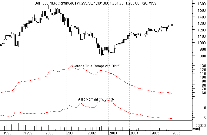
Notice how the normalized ATR flattend out in late 1998 even as standard ATR kept rising. That is an indication that while the absolute price moves were still on the rise, on a relative basis they were not.
ATR Plotted
The graphic below depicts ATR plotted for the S&P 500 futures over a recent period. A candlestick chart has been utilized to better outline the range for each trading day. Notice how the ATR line in the middle of the graph rises when there is a preponderance of large candles as during the latter part of October, then falls when the ranges contract during the uptrend which follows.
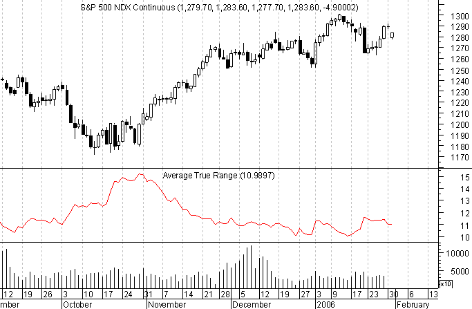
Take note of the fact that in the high volume period during December, ATR was falling because the price movement was limited. That serves to underline how it is not trading activity, but rather price movement which is measured by ATR. The two do not necessarily go hand-in-hand.
ATR Interpretation
Welles Wilder, the originator of ATR (see New Concepts in Technical Trading Systems) reported that he found high ATR values often occurring at market bottoms following a "panic" sell-off. That can be seen in the previous chart where ATR was rising during the market's sell-off and throughout the choppy bottom phase which followed.
Low ATR values, according to Wilder, are often found during extended sideways periods, such as those found at tops and after consolidation periods. That can also be seen on the S&P 500 chart during the December consolidation following the November rally. And as we noted, ATR can also be low (or at least falling) while a market trends if it does so in a steady, if unspectacular fashion, like in the case of the stock index example.
ATR as a Trailing Stop
In his book, Trade Your Way to Financial Freedom, Van Tharp put forth the idea of using ATR as a kind of trailing stop. Since ATR is a point measure, it can be applied to current price to determine approximately how far the market is likely to trade in a given time period. For example, if one were long, a stop could be placed at the last period's close minus the ATR reading. Assuming that close was 100 and ATR was 5, the stop would be at 95.
Now Tharp does not necessarily propose that ATR itself be used straight-up in this fashion. Rather, ATR would have to be multiplied by some factor. He uses 1.5 quite a bit, but that is by no means a hard and fast rule. The idea behind using ATR as a volatility stop, which is what Tharp is suggesting, is to identify a point which represents an unusual move. Such action is likely to suggest some kind of shift in the market, such as a trend change or cessation.
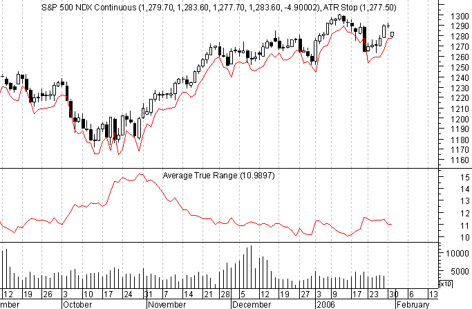
The chart below is the same S&P 500 one as shown before, this time with a trailing sell stop of 1 x ATR plotted (Metastock formula: Ref(CLOSE, -1) - Ref(ATR(14),-1) ).
An Observation
Bringing back the earlier plot of the monthly S&P 500 futures (continuous contract), this time condensed to go back a bit further, there is something interesting to note.
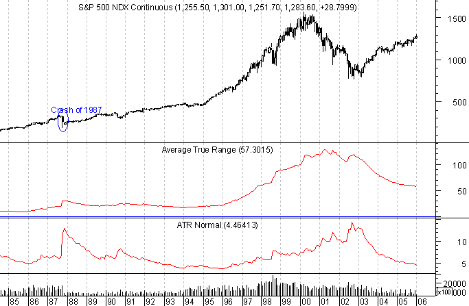
Take a look at the ATR spike from the Crash of 1987, which is especially pronounced on the lower normalized ATR plot. After that surge with the excption of one little blip in late 1990, ATR dropped off steadily in the normalized reading, thought not quite so dramatically for standard ATR. It took basically until 1996 before the ranges started to expand once more, by both measures. That's nearly 10 years, which is how long it took for the individual traders and investors to get over teh Crash and start playing the market again.
Fast forward to the market peak in 2000. Standard ATR did not peak until partway in to the decline early in 2001, and the normalized reading didn't top out until near the market bottom in 2002. Since then, both have dropped of steadily. Because of the significantly higher index value of the S&P now, ATR will not get down to the lows it reached in the mid-1990s, but normalized ATR is a different story. As of the end of January 2006 it was at a point just 0.8% above where it bottomed out in 1995.
Could it be that we are near to the end of the relatively narrow ranges seen the last few years? Only time will tell, but we can already see that private investors are not nearly as frightened as they were in the early 1990s, and there is still an awful lot of retirement account money being pumped in to the markets. It might take a couple of years yet, but before long those trading ranges will expand again and things will get really exciting once more.
ATR Calculation
The ATR calculation starts with determining the True Range (TR). The TR for a given period is defined as being the largest of:
- Current Period High minus Current Period Low
- Current Period High minus Previous Period Close
- Previous Period Close minus Current Period Low
ATR is the average of the True Range (TR) over the past n periods. This is calculated the same as any standard simple moving average. The default setting is generally 14 periods.
As can be seen by examining the determination of TR, the study is attempting to capture the amount of actual price moment which has taken place during a trading period, which differs somewhat from the trading action. The latter could be defined as where the market actually traded during the course of a trading period, but the former actually takes in to account price gaps between periods.
It should be observed that ATR as calculated is not in any way normalized. That is to say because it is purely a price measure, ATR cannot easily be used to compare different securities as the indicator's readings would expected to be different for instruments with different prices. For example, one would expect ATR to be significantly higher for a stock trading at 100 than for one trading at 20.
In order to compare ATR across securities, or even across timeframes for the same security, it would have to be normalized. This can be accomplished by dividing the ATR by some current price measure such as the most recent close or a moving average. That would given a reading of ATR as a percentage of whatever that standard divisor is. So if ATR on a 100 stock is 5, then the normalized ATR would be 5% (assuming the close is used for the calculation).
We can look at the following example of the monthly S&P 500 chart which has both standard ATR (middle) and a normalized ATR plotted (lower).

Notice how the normalized ATR flattend out in late 1998 even as standard ATR kept rising. That is an indication that while the absolute price moves were still on the rise, on a relative basis they were not.
ATR Plotted
The graphic below depicts ATR plotted for the S&P 500 futures over a recent period. A candlestick chart has been utilized to better outline the range for each trading day. Notice how the ATR line in the middle of the graph rises when there is a preponderance of large candles as during the latter part of October, then falls when the ranges contract during the uptrend which follows.

Take note of the fact that in the high volume period during December, ATR was falling because the price movement was limited. That serves to underline how it is not trading activity, but rather price movement which is measured by ATR. The two do not necessarily go hand-in-hand.
ATR Interpretation
Welles Wilder, the originator of ATR (see New Concepts in Technical Trading Systems) reported that he found high ATR values often occurring at market bottoms following a "panic" sell-off. That can be seen in the previous chart where ATR was rising during the market's sell-off and throughout the choppy bottom phase which followed.
Low ATR values, according to Wilder, are often found during extended sideways periods, such as those found at tops and after consolidation periods. That can also be seen on the S&P 500 chart during the December consolidation following the November rally. And as we noted, ATR can also be low (or at least falling) while a market trends if it does so in a steady, if unspectacular fashion, like in the case of the stock index example.
ATR as a Trailing Stop
In his book, Trade Your Way to Financial Freedom, Van Tharp put forth the idea of using ATR as a kind of trailing stop. Since ATR is a point measure, it can be applied to current price to determine approximately how far the market is likely to trade in a given time period. For example, if one were long, a stop could be placed at the last period's close minus the ATR reading. Assuming that close was 100 and ATR was 5, the stop would be at 95.
Now Tharp does not necessarily propose that ATR itself be used straight-up in this fashion. Rather, ATR would have to be multiplied by some factor. He uses 1.5 quite a bit, but that is by no means a hard and fast rule. The idea behind using ATR as a volatility stop, which is what Tharp is suggesting, is to identify a point which represents an unusual move. Such action is likely to suggest some kind of shift in the market, such as a trend change or cessation.
The chart below is the same S&P 500 one as shown before, this time with a trailing sell stop of 1 x ATR plotted (Metastock formula: Ref(CLOSE, -1) - Ref(ATR(14),-1) ).

An Observation
Bringing back the earlier plot of the monthly S&P 500 futures (continuous contract), this time condensed to go back a bit further, there is something interesting to note.

Take a look at the ATR spike from the Crash of 1987, which is especially pronounced on the lower normalized ATR plot. After that surge with the excption of one little blip in late 1990, ATR dropped off steadily in the normalized reading, thought not quite so dramatically for standard ATR. It took basically until 1996 before the ranges started to expand once more, by both measures. That's nearly 10 years, which is how long it took for the individual traders and investors to get over teh Crash and start playing the market again.
Fast forward to the market peak in 2000. Standard ATR did not peak until partway in to the decline early in 2001, and the normalized reading didn't top out until near the market bottom in 2002. Since then, both have dropped of steadily. Because of the significantly higher index value of the S&P now, ATR will not get down to the lows it reached in the mid-1990s, but normalized ATR is a different story. As of the end of January 2006 it was at a point just 0.8% above where it bottomed out in 1995.
Could it be that we are near to the end of the relatively narrow ranges seen the last few years? Only time will tell, but we can already see that private investors are not nearly as frightened as they were in the early 1990s, and there is still an awful lot of retirement account money being pumped in to the markets. It might take a couple of years yet, but before long those trading ranges will expand again and things will get really exciting once more.
Last edited by a moderator:
