Technical Analysis The Picture of Imbalance

image00139.png
In my early days, I was always fascinated by the gap in the financial system between those who know what they are doing and profit, and those who don’t and lose money. It was really fascinating, big strong institutions made so much money and were correct most of the time. At the same time, retail traders and investors were equally wrong most of the time and lost tons of money. If I could just figure out how and why an institution made the trading decisions they did, maybe one day I could reap the same rewards was my thinking. I also spent time figuring out why retail traders performed so poorly, that was actually very easy to do. Without going into too much detail, I also realized that most retail traders and investors learned to speculate in markets the exact same way and commit the same simple mistakes over and over that inevitably led to their consistent losses which in turn became an institution’s profits. One thing I have paid close attention to in my many years of writing articles is to make sure I did not spend much time writing about popular concepts and strategies that most people learn and use. If I did, there would be no point in reading the article because those popular strategies tend to lead to losses, not profits.

To accomplish this however means suggesting ideas, concepts, and strategies that sometimes fly in the face of conventional wisdom. What I have found over the years is that simply questioning anything conventional often exposes a flaw and most importantly, opens the door of opportunity so many search for but never find.

Today, let’s question conventional wisdom when it comes to price, market timing, volume, and time itself. Specifically, I am referring to what happens to price at key market turning points. The goal of any market speculator is to identify where and when the market is going to turn, before it turns and where it is going to go, before it goes there. That is the only way to truly attain low risk, high reward, and high probability trading opportunities. To make a long story short, markets turn at price levels where supply and demand are “most” out of balance. In other words, the more out of balance supply and demand is at a price level, the stronger and more probable the turn in price. So, how do we identify these levels on a price chart? Today, let’s focus on one specific issue when it comes to identifying key supply and demand levels because as we know, this is where prices turn. Time and volume are two important issues when it comes to conventional Technical Analysis. For example, the Technical Analysis books tell us when looking for key “support” and “resistance” levels, we should look for areas on the chart that have “plenty” of trading activity, many candles on the screen, and “heavy” volume. They strongly suggest we should look for support and resistance levels that have many candles in the area and above average volume. This type of level on a chart to the eye does look good but is this the best answer when attempting to identify key market turning points, a supply and demand imbalance?

When you think the simple logic through, I think you will find that actually, conventional Technical Analysis has it wrong and the real answer is actually the opposite. We just concluded that the most significant turns in price will happen at price levels where supply and demand are most out of balance. Think about it, at price levels where supply and demand are most “out of balance,” will you see lots of trading activity or very little trading activity? If you said very little, you are correct. This is because of the big supply and demand imbalance. At that same price level, you have the potential for the most activity but the reason you don’t get much trading activity is because all that potential is on one side of the market, the buy (demand) or sell (supply) side. So, what does this picture look like on a price chart? It’s not many candles on a screen like conventional technical analysis suggests, it’s actually very few. Furthermore, this picture is not going to include above average volume, it’s going to be very low volume most of the time.

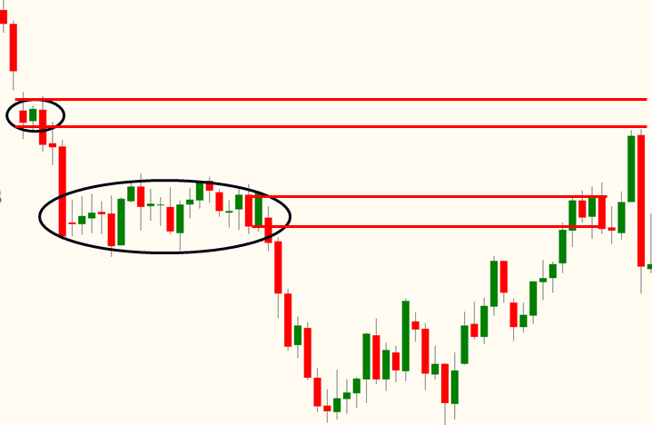
The chart below represents exactly what I am suggesting in this piece. The circled area with many candles is what conventional technical analysis would suggest is a strong “resistance” level. This is because of the high amount of trading activity, the many candles on the screen, and so on. When price does rally up to that level, it does stall and stay there for a bit because there is some supply at that level. However, with that much trading activity at that level, there CAN’T be a significant supply and demand imbalance.

Eventually price rallies up through that level and reaches an area of congestion most people would ignore. They would ignore it because they would think there is so little trading activity there, it can’t be a good level. That my friends is EXACTLY why it is a strong supply level but people don’t think that was because of conventional technical analysis. As you can hopefully now understand, that lack of activity is what makes it such a strong demand level.

a strong demand level

Always remember, we don’t care about where price traded, which is what charts show us clearly. What we do care about is where price could NOT trade at or when it traded there, it was only for a very short period of time. In other words, we are not looking for filled orders which is what charts show us, we are looking for significant unfilled orders. This is the key to low risk, high reward, and high probability trading and investing. As I have said before, don’t be afraid to question something everyone believes to be true. If something doesn’t make logical sense, there is probably a better answer that does. By thinking the simple logic through, you will almost always arrive at truth.

Sam Seiden can be contacted on this link: Sam Seiden
 
Last edited by a moderator:
Very good points. I have also noticed that trending stocks tend to have low volatility and low volume. Of course, there may be a blip upward in both volatility and volume at the start of an up trend or downtrend, but that quiets down once the trend is established. It then reappears once the trend is about to end or reverse. Bottom line: low volatility can be associated with steady changes in price, which must be due to imbalance in urgency on one side or ther other of the transaction.
 
Sam Seiden is a very suddessful trader, lecturer and a mentor. I had the pleasure of attending couple of his lectures , few of his live webinars which convinced me to spend some hard earned money to attend his school - OTA.
 
Trade Seeker

Usually you will have a smaller price range than normal(squat) and volume is below average (30 day). Then price will move quickly away from that price area, and Mr. Seiden has done a very good job of describing this price action.
 
Sam Seiden is a very suddessful trader, lecturer and a mentor. I had the pleasure of attending couple of his lectures , few of his live webinars which convinced me to spend some hard earned money to attend his school - OTA.

No need to attend his school. Everything you need is at fxstreet. Simply superb!
 
It seems to me that Sam's chart makes both his point but also the one he's trying to disprove, or have I got this wrong?

Sam suggests we attach more significance to the ealier consolidation zone on the chart than conventional TA says we should. And, having learned that lesson, we would then not be caught long when price returns to that level at the right edge of the chart and fails to break through.

Avoiding a bad trade is a good skill to have. But look at the second, much more extended consolidation zone. Not unexpectedly, price drops out through this to resume the downtrend and offers a nice shorting opportunity. Conventional TA says wait for price to break down and go short, and there's no error in doing this here.

Price rallies back into the second zone and again gets trapped in a range there. What I see here is that the second stay in this zone has only emphasised its significance and this should make me distrust any upside break-out. It also m,akes a double top, failing to make a higher high. In fact, price does make an upside break-out but only for 1 bar, then immediately collapses and makes a downside break-out: the subsequent shooting star suggests there's more selling to come. But my point is you wouldn't have been going long anyway, it was just too likely to be a false move, whether or not there was an atypical consolidation zone overhead or not.

The extended zone ie second one down, has many bars so most likely most orders (supply) got filled, hence the higher supply level more likely to work out due to less activity. Unlike trad SR, levels become weaker with more activity as orders get absorbed. Whilst Sam doesn't emphasise htf in this case , putting it into a higher time frame context will add momentum to any valid levels on smaller tf's near htf extremes. Its not an exact science but works out pretty well most days.
 
Top