Introduction -
There are occurrences in the business cycle when the consensus of my proprietary primary trend indicators find themselves within the confines of the bearish camp. Unfortunately, now seems to be one of those occasions. The last time the technical, economic, and monetary indicators aligned themselves in such a negative way was the turn of the millennium. Then, as now, for the benefit of my subscribers, and their valued clients and investments, I feel duty-bound to publish a Special Report setting out the arguments for the impending scene about to unfold.
In early 2000 it like the market was at, or close to, a secular or very long-term peak (albeit if not in absolute price terms, certainly in inflation-adjusted ones). Since then, the S&P has failed to take out its 2000 high; and deflated for commodity prices, actually came extremely close to a new (secular) bear market low in May of 2006.
Before setting out the current cycle's negative case though, we must first step back and re-examine the market's secular, or very long-term, technical position. It's also important to understand that while the position of the long-term indicators look extremely ominous from a primary trend point of view, they have not been confirmed with a negative 12-month moving average crossover by the S&P. And until that happens, assume the primary uptrend is intact.
At the end of June, the average is expected to be around 1255, which is about where the average was in mid-June when this report was completed. However, it requires a monthly closing price for a signal.
Secular Trend in Stock Prices -
Stock prices have undergone a series of secular up and down trends since the mid-nineteenth century. These very long-term price movements can survive through several business cycles and have often taken the form of strong multi-year bull markets, such as the 1920s, 1980s, and 1990s. On the other hand, secular "bear" markets have been more subdued and often show up on the charts as multi-decade sideways trading ranges. When adjusted for inflation though, these "trading ranges" turn out to be major bear markets where the purchasing value of stocks has been decimated.
Peaks in optimism and troughs of pessimism establish secular inflection points. And what better way to measure this concept than price-earnings ratios? After all, when investors are willing to purchase stocks with a high valuation, they are obviously confident and optimistic. In these situations, prices have typically been moving up for a decade or so, which means that confidence is extremely high and carelessness takes over from sound money management principles. The only reason they literally give them away when valuations are in the basement is because they have little or no hope for the future. Bearing this in mind, Chart 1 shows Robert Shiller's Price-Earnings Ratio between the late nineteenth century and the turn of the millennium.
Using the P/E Ratio, there have been four peaks in sentiment since 1870. I chose those that developed in excess of 22.5, and labeled them with the numbers 1, 2, 3, and 4. These peaks developed around 1900, 1969, 1966, and 2000, respectively. Generally speaking, when crowd psychology reaches such an extreme (flagged by the high price-earnings numbers), it either takes a long time, considerable price erosion, or both, along with a total disgust with equities before the psychological pendulum can swing sufficiently in the opposite direction to lay the foundation for a new secular bull market. Troughs are signaled when the Ratio falls below 7.5; i.e., at times when the market offered exceptional values (they are labeled A, B, and D). C1 and C2 also offered timely long-term entry points.
caption: Chart 1. See Chart 1A for more detail.
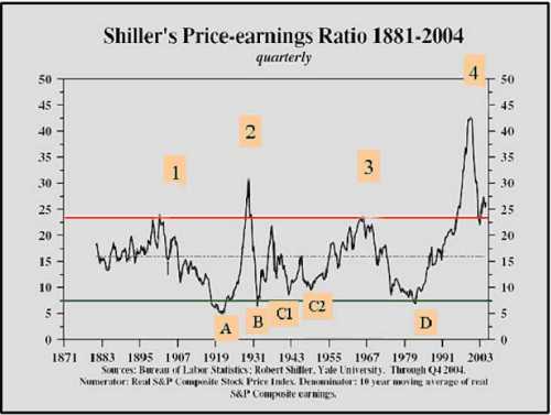
caption: Chart 1A: Showing the comparison between Stock Prices and Shiller's Price Earings Ratio in more detail.
These enormous pendulum-like swings indicate that the law of action and reaction for market activity is very much in force. The longer a psychological trend takes to build, the greater the magnitude and duration of the corresponding change in sentiment is in the opposite direction.
To demonstrate this concept I overlaid the numbers and letters from Chart 1 on to Chart 2. It took the 8-year bull market in the 1920s to build up the drunken euphoria that was present at the 1929 top. The actual low was seen three years later in 1932, but the psychological damage, in the sense of people expecting the other shoe to drop, continued for decades. It took about 2½ generations before confidence was fully restored and the market was able to begin the bull trend of the 1980s and 1990s. In terms of prices, it was not until the mid 1950s that the 1929 peak was surpassed. It's also interesting to note that a substantial, and long- lasting, bull market followed each period when the Price-Earnings Ratio was exceptionally low.
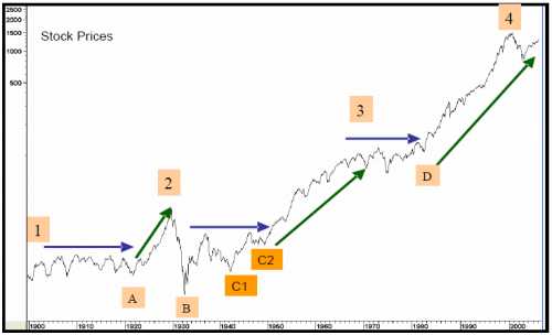
caption: Chart 2.
You may be thinking investors got off lightly following peaks A and C, since the market resolved its corrective period with an extended trading range rather than a sharp 1929/32 type decline. However, when equity prices are deflated by commodity prices, we can see the real damage that took place. This is shown in Chart 3, where the numbers and letters from Chart 1 have been overlaid on "real" stock prices.
I'm sure you can now appreciate that the 1900/1921 period was an exceptionally bearish one, especially towards the end. So was the 1966/82 period, although the actual peak in this inflation-adjusted series was 1968. The 1929/49 period is also an interesting analysis. The actual low developed in 1942, although the 1949 bottom was not much higher. In effect, the whole bearish inflation-adjusted trend lasted twenty years, the longest on record. The 2000 peak in the P/E Ratio was the Stock Prices highest, and most distorted on record. If the past is a prelude to the future, it's unlikely that real stock prices will see the levels attained in 2000 until well into the 2010/20 period.
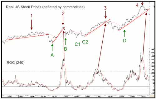
caption: Chart 3
Finally, the Stock/Commodity Ratio broke below its secular up trendline in May, 2006. There are only five periods when it is possible to construct a meaningful trendline since 1800. This is a very important event because the average drop following a secular trendline break in this Ratio is around 60% and lasts roughly 8 years.
It's a little known fact that there's definite correlation between sentiment and momentum measures, or "oscillators". (To learn more about oscillators, peruse Momentum Explained, Volume I.) This means we can use the momentum of stock prices as a substitute for sentiment when sentiment data is unavailable. For example, you can see that prices (psychology) have moved too far in one direction by plotting the annual level of equity prices against a trend deviation indicator. The indicator in this case is a 12-year moving average (MA) divided by a 3-year time span. Charts 4 and 5 display what happens when the data of the two averages are identical; the oscillator is plotted at zero. Since we're using annual data, we're not expecting precise timing, but the indicator's peaks and troughs nevertheless offer useful benchmarks of the market's long-term temperature.
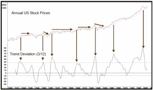
caption: Chart 4.
The late 1930s signal proved to be the only one of the nine since 1800 to be a whipsaw. Given that markets spend more time rising than falling, the benchmark has been raised from 10% to 35%, so momentum sell signals are triggered when the oscillator peaks. These sell signals are flagged with the downward pointing arrows in Chart 4. In some instances the peaks are followed by multi-year trading ranges rather than actual declines, but nominal prices still had a hard time advancing after the signal had been given.
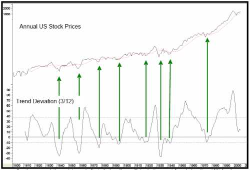
caption: Chart 5. Secular accummulation points are indicated where the oscillator bottoms out from below the -10% level.
Now the Ratio has triggered its seventh sell signal. While it may not be an indication of a major bear market, the oscillator's record certainly suggests that the range. Perhaps most importantly of all is what I call the "pendulum principle", which is based on the observation that every sell signal since the early nineteenth century has been followed by an oversold reading before a new secular bull market could get underway. With the indicator still quite a ways above zero, the market clearly has plenty of downside potential before another oversold reading can be generated. In layman's terms, the pendulum still has a long way to swing before investors return to the mood of total disgust with equities that precedes a secular bull market. And this is what brings us to the current picture. (Techniques for identifying reversals in the secular trend of bonds, commodities, and stocks, can be found in The Investor's Guide to Active Asset Allocation.)
The State of the Current Bull
How does the current bull market stack up against previous rallies in a secular bear trend?
There are two big differences between a primary bull market in a secular uptrend and a primary bull market that develops under the backdrop of a secular trading range, or bear market. The "secular uptrend" bull is typically far greater in magnitude and duration, while the "secular downtrend" bull is usually much more subdued. Taking the 1900/21 and 1966/82 periods, the average duration, based on month-end closes, was 27-months for an average gain of 51%. The longest bull market began in 1903 and lasted for 35-months. And the biggest rally, which began in 1907, was followed by a gain of 65%.
The most recent bear market low developed in October 2002, although there was a test in March of 2003, when many other world markets touched their final lows. If we use the October date with an April 2006 high, we come up with a record duration of 42-months for a gain of 61%. If we substitute March 2003 as the low, the duration and magnitude of the rally up to April 2006 was 37-months with a 56% gain, respectively. If the secular bear market or trading range scenario is valid, a cyclical bear market is clearly way overdue, whichever low is used.
Incidentally, the average bear market for both the early- and mid-century periods lasted about 18-months, and prices lost approximately 28% of their value in absolute terms. The average duration was actually a bit longer because the unusually long 59-month decline that took place between 1909 and 1914 was omitted from the calculation. Projecting this average 28% decline would place the S&P Composite at approximately 940 - just below the October 1998 bottom of 966 and almost right at the rally peak separating the late 2002 and early 2003 lows
The Four-year Cycle
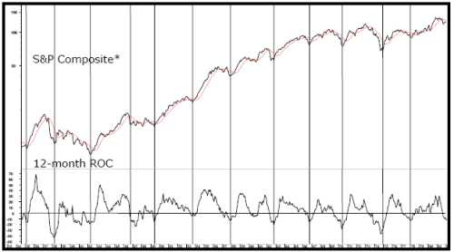
One of the most consistently reliable economic cycles over the last seventy years is the Four-year Cycle. Its premise is that approximately every four years, the market presents us with a major buying opportunity. Normally, the opportunity develops at the end of a bear market, but there have been exceptions such as 1986 and 1998, when the opportunity occurred after a quick decline or extended consolidation. In these instances, the "low" represented a correction in what turned out to be an ongoing bull market. The vertical lines in Chart 6 flag these cycle lows since the 1930s. Sometimes the low occurred at the end of the year preceding the expected low; e.g. 1953, and sometimes a little after; e.g. 1935. This explains why the lines in the chart are not equidistant. The previous four-year low was in 2002, while European markets bottomed in early 2003. That means that cyclically, either this year, or early next, is set to be a low. The chart also shows that in most cases, the market peaks in the year prior to the expected cycle low.
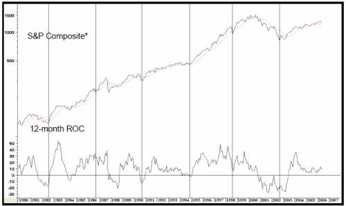
caption: Chart 6. Vertical lines show 4 year cycle lows - See Chart 6A for more detail.

caption: Chart 6A. Vertical lines show 4 year cycle lows.
In quite a few instances though, when the market tops out in the same year, the decline is short, quite sharp, and invariably unexpected. This scenario took place in 1946, 1990, and 1998, although 1986 was the exception.
The Typical Stock Market Cycle
The four-year business cycle has been reliably tracked since the beginning of the 19th century, when statistical data first became available to track it, cycling through a set series of chronological sequences beginning with an improvement in the financial indicators. The process continues with a revival of leading interest-sensitive indicators such as housing right through to lagging sectors such as capital spending. The financial markets (bonds, stocks, and commodities) also form part of this sequence. Figure 1 displays how the various components have usually peaked and troughed throughout its 200-year history.
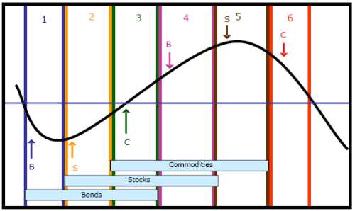
caption: Figure 1.
The sine curve represents the path of economic growth or contraction, and the horizontal lines separate expansionary periods from contractionary ones. Because historically, an economy undergoes a chronological sequence of events during a complete cycle, it's possible to identify turning points for various financial and economic indicators as well as bonds, stocks, and commodities. Figure 1 shows the idealized periods for the three financial markets; bonds, stocks, and commodities. The financial market sequence usually develops without fail, even when the growth path reverses from above zero as it did in the 1960s, 1980s and 1990s. The major difference between these "growth recessions" and actual economic contractions is that there is usually less volatility within the three markets. (These topics are discussed at great length in, The Investor's Guide to Active Asset Allocation.)
I have taken this concept a step farther by breaking the three cycles into six definable stages since the three markets each have two turning points. The bullish stages have been flagged in Figure 1 with the rectangular boxes. Stages II-IV are bullish for stocks, but when the cycle enters Stage V, it's time to anticipate a primary trend peak. My consensus model, or "Barometers" are comprised of economic, monetary, and technical indicators monitoring the status of each market, and emphasize whether the background factors are bullish or bearish for a particular market
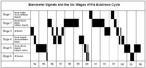
caption: Figure 2.
As with any technical indicator though, markets don't always respond to the environment in the expected way. This is especially true for stocks, which are more susceptible to psychological mood swings than the other economically driven markets. The Stock Barometer went bearish in the summer of 2004 (see Chart 7). Since then, the market has rallied of course, but this is not uncommon, as stocks have often eked out a small gain during the months immediately following the bearish signals. However, as long as the Barometer remains in a bearish mode, the overall risk/reward is not favorable, as can be seen with the 1969, 1974, and 1987 periods. (The stock commodity, and bond Barometer, are updated and analyzed in our monthly newsletter, The InterMarket Review. Figure 2 shows our current location within the 6 stages as of the June InterMarket Review.)
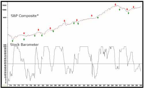
caption: Chart 7. Arrows show when the Barometer crosses 50%. See Chart 7A for more detail.
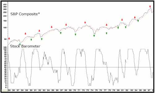
caption: Chart 7A. Arrows show Barometer buy and sell signals.
In the next section we will look at the Monetary Background behind a bear market and Key Intermarket Relationships.
There are occurrences in the business cycle when the consensus of my proprietary primary trend indicators find themselves within the confines of the bearish camp. Unfortunately, now seems to be one of those occasions. The last time the technical, economic, and monetary indicators aligned themselves in such a negative way was the turn of the millennium. Then, as now, for the benefit of my subscribers, and their valued clients and investments, I feel duty-bound to publish a Special Report setting out the arguments for the impending scene about to unfold.
In early 2000 it like the market was at, or close to, a secular or very long-term peak (albeit if not in absolute price terms, certainly in inflation-adjusted ones). Since then, the S&P has failed to take out its 2000 high; and deflated for commodity prices, actually came extremely close to a new (secular) bear market low in May of 2006.
Before setting out the current cycle's negative case though, we must first step back and re-examine the market's secular, or very long-term, technical position. It's also important to understand that while the position of the long-term indicators look extremely ominous from a primary trend point of view, they have not been confirmed with a negative 12-month moving average crossover by the S&P. And until that happens, assume the primary uptrend is intact.
At the end of June, the average is expected to be around 1255, which is about where the average was in mid-June when this report was completed. However, it requires a monthly closing price for a signal.
Secular Trend in Stock Prices -
Stock prices have undergone a series of secular up and down trends since the mid-nineteenth century. These very long-term price movements can survive through several business cycles and have often taken the form of strong multi-year bull markets, such as the 1920s, 1980s, and 1990s. On the other hand, secular "bear" markets have been more subdued and often show up on the charts as multi-decade sideways trading ranges. When adjusted for inflation though, these "trading ranges" turn out to be major bear markets where the purchasing value of stocks has been decimated.
Peaks in optimism and troughs of pessimism establish secular inflection points. And what better way to measure this concept than price-earnings ratios? After all, when investors are willing to purchase stocks with a high valuation, they are obviously confident and optimistic. In these situations, prices have typically been moving up for a decade or so, which means that confidence is extremely high and carelessness takes over from sound money management principles. The only reason they literally give them away when valuations are in the basement is because they have little or no hope for the future. Bearing this in mind, Chart 1 shows Robert Shiller's Price-Earnings Ratio between the late nineteenth century and the turn of the millennium.
Using the P/E Ratio, there have been four peaks in sentiment since 1870. I chose those that developed in excess of 22.5, and labeled them with the numbers 1, 2, 3, and 4. These peaks developed around 1900, 1969, 1966, and 2000, respectively. Generally speaking, when crowd psychology reaches such an extreme (flagged by the high price-earnings numbers), it either takes a long time, considerable price erosion, or both, along with a total disgust with equities before the psychological pendulum can swing sufficiently in the opposite direction to lay the foundation for a new secular bull market. Troughs are signaled when the Ratio falls below 7.5; i.e., at times when the market offered exceptional values (they are labeled A, B, and D). C1 and C2 also offered timely long-term entry points.

caption: Chart 1. See Chart 1A for more detail.

caption: Chart 1A: Showing the comparison between Stock Prices and Shiller's Price Earings Ratio in more detail.
These enormous pendulum-like swings indicate that the law of action and reaction for market activity is very much in force. The longer a psychological trend takes to build, the greater the magnitude and duration of the corresponding change in sentiment is in the opposite direction.
To demonstrate this concept I overlaid the numbers and letters from Chart 1 on to Chart 2. It took the 8-year bull market in the 1920s to build up the drunken euphoria that was present at the 1929 top. The actual low was seen three years later in 1932, but the psychological damage, in the sense of people expecting the other shoe to drop, continued for decades. It took about 2½ generations before confidence was fully restored and the market was able to begin the bull trend of the 1980s and 1990s. In terms of prices, it was not until the mid 1950s that the 1929 peak was surpassed. It's also interesting to note that a substantial, and long- lasting, bull market followed each period when the Price-Earnings Ratio was exceptionally low.

caption: Chart 2.
You may be thinking investors got off lightly following peaks A and C, since the market resolved its corrective period with an extended trading range rather than a sharp 1929/32 type decline. However, when equity prices are deflated by commodity prices, we can see the real damage that took place. This is shown in Chart 3, where the numbers and letters from Chart 1 have been overlaid on "real" stock prices.
I'm sure you can now appreciate that the 1900/1921 period was an exceptionally bearish one, especially towards the end. So was the 1966/82 period, although the actual peak in this inflation-adjusted series was 1968. The 1929/49 period is also an interesting analysis. The actual low developed in 1942, although the 1949 bottom was not much higher. In effect, the whole bearish inflation-adjusted trend lasted twenty years, the longest on record. The 2000 peak in the P/E Ratio was the Stock Prices highest, and most distorted on record. If the past is a prelude to the future, it's unlikely that real stock prices will see the levels attained in 2000 until well into the 2010/20 period.

caption: Chart 3
Finally, the Stock/Commodity Ratio broke below its secular up trendline in May, 2006. There are only five periods when it is possible to construct a meaningful trendline since 1800. This is a very important event because the average drop following a secular trendline break in this Ratio is around 60% and lasts roughly 8 years.
It's a little known fact that there's definite correlation between sentiment and momentum measures, or "oscillators". (To learn more about oscillators, peruse Momentum Explained, Volume I.) This means we can use the momentum of stock prices as a substitute for sentiment when sentiment data is unavailable. For example, you can see that prices (psychology) have moved too far in one direction by plotting the annual level of equity prices against a trend deviation indicator. The indicator in this case is a 12-year moving average (MA) divided by a 3-year time span. Charts 4 and 5 display what happens when the data of the two averages are identical; the oscillator is plotted at zero. Since we're using annual data, we're not expecting precise timing, but the indicator's peaks and troughs nevertheless offer useful benchmarks of the market's long-term temperature.

caption: Chart 4.
The late 1930s signal proved to be the only one of the nine since 1800 to be a whipsaw. Given that markets spend more time rising than falling, the benchmark has been raised from 10% to 35%, so momentum sell signals are triggered when the oscillator peaks. These sell signals are flagged with the downward pointing arrows in Chart 4. In some instances the peaks are followed by multi-year trading ranges rather than actual declines, but nominal prices still had a hard time advancing after the signal had been given.

caption: Chart 5. Secular accummulation points are indicated where the oscillator bottoms out from below the -10% level.
Now the Ratio has triggered its seventh sell signal. While it may not be an indication of a major bear market, the oscillator's record certainly suggests that the range. Perhaps most importantly of all is what I call the "pendulum principle", which is based on the observation that every sell signal since the early nineteenth century has been followed by an oversold reading before a new secular bull market could get underway. With the indicator still quite a ways above zero, the market clearly has plenty of downside potential before another oversold reading can be generated. In layman's terms, the pendulum still has a long way to swing before investors return to the mood of total disgust with equities that precedes a secular bull market. And this is what brings us to the current picture. (Techniques for identifying reversals in the secular trend of bonds, commodities, and stocks, can be found in The Investor's Guide to Active Asset Allocation.)
The State of the Current Bull
How does the current bull market stack up against previous rallies in a secular bear trend?
There are two big differences between a primary bull market in a secular uptrend and a primary bull market that develops under the backdrop of a secular trading range, or bear market. The "secular uptrend" bull is typically far greater in magnitude and duration, while the "secular downtrend" bull is usually much more subdued. Taking the 1900/21 and 1966/82 periods, the average duration, based on month-end closes, was 27-months for an average gain of 51%. The longest bull market began in 1903 and lasted for 35-months. And the biggest rally, which began in 1907, was followed by a gain of 65%.
The most recent bear market low developed in October 2002, although there was a test in March of 2003, when many other world markets touched their final lows. If we use the October date with an April 2006 high, we come up with a record duration of 42-months for a gain of 61%. If we substitute March 2003 as the low, the duration and magnitude of the rally up to April 2006 was 37-months with a 56% gain, respectively. If the secular bear market or trading range scenario is valid, a cyclical bear market is clearly way overdue, whichever low is used.
Incidentally, the average bear market for both the early- and mid-century periods lasted about 18-months, and prices lost approximately 28% of their value in absolute terms. The average duration was actually a bit longer because the unusually long 59-month decline that took place between 1909 and 1914 was omitted from the calculation. Projecting this average 28% decline would place the S&P Composite at approximately 940 - just below the October 1998 bottom of 966 and almost right at the rally peak separating the late 2002 and early 2003 lows
The Four-year Cycle
One of the most consistently reliable economic cycles over the last seventy years is the Four-year Cycle. Its premise is that approximately every four years, the market presents us with a major buying opportunity. Normally, the opportunity develops at the end of a bear market, but there have been exceptions such as 1986 and 1998, when the opportunity occurred after a quick decline or extended consolidation. In these instances, the "low" represented a correction in what turned out to be an ongoing bull market. The vertical lines in Chart 6 flag these cycle lows since the 1930s. Sometimes the low occurred at the end of the year preceding the expected low; e.g. 1953, and sometimes a little after; e.g. 1935. This explains why the lines in the chart are not equidistant. The previous four-year low was in 2002, while European markets bottomed in early 2003. That means that cyclically, either this year, or early next, is set to be a low. The chart also shows that in most cases, the market peaks in the year prior to the expected cycle low.

caption: Chart 6. Vertical lines show 4 year cycle lows - See Chart 6A for more detail.

caption: Chart 6A. Vertical lines show 4 year cycle lows.
In quite a few instances though, when the market tops out in the same year, the decline is short, quite sharp, and invariably unexpected. This scenario took place in 1946, 1990, and 1998, although 1986 was the exception.
The Typical Stock Market Cycle
The four-year business cycle has been reliably tracked since the beginning of the 19th century, when statistical data first became available to track it, cycling through a set series of chronological sequences beginning with an improvement in the financial indicators. The process continues with a revival of leading interest-sensitive indicators such as housing right through to lagging sectors such as capital spending. The financial markets (bonds, stocks, and commodities) also form part of this sequence. Figure 1 displays how the various components have usually peaked and troughed throughout its 200-year history.

caption: Figure 1.
The sine curve represents the path of economic growth or contraction, and the horizontal lines separate expansionary periods from contractionary ones. Because historically, an economy undergoes a chronological sequence of events during a complete cycle, it's possible to identify turning points for various financial and economic indicators as well as bonds, stocks, and commodities. Figure 1 shows the idealized periods for the three financial markets; bonds, stocks, and commodities. The financial market sequence usually develops without fail, even when the growth path reverses from above zero as it did in the 1960s, 1980s and 1990s. The major difference between these "growth recessions" and actual economic contractions is that there is usually less volatility within the three markets. (These topics are discussed at great length in, The Investor's Guide to Active Asset Allocation.)
I have taken this concept a step farther by breaking the three cycles into six definable stages since the three markets each have two turning points. The bullish stages have been flagged in Figure 1 with the rectangular boxes. Stages II-IV are bullish for stocks, but when the cycle enters Stage V, it's time to anticipate a primary trend peak. My consensus model, or "Barometers" are comprised of economic, monetary, and technical indicators monitoring the status of each market, and emphasize whether the background factors are bullish or bearish for a particular market

caption: Figure 2.
As with any technical indicator though, markets don't always respond to the environment in the expected way. This is especially true for stocks, which are more susceptible to psychological mood swings than the other economically driven markets. The Stock Barometer went bearish in the summer of 2004 (see Chart 7). Since then, the market has rallied of course, but this is not uncommon, as stocks have often eked out a small gain during the months immediately following the bearish signals. However, as long as the Barometer remains in a bearish mode, the overall risk/reward is not favorable, as can be seen with the 1969, 1974, and 1987 periods. (The stock commodity, and bond Barometer, are updated and analyzed in our monthly newsletter, The InterMarket Review. Figure 2 shows our current location within the 6 stages as of the June InterMarket Review.)

caption: Chart 7. Arrows show when the Barometer crosses 50%. See Chart 7A for more detail.

caption: Chart 7A. Arrows show Barometer buy and sell signals.
In the next section we will look at the Monetary Background behind a bear market and Key Intermarket Relationships.
Last edited by a moderator:
